Tutorial: Create a Landing Page
A well-crafted landing page is designed with a clear purpose: to guide visitors toward a specific action while delivering a focused, engaging experience. In this tutorial, you'll learn how to build an effective landing page by structuring content strategically, using compelling visuals, and applying best practices for layout and user flow.
In this tutorial we will:
- Discuss the importance of engaging visuals
- Use font selection to create an editorial feeling
- Select custom icons
- Incorporate a Section layout component to introduce colour and interest
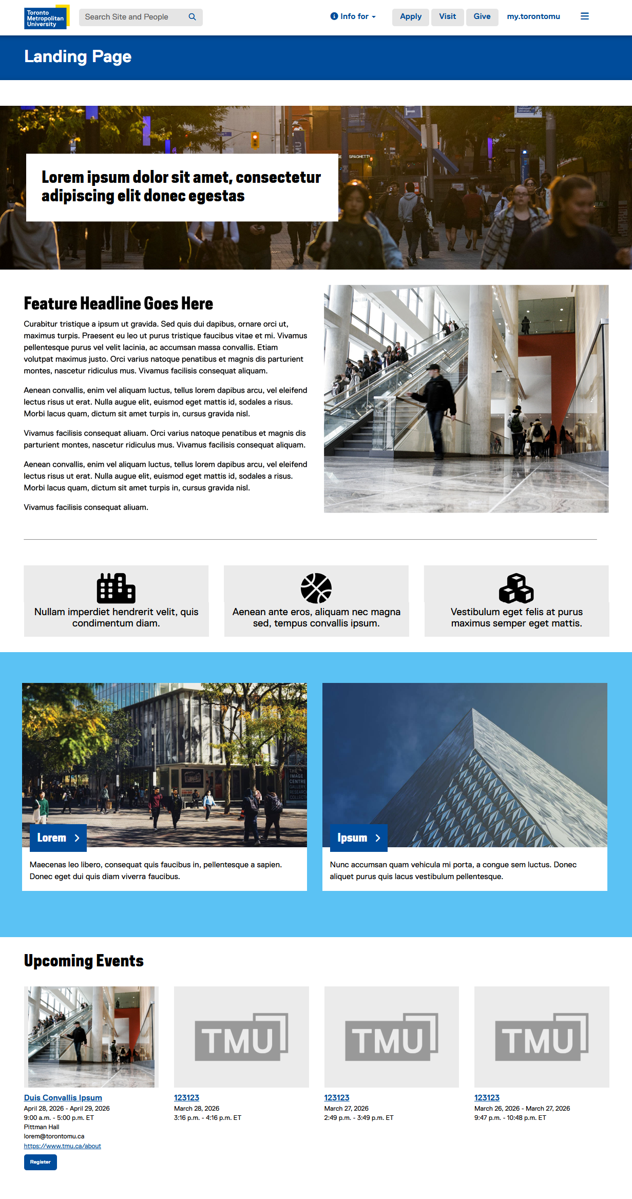
Note: This tutorial assumes your site’s landing page is built using a Homepage template. While it’s also possible to create a landing page with a Content template, we’ll focus on the Homepage approach in this example.
-
Open the Properties of your Homepage.
-
Select the "Site Colour" tab and choose a Primary Site Colour, Accent Colour, and Background Colour that best matches your brand or department identity. For more information on this, please see the website setup page on the TMU Brand site (opens in new window) .
When in doubt, it's best to stick with the default site colours. These are carefully chosen to maintain consistency across pages, ensure good readability, and preserve the overall TMU brand identity.
-
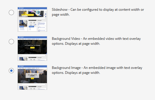
A strong visual image is one of the most important elements of a landing page because it creates an immediate first impression and sets the tone for the experience. In the Properties of your Homepage, click the "Homepage Feature" tab and select "Background Image":
-
Configure the Background Image component on your Homepage. Select the "Display As" tab and choose "Style 2".
-
Choose a horizontally-oriented image asset and enter some content for "Overlay Text - Heading". Set the "Overlay Text - Horizontal Alignment" to Left, "Overlay Text - Vertical Alignment" to Centre, and the "Component Height" to 30%.
Since a Homepage's Background Image component spans the full width of the screen, please select an image that is at least 2000px wide. See the the Image Specifications page on the Web Support site (opens in new window) for more information.
-
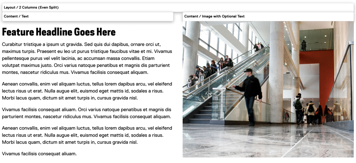
In our mock-up we have used a 2 Columns (Even Split) layout component to display the Feature content, and arranged the components as shown here:
-
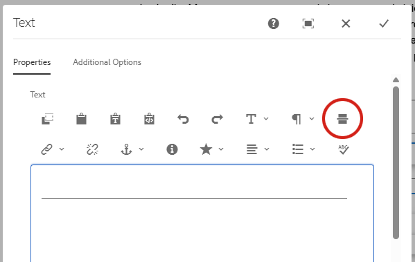
Add a horizontal rule to the page by adding a Text component and selecting the following button:
-
Add a 3 Columns (Even Split) layout component to the page and add an Infographic component into each column as shown here:
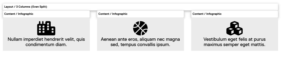
The Infographic component includes a set of pre-configured icons, but you can also use a custom one. To choose a free option, visit the Font Awesome website (external link, opens in new window) , find an available icon, copy its class name (typically starting with "fa-"), and paste it into the "Custom Icon" field.
-
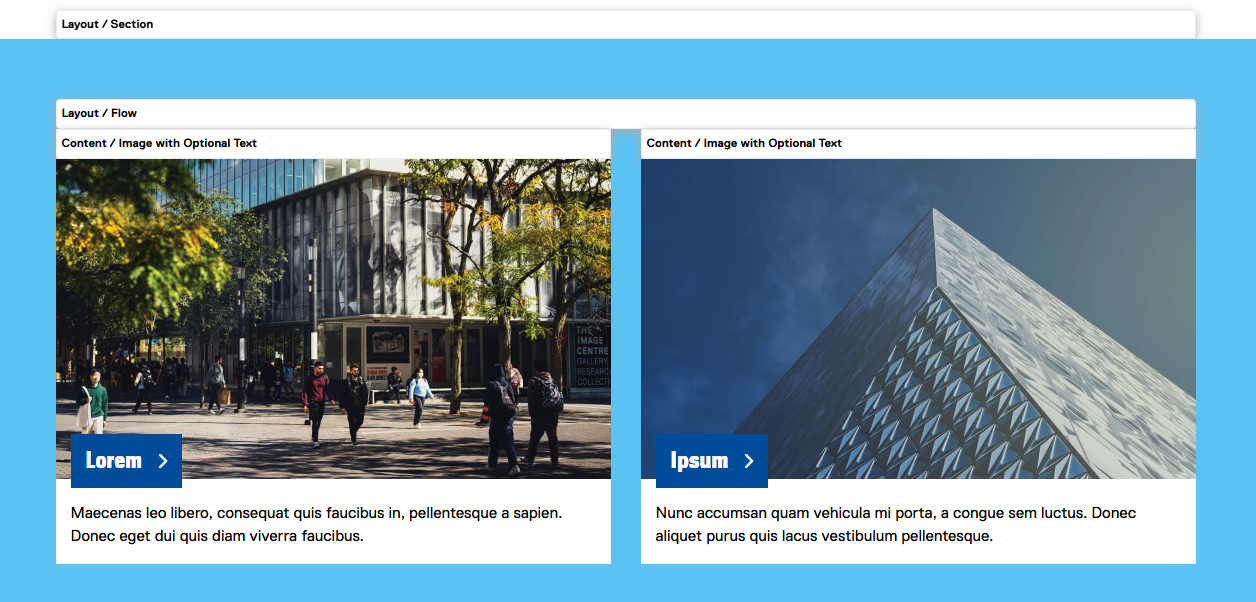
The Section component is used to define areas with colour, helping to break up the page and add visual interest. Add a Section layout component to the page, add a 2-column Flow component inside it, and add two Image with Optional Text components as shown here:
-
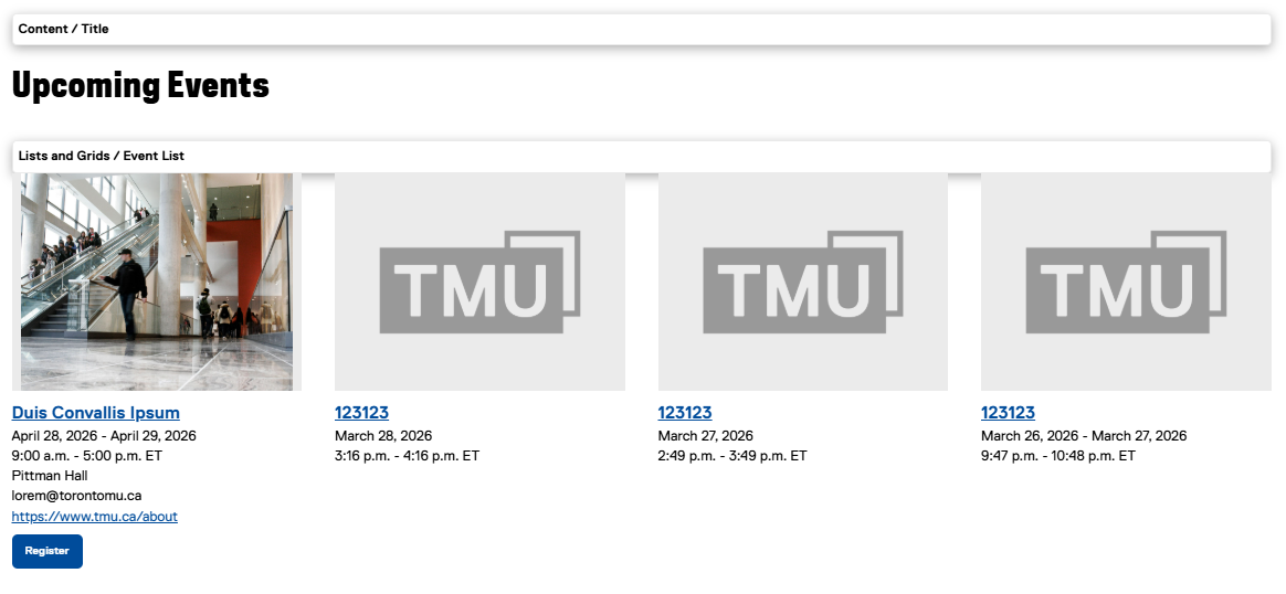
Add a Title and Event List component to the page to create a clear, scannable section of upcoming events. Consider limiting the number of results shown to a small number to maintain a clean layout and prevent the section from becoming overwhelming: