Tutorial: Create a Biography Page
Learn how to build a professional biography page using AEM components, while following best practices for layout and accessibility. Whether you're highlighting a staff member, author, or executive, this guide will walk you through organizing key details like background, achievements, and media assets so your biography pages look polished and consistent across your site.
In this tutorial we will:
- Use a "Large Image" version of the Biography component
- Add a horizontal rule to a page
- Use enhanced tables to present structured data more effectively
- Auto-format Publication List data
-
Create a Biography template by following the steps found on this page (opens in new window) .
-
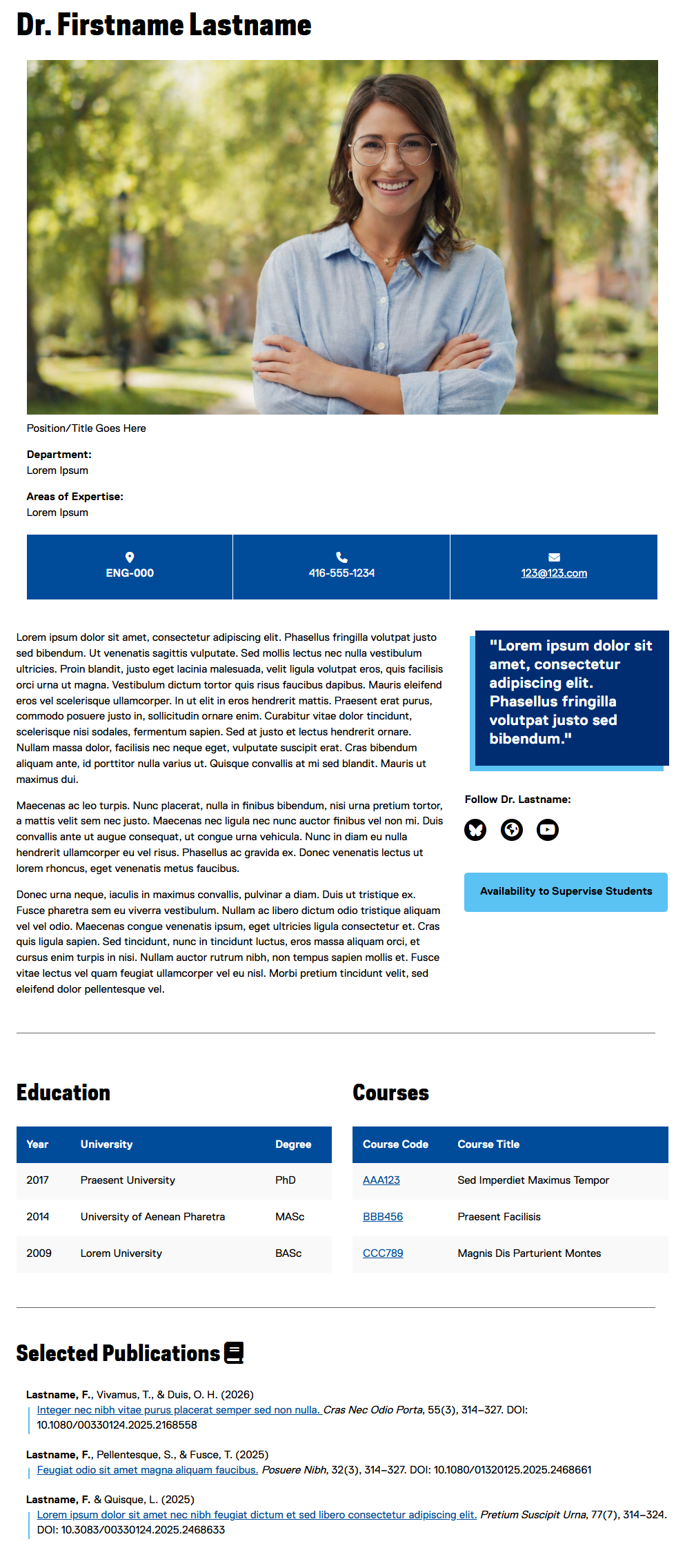
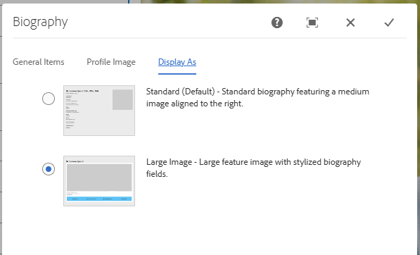
Configure the Biography component on the page, and select the "Display As" tab, and select "Large Image":
Using a larger image helps to maximize clarity across devices and increases audience engagement.
-
Enter some content into the Biography component.
The Large Image biography option applies special styles (appearing as coloured boxes under the large image) to the following fields: Office Address / Location, Telephone, Email, and Website.
-
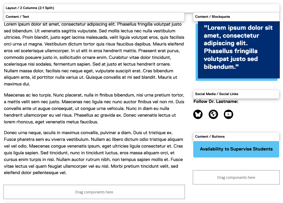
For presenting related information as shown at the top of the content area in the mock-up, we recommend using a column component to arrange the content in a visually appealing and well-structured layout. In our mock-up we have used a 2 Columns (2:1 Split) layout component, and arranged the content as shown here. Be creative with your own content and arrange it in whatever format works best for you and your subject:
-
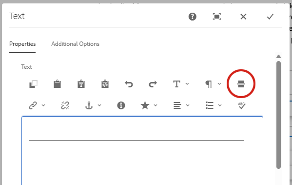
Add a horizontal rule to the page by adding a Text component and selecting the following button:
-
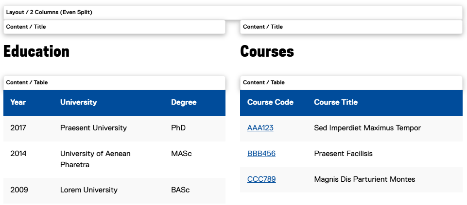
Education and course details naturally fit a simple tabular format, so consider using a Table component to present this information clearly. Add a 2 Columns (Even Split) layout component to the page and add a Title and Table component into each column as shown here:
-
For information on how to format the Table components so they appear as they do in the example above, please visit the Table component page on the Web Support site (opens in new window) .
-
Add a second horizontal rule to the page by copying and pasting the component created in Step 5.
-
Add a Title and Text component to the page to create a Publication List section:
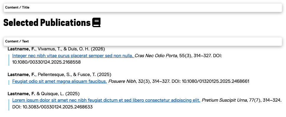
The Title component includes an option to add an icon, which can be useful for drawing attention to key sections, reinforcing meaning through visual cues, and helping users quickly scan and understand the content.
-
For instructions on how to format content in the Publication List style, please see the Publication List section on the Text component Web Support page (opens in new window) .