You are now in the main content area
Tabs Layout Component
The tabs component is used as a layout tool. Using a series of tabs, content is hidden until the user selects another tab.
- Found in Side Panel > Components > Tabs
- One style only
- Custom colours applied
- Do not use in the accordion component
Sample tabs component:
Tab one content. Text, images and most components can be added to a tab with the exception of the accordion.
Tab two content. Text, images and most components can be added to a tab with the exception of the accordion.
Tab three content. Text, images and most components can be added to a tab with the exception of the accordion.
Similar content:
How to use
- In open page, select the side panel icon
- Locate Components > Tabs
- Drag tabs component onto page
- alternatively, on the open page, select the area designated 'drag components here'; then select the + sign when it appears, and choose tabs component
- alternatively, on the open page, select the area designated 'drag components here'; then select the + sign when it appears, and choose tabs component
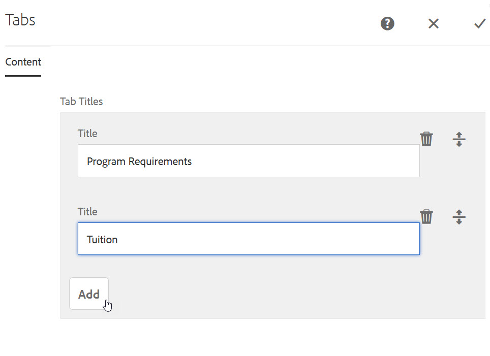
- Double click component or select wrench icon to open
- Add first tab title to Title field
- Select the "Add" button to add more tabs/titles
- Caution: Keep labels short; do not allow tabs to exceed available space; tabs should not wrap to a second row.
- Caution: Keep labels short; do not allow tabs to exceed available space; tabs should not wrap to a second row.
- Remove tabs by selecting the trash can icon
- Select the checkmark when all tab titles have been added
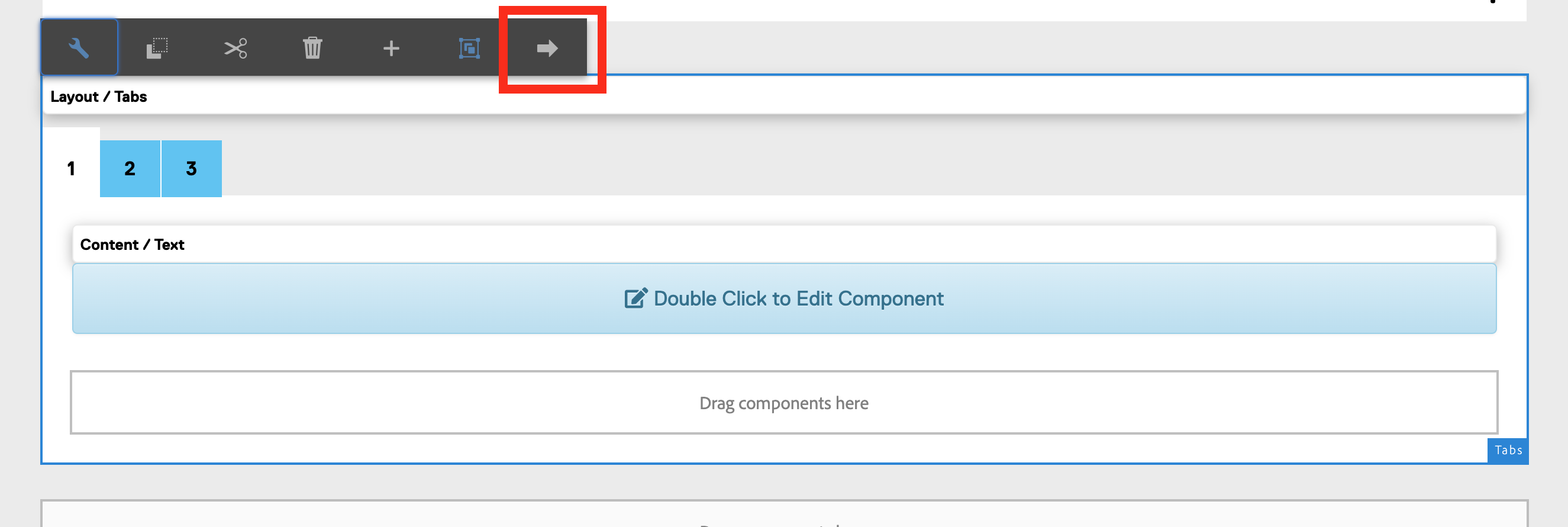
- Drag components onto the first open tab
How to switch between tabs for editing:
- Select the Tabs component to edit
- Select the left or right buttons.