You are now in the main content area
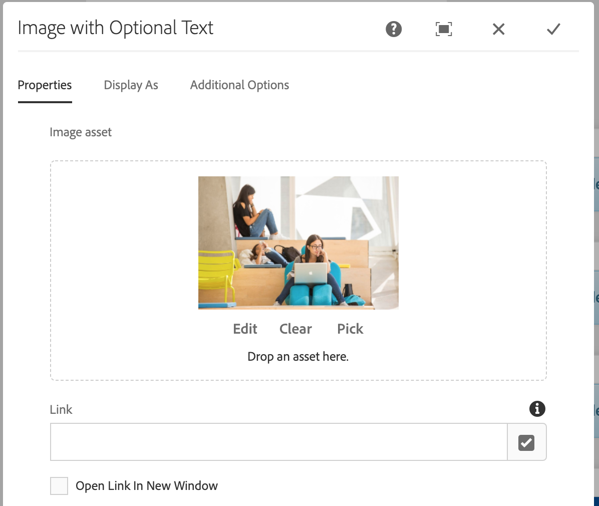
Image with Optional Text
This component is used to display an image on a webpage. This component can also display optional text.
- Found in Side Panel > Components > Image with Optional Text
- Required content: Image
- Fonts available: Replica, Lyon
- Optional fields: link, overlay text, optional text, title, course linker
- Additional options: Hide Component Border
- Custom Colours Applicable: No
How to use
- In an open page, select the "Side Panel" button in the top left corner
- Select the Components button on the left
- Drag and drop the Image with Optional Text component onto the page
- Double click to edit
- Select the Assets button on the left (above Components)
- Drag an image from assets on the left and drop it into the component
- Optional fields: link, open in new window check box, Overlay Text, Title, Optional Text, Button
- Select the "Display As" tab
- Select how you would like the image displayed (Vertical, Horizontal (1:2) Media Left, etc.)
- Select the check mark when complete
Optional button feature
The Optional button feature is located at the bottom of the Image with Optional Text component. It allows the option of adding one button below the text.
- Type in the name of the button
- Enter the Path/URL
- Select OK
Note: The colour of the button is based on the accent colour of your site.
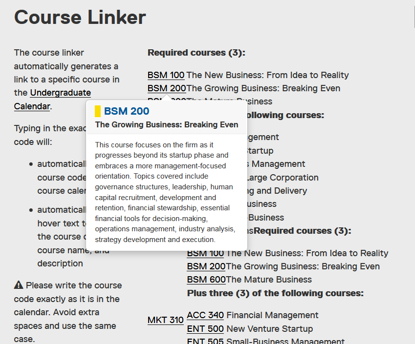
Course link feature
The course linker automatically generates a link to a specific course in the current Undergraduate Calendar.
Typing in the exact course code will:
- automatically link the course code to the course calendar
- automatically create hover text to show the course code, course name, and description
Please write the course code exactly as it is in the calendar. Avoid extra spaces and use the same case.
For example, type CMN 100 and not cmn 100
This feature is available in the following components: