You are now in the main content area
Drop-down menus
Drop-down menus have been introduced to improve user experience and navigation efficiency on TMU websites.
Benefits of using drop-downs:
- Streamlined navigation bars
- Easier content discovery
- Reduced need for overview (aka landing) pages and left navigation
Optional menus:
- Allow visitors to access child pages directly from the main navigation
- Reduce clutter and improve organization of navigation elements
- Authors can enable or disable drop downs as needed
- Serve as ‘containers’ for child pages
- Authors can choose whether to display overview pages in the navigation
- If displayed, overview links will be labeled with "Overview" (e.g., "About Overview") for clarity.
Sample navigation:
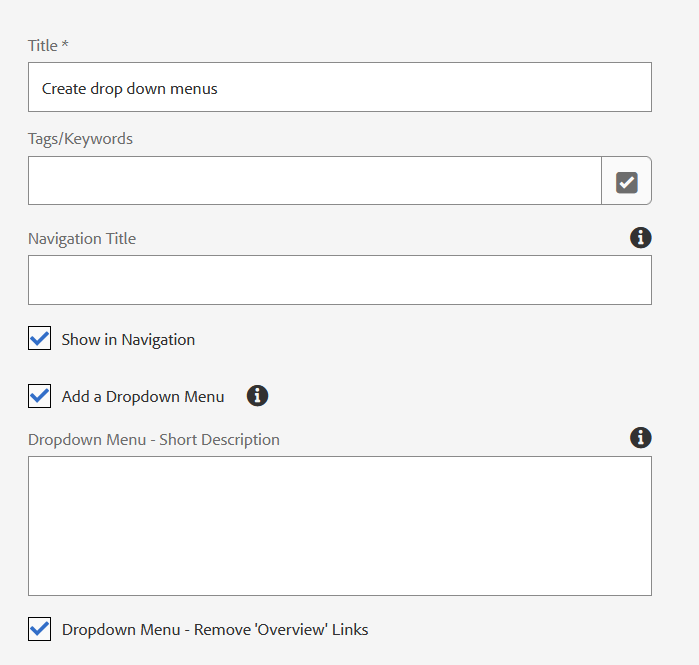
How to add drop-down menus to horizontal navigation:
- On a navigation page (level 1), open the page properties and select "Show Dropdown Menu"
- Enter a short description for the "Overview" field.
- Optional: Hide "Overview" links
Navigation structure & behaviour:
Closed State: Navigation bar displays as usual, with downward-facing caret icons for sections containing drop downs.
Open State: Clicking a menu item with a drop down reveals a floating menu overlaying the content area. Menu width is consistent; height varies by content.
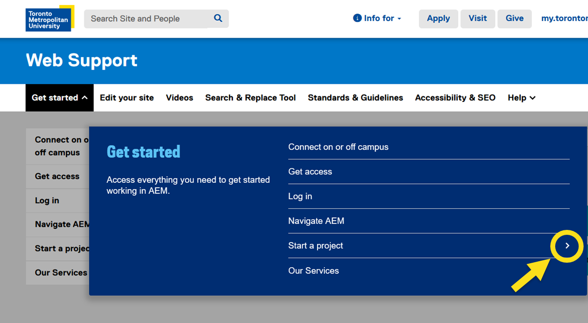
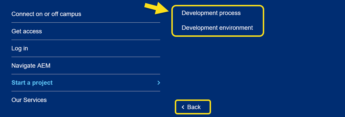
Child Page View: Clicking a section with child pages slides the menu to show child page links and a back button.
Additional information:
UI elements
- Nav Bar: Three states—default, hover, and active ("lit").
- Caret Icons: Indicate sections with drop downs; rotate when open.
Menu panel:
- Left panel (40% width): Section title, optional description, and optional overview link.
- Right panel (60% width, or 50% when viewing child pages): List of pages, with carets for items with further children.
- Text Handling: Section names limited to one line; overflow is truncated with ellipses.
Author options & customization
- Authors can enable drop down menus per section.
- Authors can choose to display or hide overview pages in navigation.
- Section descriptions (up to 220 characters) can be added.
- No limit to the number of pages shown in drop downs.
Design specifications
- Typography: Matches current site settings; drop down menus add minimal extra width.
- Menu Animation: Menus animate open/close and slide between levels for interactivity.
- Consistent Layout: Menu overlays are consistent in width and adapt in height.
Best practices
- Avoid creating unnecessary overview or container pages.
- Limit navigation depth to three levels on desktop for clarity.
- Use concise, clear section and page names for optimal display and usability.
Mobile navigation for drop-down menus