Alternative text guide
Alternative (alt) text is used to convey meaning and provide context in place of an image, graph and other media. Blind and low vision users rely on the alt text attribute to understand the equivalent meaning of images, figures or other graphics in textual form. Alt text should provide a concise description conveying essential information about the image. Here are some key tips:
- Should be concise and meaningful, yet does not compromise on detail for it to make sense.
- Usually, around one hundred characters or less, like a “tweet”.
- Uses full stops and commas, so it can be read in a more human way by a screen reader.
- Avoids phrases such as "image of…” or “photo of..." or "graphic of…"
- A screen reader already indicates this information.
- Consider the context of the surrounding information when writing.
On this page:
- Where to add alternative text
- Decorative images
- Images that capture a mood
- Images that tell a story
- Images with a visible caption
- Images of text and numbers
- Images of people for a biography page or profile
- Images that hyperlink to another page
- Logos and brand marks
- Alternative text for complex images and figures
- Alternative description for Google Data Studio
- Relevant WCAG 2.0 Success Criteria
Where to add alternative text
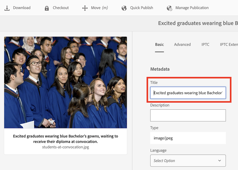
Once you upload an image to the DAM, insert alternative text in the “Title” field. Alternatively, you can use the Accessibility Dashboard to add alternative text or to mark images as decorative.
Tip! Do not use double quotation marks in the alt text or title field. It will conflict with the HTML and break your alternative text.
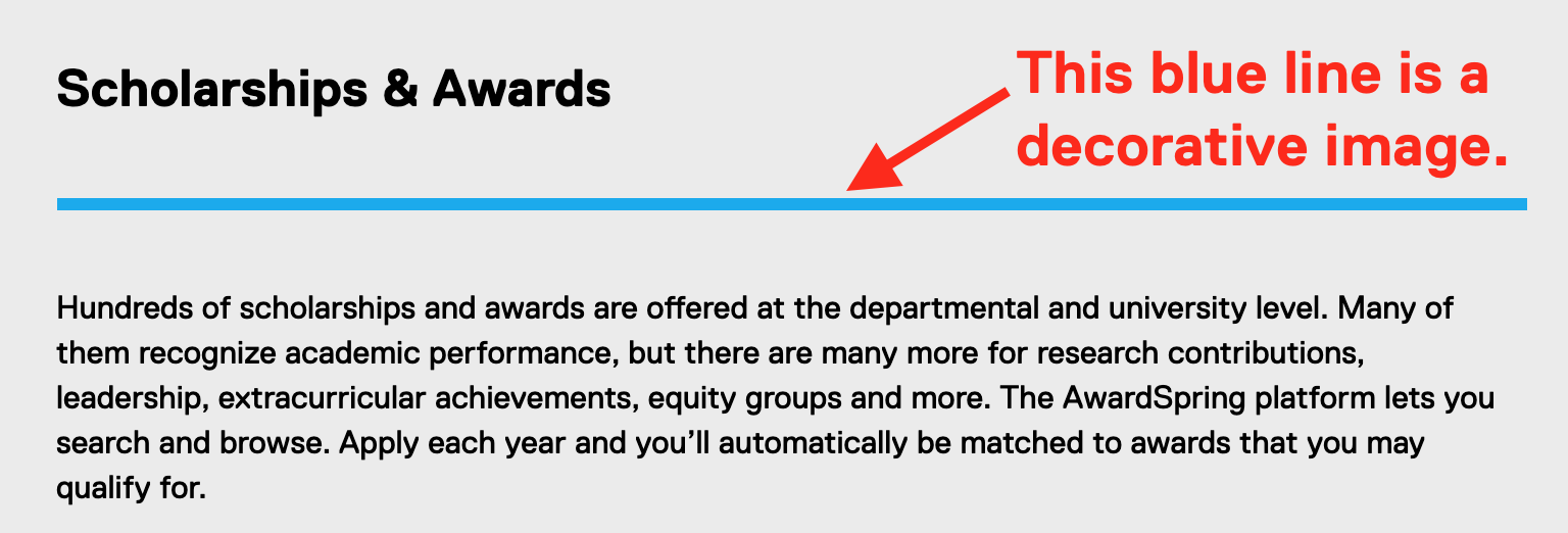
Decorative images
Set images as decorative in the Accessibility Dashboard if they do not add meaningful information to a page. Decorative images are ignored by assistive technologies, such as screen readers.
Whether to set an image as decorative is based on your judgement. Visual elements such as borders or spacer elements should be set as decorative. If the surrounding text already captures the information in the image, it may be set as decorative too. Otherwise, please add alternative text to your image.
Good: “Excited graduates wearing blue Bachelor’s gowns, waiting to receive their diploma at convocation."
Bad: “Graduates at convocation”

Good: “Two members of the security team speaking to a student whose bike was stolen.”
Bad: “Three people talking”

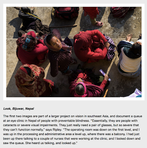
Good: “A queue of people waiting for medical treatment in Nepal, with one woman looking up to the camera.”
Bad: “Woman looking up”
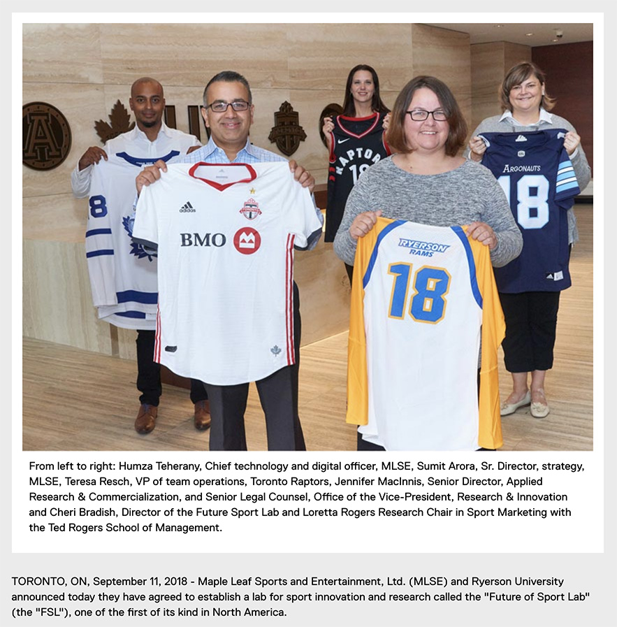
Good: “Representatives from MLSE and Toronto Metropolitan University each holding up jerseys for the Toronto Maple Leafs, Toronto FC, Raptors, Argonauts and Ryerson Rams.”
Bad: “Photo: From left: Humza Teherany, MLSE’s chief technology and digital officer; Sumit Arora, MLSE’s senior director…”
Note: Do not duplicate the visible caption in the alternative text field.
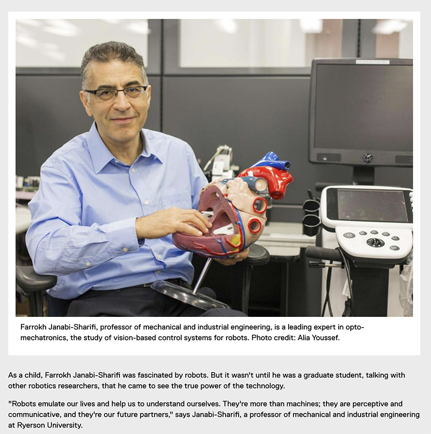
Good: “Farrokh holding an anatomical model of a human heart.”
Bad: “Man holding a heart"
Images of text and numbers
Plain text should always be used instead of placing text inside of an image. Plain, selectable text is much more flexible and accessible. Real text can be resized using the browser without losing clarity. Secondly, text colours and spacing can be adjusted to suit the reading preferences of users with the help of browser settings or extensions.
Recommended: Use the Infographic, Full Width Colour, Block quote or Image with Overlay Text component instead of embedding text within an image.
Accessibility guideline: Avoiding images of text is a WCAG 2.0 Level AA success criterion. Please reference: 1.4.5 Images of Text (Level AA). (external link)
Do not use images of text as visual headings. Use semantic headings instead.
Do not use images of text for quotes or long passages of text. Use a text-based component instead.
Problems with images of text
- Cannot translate automatically.
- More likely to distort and pixelate when resized. At high magnification, the text may look "fuzzy" and sometimes unreadable.
- The text within the image will not scale proportionally when using the browser's magnification features.
- In small viewports (like mobile screens), the text may become too small or very difficult to read.
- Not selectable (impossible to copy and paste), and won't be accessible for people who use assistive technology unless a text alternative is provided.
- Not customizable for people with browser preferences or extensions that make it more readable for them.
- If using a dark mode extension, sometimes the image becomes completely unreadable because it blends in with the background.
There should be minimal text within the image. Check if the text is still readable on mobile.
Save the image as an SVG (Scalable Vector Graphics). SVGs can easily re-size without degradation and usually have a small file size.
In rare situations where images of text must be used, the text alternative must contain the same text presented in the image. If the alternative text exceeds more than two sentences, please reference alternative text for complex images and figures.
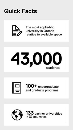
It’s recommended to write out numbers in word form, as some screen readers may not recognize larger numbers and read out each digit one by one.
Good:
- “The most applied-to university in Ontario relative to available space.”
- “Forty three thousand students.”
- “Over one hundred undergraduate and graduate programs.”
- “One hundred and thirty three partner universities in thirty seven countries.
Bad:
- “Infographic 1.jpg”
- “Infographic 2.jpg”
- “Infographic 3.jpg”
- “Infographic 4.jpg”
Save as SVG in Illustrator
If creating an image of text or vector graphics, export the image as an SVG! SVG is a vector image format, which means it will not lose its sharpness at high magnification or clarity.
- Using the Selection Tool, select the text frame, then go to Type > Create Outlines.
- Once you are ready to export, go to File > Export > SVG.
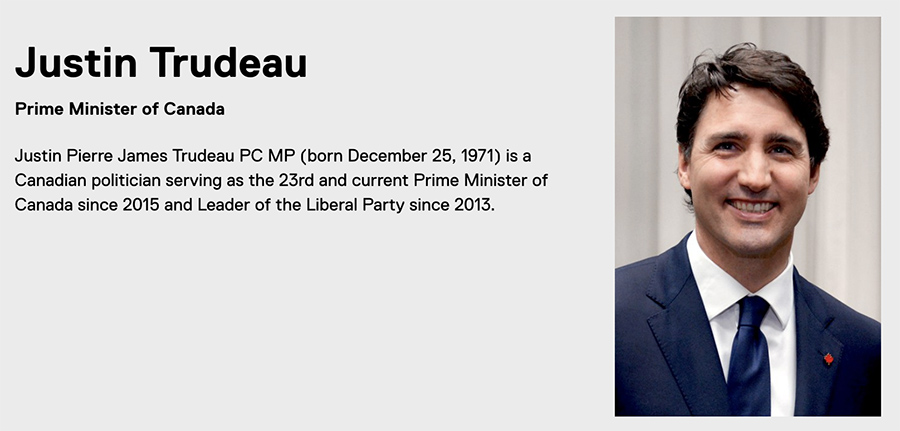
Good: "Justin Trudeau"
Bad: "Portrait of Justin Trudeau smiling"
Images that hyperlink to another page
For 'clickable' images, it is highly recommended to use Overlay Text with the Image Component. The Overlay Text replaces the alternative text of the image in this case, and accurately describes to an assistive technology user where the image takes you.


Good: "Toronto Metropolitan University"
Bad: "Toronto Metropolitan University logo with white text on blue box and a smaller yellow gold bar"

Good: "Department of Mathematics at the Faculty of Science at Toronto Metropolitan University"
Bad: "TMU math department logo"
Good example
The alternative text is "Environmental Health and Safety Inspections and Audits pie chart." The long description is located in the accordion component after the image which includes a brief summary and a data table.
Bad example
The alternative text is "Pie chart of EHS inspections and Audits." Although the image has alt text, this does not accurately describe the contents of the pie chart! The purpose of alt text is to provide the same information and experience as displayed in the chart.
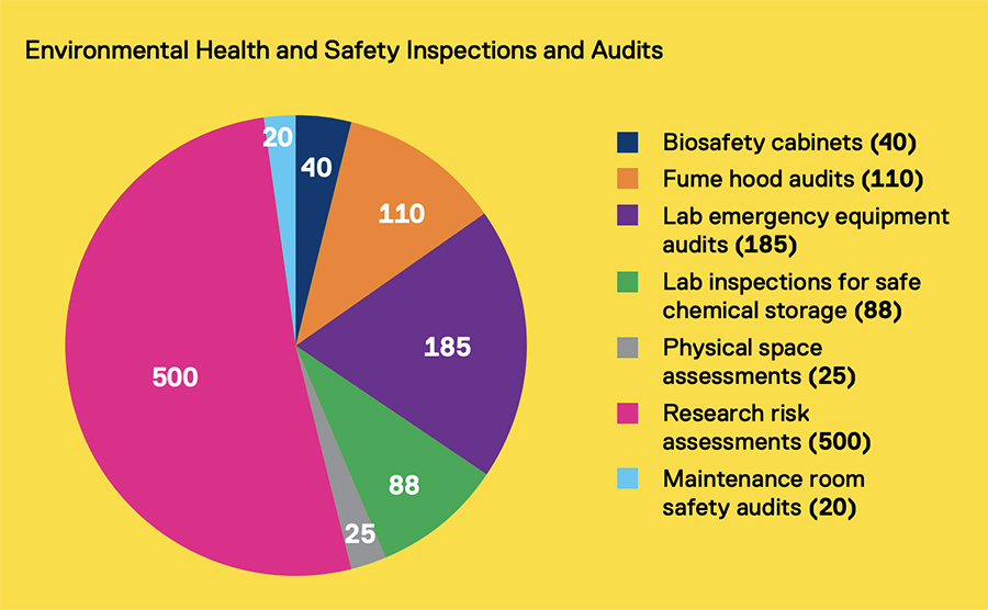
Bad: "Pie chart of EHS inspections and Audits"
The pie chart shows the audit type and number of Environmental Health and Safety inspections and audits conducted in 2017.
| Audit Type | Number of Audits |
|---|---|
| Biosafety cabinets | 40 |
| Fume hood audits | 110 |
| Lab emergency equipment audits | 185 |
| Lab inspections for safe chemical storage | 88 |
| Physical space assessments | 25 |
| Research risk assessments | 500 |
| Maintenance room safety audits | 20 |
The bar chart shows the world population versus the number of internet users in China, India, United States, Indonesia, Brazil, Pakistan, Nigeria, Bangladesh, Russia and Japan. [Insert some key information like general trends or outcomes in simple, easy to understand language.]
| Country | Population | Internet Users |
|---|---|---|
| China | 13,342,720,000 | 3,310,708,029 |
| India | 11,977,337,695 | 775,202,869 |
| United States | 3,076,528,567 | 2,030,008,955 |
| Indonesia | 2,388,914,104 | 196,466,812 |
| Brazil | 1,942,727,085 | 660,764,653 |
| Pakistan | 1,715,658,910 | 123,461,695 |
| Nigeria | 1,581,543,983 | 284,284,599 |
| Bangladesh | 1,505,724,822 | 45,073,048 |
| Russia | 1,431,239,304 | 473,508,567 |
| Japan | 1,277,657,187 | 885,924,532 |
Relevant WCAG 2.0 Success Criteria
Providing alternative text for images is a Level A success criteria, which is required for conformance with WCAG 2.0 and the Accessibility for Ontarians with Disabilities Act (AODA).
- 1.1.1 Non-text Content (Level A): (external link) All non-text content that is presented to the user has a text alternative that serves the equivalent purpose...
- 1.4.5 Images of Text (Level AA): (external link) If the technologies being used can achieve the visual presentation, text is used to convey information rather than images of text except...
- 1.4.9 Images of Text (No Exception) (Level AAA): (external link) Images of text are only used for pure decoration or where a particular presentation of text is essential to the information being conveyed.