You are now in the main content area
Buttons
The buttons component is used to add selectable and customized links to a webpage.
- Found in Side Panel > Components > Buttons
- Three styles available: Default, call-to-action, transition
- Fonts available: Replica
- Required content: Button name, link
- Optional fields: None
- Custom Colours Applicable: Default style and Call-To-Action style
How to use
- Select the "Toggle Side Panel" button in the top left corner
- Select the Components button on the left
- Drag and drop the Buttons component onto the page
- Double click to edit
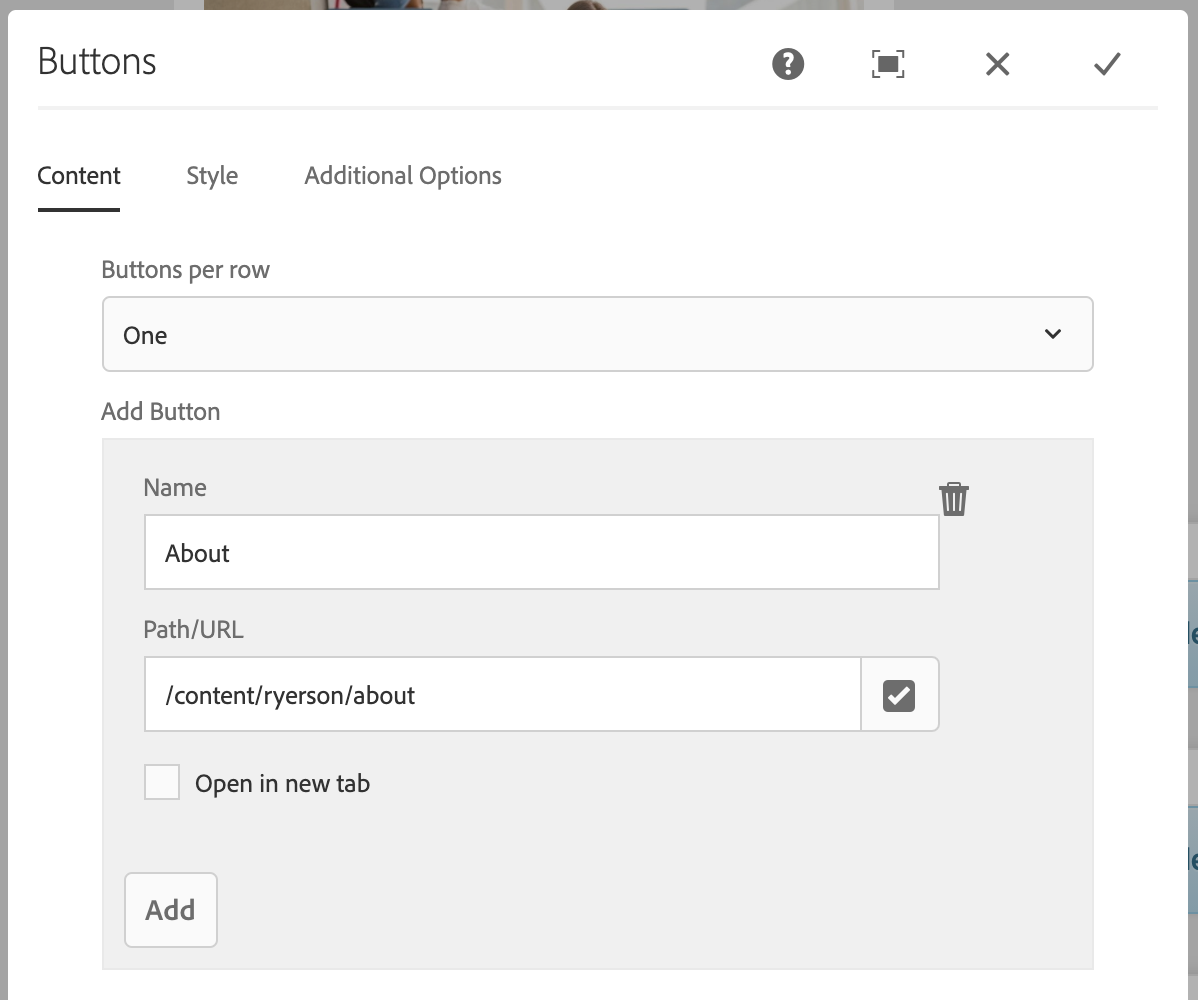
- Select number of buttons per row
- Select "Add"
- Enter "Name" and "Path/URL"
- Optional: Check off "Open in new tab"
- Select the "Style" tab
- Select Default (default), Call-To-Action, or Transition
- Select the checkmark when complete
Default style
Sample call-to-action style
Sample transition style
White background style
Display options
Choose the number of buttons that should appear in each row (maximum of four rows). This allows for the creation of a variety of layouts – vertical, horizontal and stacked.
Buttons per row:
- One
- Two
- Three
- Four
The component’s display is constrained by the amount of vertical and horizontal space it is placed in. This component’s layout will rearrange depending on the device.
For example: multiple columns on a desktop display will become a single column on a phone.
Sample button displays:
One button per row:
Two buttons per row: