You are now in the main content area
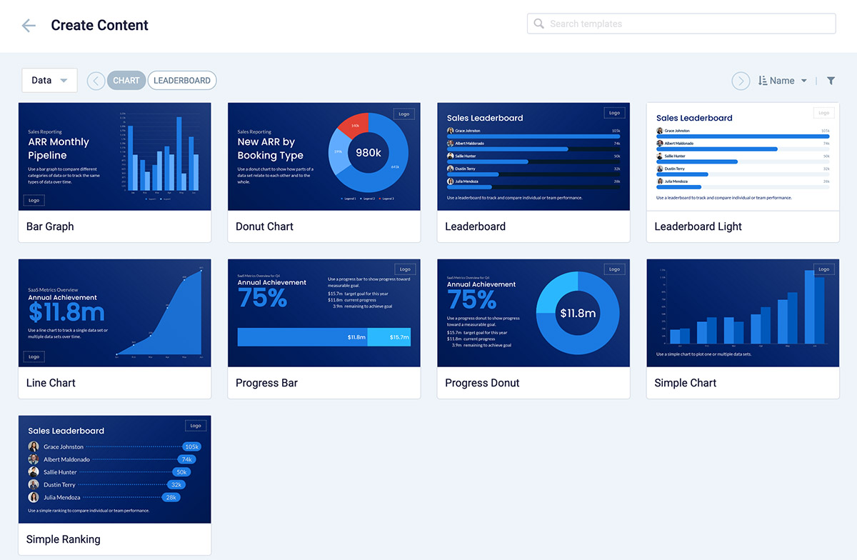
Data visualization card
This card includes a myriad of themes in the Library for displaying customized graphs, charts, and progress charts, (external link) such as:
- Donut – to display data as a pie or donut chart, where the circle is divided into multiple sectors.
- Line – a line chart to compare changes over the same period of time for one or more series.
- Bar – a bar chart to present categorical data in rectangular bars with heights or lengths proportional to the values that they represent.
- Progress Bar – a progress bar chart to show the progress of a goal such as monetary value, time, or achievements.
- Progress Donut – a progress donut chart to show the progress of a goal such as monetary value, time, or achievements in a pie chart.
Each theme has its own multiple customization options and data import capabilities.
Creating Data visualization cards in Appspace
There are various types of data visualization templates to choose from and various ways to customize the look to match your needs. The video below gives you a quick overview.
Data visualization cards available