Employee Diversity Data Centre
“By choosing to participate in the Employee Self-ID, you’re choosing to stand up and be counted as a member of your community, and by that very act, you’re reminding leaders within the university that our community has specific needs, including the paramount need for safety and connection.”
– Dan Cantiller and Michael Turco, Co-chairs, Positive Space Faculty and Staff Network
Over 7,400 current employees have completed the Diversity Self-ID
94% response rate for full-time faculty and staff
About the 2024 update to Employee Diversity Self-ID data
The 2024 data provides an update while also communicating changes since 2016. The data includes information about the recruitment, representation and retention of employees from six equity-deserving groups: women, racialized people, Black people, First Nations, Inuit and Métis Peoples, persons with disabilities and 2SLGBTQ+ people. Following the 2020 release of TMU’s Anti-Black Racism Campus Climate Review Report, Black employees have been presented as a distinct equity group so that the university can track its progress on commitments made to confront anti-Black racism and enhance Black inclusion at the university.
Community members are invited to explore the data to discover what is working and where improvements can be made. We want to sustain and build on successes and make adjustments where necessary. In short, the Data Centre is a tool for university leaders, committees and decision-makers to advance equity, diversity and inclusion at TMU.
The data does not, however, tell the full story of progress or barriers that prevent progress. Diversity Self-ID data shows patterns and trends in representation, recruitment and retention and thus suggests areas for further discussion and exploration.

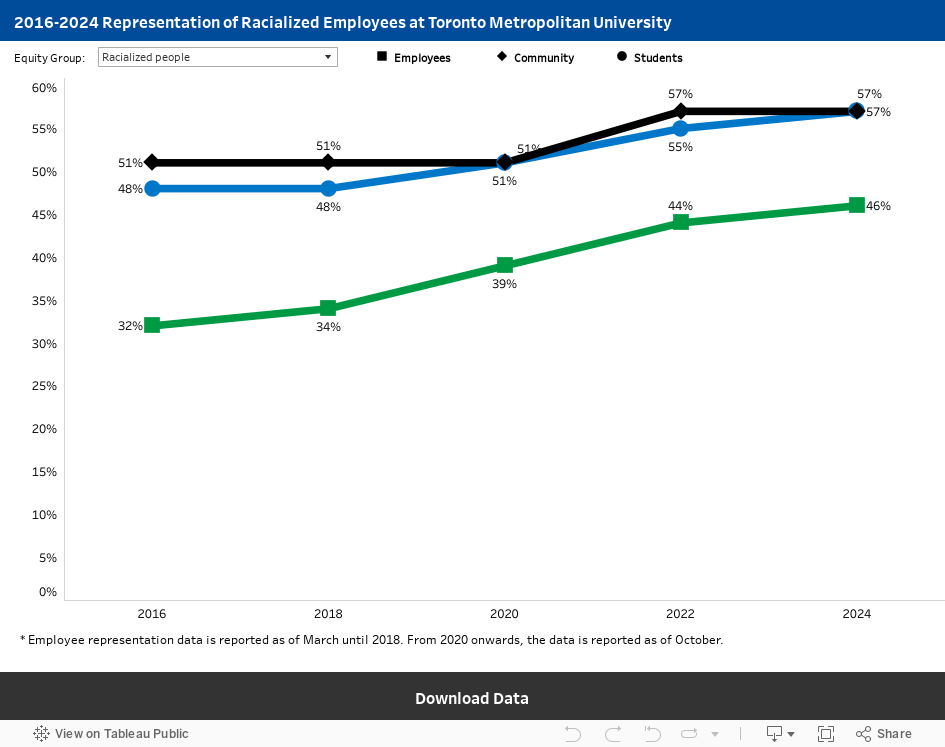
The data shows that representation for all equity groups has either increased or remained at or above the external community representation from 2016 to 2024, except for First Nations, Inuit and Métis Peoples whose representation has stayed at 2 per cent since 2020 and is still below the 3 per cent community representation.
It must be noted that although the representation of racialized employees has continued to increase, it remains below the external community representation that has also increased. In addition, the representation of persons with disabilities remains lower than the external community representation.
This high-level data masks the uneven representation in different types and areas of work. To learn more about where gaps in representation exist, explore the additional sections in this Diversity Data Centre.
Based on the university’s aspirations to reflect the diversity of the broader community in our student and employee populations, the data presented is compared to the diversity data of the Greater Toronto Area or Ontario, depending on the group. Student data by program and faculty is available in the Student Diversity Data Centre.
The following line graph shows the representation of employees from the six equity-deserving groups at TMU from 2016 to 2024, with comparison data from the Greater Toronto Area or Ontario and TMU’s Student Diversity Self-ID data.
- The x-axis (horizontal) shows the years, and the y-axis (vertical) shows the percentages.
- One line shows the employee representation and whether it increased or decreased over the past nine years.
- The other lines show the student and community representation. Any space between the employee representation and community lines, where the employee representation line is below either, indicates a gap in representation. Please note that the community representation reflects the most recent data in the 2021 Canadian Census. See the glossary for more details.
- Employees include faculty, staff (including full-time career and long-term contract employees), contract lecturers, student employees, research employees and casual, part-time and short-term contract employees.
The graphical illustrations facilitate an interactive experience — users can see the data that corresponds to the visual by hovering or clicking over portions of the illustration. The data can also be explored using keyboard shortcuts (external link) .
The aggregated data can be explored further, downloaded and saved in different formats, such as Google Sheets, MS Excel, CSV and more, using the link provided at the bottom end of the graph or chart. Downloads are provided for the data in a graph or chart based on user selections. For example, for this line graph, the data provided would be for the equity group selected in the drop-down menu.
Need the data in an alternative format?
Accessibility is an important goal for us. If you have questions, or if the data visualization content is not accessible using the features and alternate formats described above, please contact the Research, Planning and Assessment unit in the Office of the Vice-President, Equity and Community Inclusion at diversitydata@torontomu.ca for further assistance.