TMU Logo
The university logo is the sign-off to everything we say. It embodies who we are and unites all of our different voices so that together we are stronger than the sum of our parts.
Consistent use of our logo positions us facing forward together.
Related Content
The Toronto Metropolitan University logo uses the brand’s primary typeface, Replica Std, and the two primary colours, blue and gold. Two overlaid boxes are used to create clear, undisturbed space for the university name, as well as to communicate the brand’s modular visual language.
The logo must never be recreated or modified. It is always used in full colour, unless production restrictions prohibit it. To ensure you are always using our logo properly, see Logo Don’ts below.
(archive file) Logo Download (digital and print formats)
For legibility, the University Logo is never made smaller than 0.8 inches wide in print, or 58 pixels wide on screen.
It is important that clear space be maintained from all surrounding typographic elements in order to distinguish the logo within a composition. Clear space is always determined by the width of half a gold bar.
In all instances, the logo must be clearly visible and legible. Always make sure there is sufficient contrast between the logo and its background.
Alternate Use
Clear space is not necessary from other elements of the visual language (photography, colour fields), but careful attention must always be paid to the placement and visibility of the logo. The logo provides confidence and energy, and should be used with that in mind.
Clear Space
Alternate Use (no clear space from graphic elements)
The primary placement of the logo is in the bottom left corner of a layout. Secondary placement of the logo is in the upper left corner.
In all instances, make sure there is enough contrast between the logo and its background — meaning all edges of the logo are clearly defined and not blending into the background. For more information, see Logo Don'ts below.
Depending on layout, the use of logo lock-ups and application, these sizes may require additional consideration.
Placement & Positioning for Print
The primary placement of the logo is in the bottom left corner of a layout. Secondary placement of the logo is in the upper left corner.
- Letter documents that are 8.5 by 11 inches should have a logo width of 1.375 inches.
- Tabloid documents that are 11 by 17 inches should have a logo width of 2 inches.
- Retractable Banners that are 33 by 84 inches, should have a logo width of 7.75 inches.
Placement & Positioning for Digital
The placement of the logo for leaderboard ads, e-vites, and e-headers is on the left side. For big box and skyscraper ads, the placement is in the bottom left corner of a layout. Please ensure that there is sufficient clear space as defined by a gold bar width. In all instances, make sure there is enough contrast between the logo and its background, and that all edges of the logo are clearly defined and do not blend into the background.
- Leaderboard ads that are 728 by 90 pixels should have a logo width of 100 pixels.
- Skyscraper ads that are 160 by 600 pixels should have a logo width of 120 pixels.
- Big box ads that are 300 by 250 pixels should have a logo width of 70 pixels.
- E-vite ads that are 600 pixels in width should have a logo width of 100 pixels.
The table below shows the updated social media icons for different areas of the university. These updates improve visual consistency across all university accounts and help users more easily recognize official social media channels. University-branded social media icons can be obtained from your Functional Unit MarComm lead or by contacting University Relations at tmubrand@torontomu.ca.
This icon draws inspiration from the Toronto Metropolitan University logo, but has been designed to fit social media profile sizes. It is used for TMU’s central channels only.
All social media icons representing offices and administrative units should include an abbreviated name under the TMU logo on a standard white background.
All faculty social media icons should include an abbreviated faculty name under the TMU logo on a light blue background.
Schools and departments may choose to use either the social media icons used by their faculty or a social media icon with the TMU logo on a plain light blue background. They can leverage their social media bios and handles to communicate specific information about their schools or departments.
In addition to the primary university logo, a one-colour brand mark is available for specific instances and applications. Please contact tmubrand@torontomu.ca for more information.
One-Colour Logo
A one-colour brand mark has been developed for limited colour reproduction. Use the one-colour logo as only black, white or of a specific material (i.e., stainless steel, etched glass, etc.).
The University crest and seal are reserved exclusively for use in official documents such as: degree and certificate parchments, transcripts, and other documents required to be under the corporate seal of the University. No other usage of the University seal is permitted.
All requests to display the University crest must be submitted to the University Events and Ceremonies and University Relations teams for review and approval via ceremonials@torontomu.ca and tmubrand@torontomu.ca.
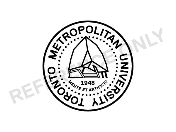
TMU Seal
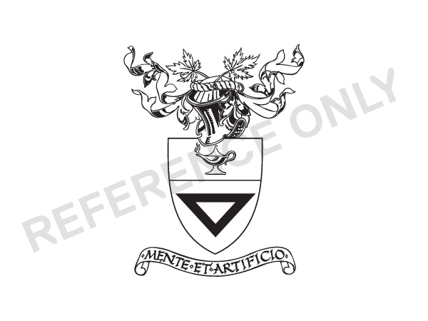
TMU Traditional Crest
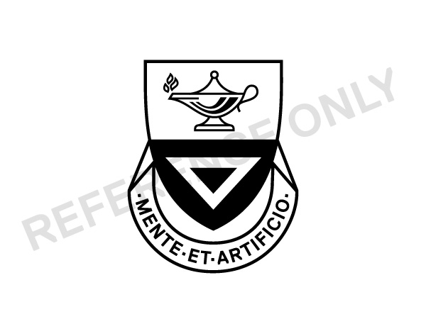
TMU Simplified Crest
Requests for permission for third parties to use the TMU logo for partnerships or sponsorships must be shared with a Functional Unit’s MarComm lead for review. For instances where the unit’s MarComm lead is not available, please connect with tmubrand@torontomu.ca. If the logo request relates to a significant partnership/sponsorship (e.g., a pan-university initiative), then the MarComm lead must share a description of the intended use via tmubrand@torontomu.ca for review and approval. All partnership and sponsorship agreements, including those which request third-party usage of logos, must also be reviewed by the Office of the General Counsel and Board Secretariat (GCBS) via gcbs@torontomu.ca.
At no time may the use of the university’s name(s) or symbol(s) imply or state endorsement of any products or services. The university does not permit institutional endorsements of any kind through the use of its names, identities, logos or images. For questions related to third-party logo use outside of partnership and sponsorship requests please contact gcbs@torontomu.ca and tmubrand@torontomu.ca.
The University logo and its related wordmarks are only permitted for use on merchandise for sale by the Campus Store and Athletics & Recreation (TMU Bold). No one else is permitted to sell University branded merchandise. Please refer to TMU’s Commercial Activities Policy.
For further details visit the Brand Stewardship Procedures section.
University-branded merchandise
- All merchandise that features the University name, associated acronyms, or branding of the University, must follow the TMU brand guidelines. University branded merchandise created for sale by TMU’s Campus Store must adhere to Campus Store brand guidelines. Proposed merchandise that does not meet these guidelines must be brand checked via University Relations.
- TMU Bold branded merchandise created for sale by Athletics & Recreation and the Campus Store must adhere to the TMU Bold brand guidelines. Proposed merchandise that does not meet the guidelines must be brand checked via University Relations.
University-branded promotional items, swag, and giveaways
- All promotional items, swag, and giveaways that feature the University name, associated acronyms, or branding of the University, must follow the TMU brand guidelines. For brand questions or to request a brand check, email University Relations at tmubrand@torontomu.ca.
The University speaks loudest when we are united as one voice. Please do not make graphic decisions that contradict the guidelines. The following are a few examples of slip-ups.
Do not change the colours of the logo.
Do not add effects to the logo.
Do not adjust the proportions of the logo.
Do not create a knockout version of the logo.
Do not tilt the logo, even at 90 degrees.
Do not enclose the logo within a shape, or a border.
Do not place the logo on a background without sufficient contrast.
Do not place the logo on an image without sufficient contrast.
Do not create single-line logos.
All logos should have accurate alternative text. The word "logo" is not necessary or useful as part of the alternative text. There is also no need to provide a literal description of what the logo looks like.

Good: "Toronto Metropolitan University"
Bad: "Toronto Metropolitan University logo with white text on blue box and a smaller yellow gold bar"

Good: "Department of Mathematics at the Faculty of Science at Toronto Metropolitan University"
Bad: "TMU math department logo"