Logo System
Logo lock-ups build on the university logo to create a signature specific to each entity within the institution. They help us build brand association and visual clarity by reducing the number of stand-alone logos. Three systems of lock-ups have been developed to facilitate all of the diverse initiatives we undertake.
Lock-up systems relate to the various brand classifications. To determine which lock-up is right for your brand, go to the Brand Architecture section.
Need a lock-up? Get in touch with your faculty’s marketing officer or email tmubrand@torontomu.ca to discuss your logo lock-up needs.
Related Content
University Brand lock-ups position the names of TMU’s closely identified entities in alignment with our gold bar. This shows TMU as a platform for these important brand components.
This system allows for one or two levels of hierarchical information, ensuring that we are focusing our audiences’ attention on what’s most important.
Do not attempt to recreate lock-up art from scratch. New lock-ups will be provided by the marketing team (University Relations). Please always connect with University Relations to determine where you fit into the brand architecture. Contact tmubrand@torontomu.ca with requests.
- When using the two-level lock-up, always prioritize the sub-entity (program, school, office, etc.). This way, the lock-up is read as the bolded entity existing within the entity below
- The maximum lines of text in the lock up are three
- Never use only one line of text unless your entity is named with only one word
- The use of "&" instead of "and" is recommended for logo lock-ups
- Line-breaks should be used to achieve the most visually-pleasing result.

- The lock-up text always aligns with the top of the blue rectangle in the logo.
- Text is always black, unless the lock-up appears on a dark background, in which case text is set in white.
- The space between the lock-up text and the logo is half a gold bar.
- Text always aligns to the top of the logo.

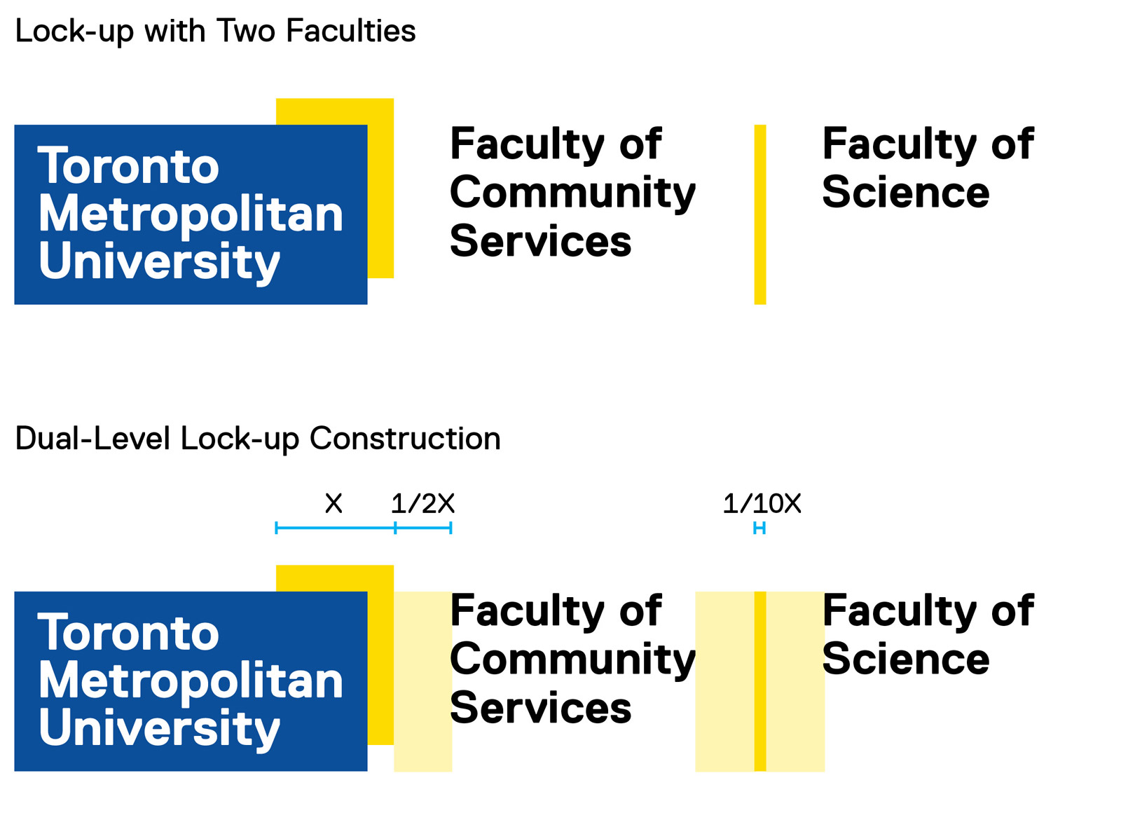
When two entities of the same hierarchical level are needed (i.e., two faculties), use a gold divider to separate entities.
- The width of the gold divider is 1/10 of the gold bar in the university logo
- Both entities are set in Replica Std. Bold
- Do not combine the gold divider with the two-level system. All lock-ups must include only two units
- Alphabetical order will determine which entity name appears first
- The space between the logo, text and the divider is equal to half a gold bar

- If more than two entities are involved, use only the Toronto Metropolitan University logo and reference the entities in the body copy elsewhere in the communications piece
- Alphabetical order will determine which entity name appears first

Sub-brands are part of the university, but they revolve around activities beyond its mission of learning and scholarly, research and creative activity.
Sub-Brand Lock-up Uses
Lock-ups should be used in all formal and media communications, including advertising. In applications where the university’s association is not inherently necessary, the lock-up is not needed. For example: TMU Bold team jerseys, internal building signage and merchandise.
Sub-Brand Logo Design
Sub-Brand logos can follow the TMU visual identity elements but are not required to.
Please always connect with University Relations to determine where you fit into the brand architecture. Contact tmubrand@torontomu.ca with requests.
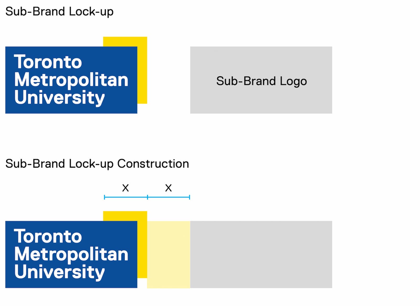
- The space between the university logo and the sub-brand logo is equal to one gold bar
- The maximum size of a sub-brand logo within the lock-up is equal to the full size of the university logo
- The sub-brand logo should be vertically centred and left-aligned within the given frame

Partnerships exist between the university and other non-university businesses, institutes and public-facing organizations. In order to maintain the integrity of both Toronto Metropolitan University and its partners, the partnership lock-up maintains an even hierarchy between logos.
Partnerships can exist at all levels within the brand architecture.
Please always connect with University Relations to determine where you fit into the brand architecture. Contact tmubrand@torontomu.ca with requests.
- A black divider is used in partnership lock-ups. The divider is 1/8 the width of the gold bar in the university logo
- Both logos are separated by the width of one gold bar on either side of the black divider
- The size of the partner logo should be scaled to appear optically similar in size to the university logo
- The partner logo should always appear vertically centred with the university logo

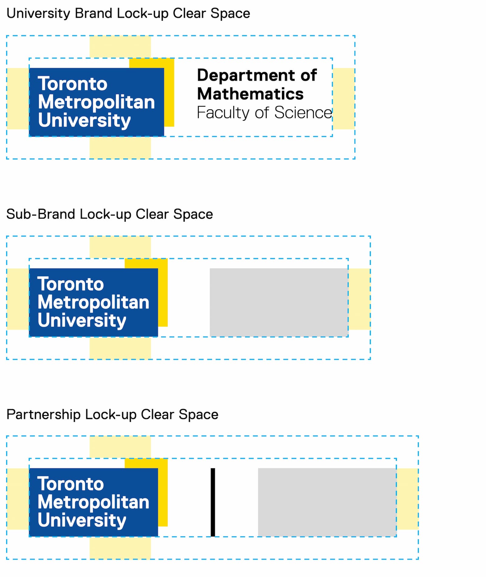
It is important that an area of clear, uninterrupted space be maintained around all lock-ups to maintain visibility.
In all lock-up types, clear space is always determined by the width of half a gold bar.
Clear space is required only from surrounding typographic elements, and careful attention should always be paid to the visibility and legibility of the lock-up.

The university speaks loudest when we are united as one voice. Consistent use of the logo lock-up is fundamental to recognition of the brand. Please review the following to avoid unintentional lock-up mistakes.

Do not add more than two levels of hierarchy, or more than three lines of text to a lock-up.

Avoid using icons that are not integral to an existing brand.

Do not put secondary information first, or bold the second level of information.

Do not include more than two levels of equal hierarchy in a lock-up.

Do not use the TMU or Social Media mark to create a lock-up

Do not lock up two internal departments or faculties with a black bar. A gold bar should be used.