Art & Science of Typography
 Welcome to GCM 110. Choose Your Own Adventure.
HELLO FROM DIANA!

Wingdings 2022
Students were asked to reimagine one new symbol to be added to the collection of glyphs for the updated typeface ‘Wingdings 2022’. The symbol should reflect current events or technologies of our time (from 2015 - present).
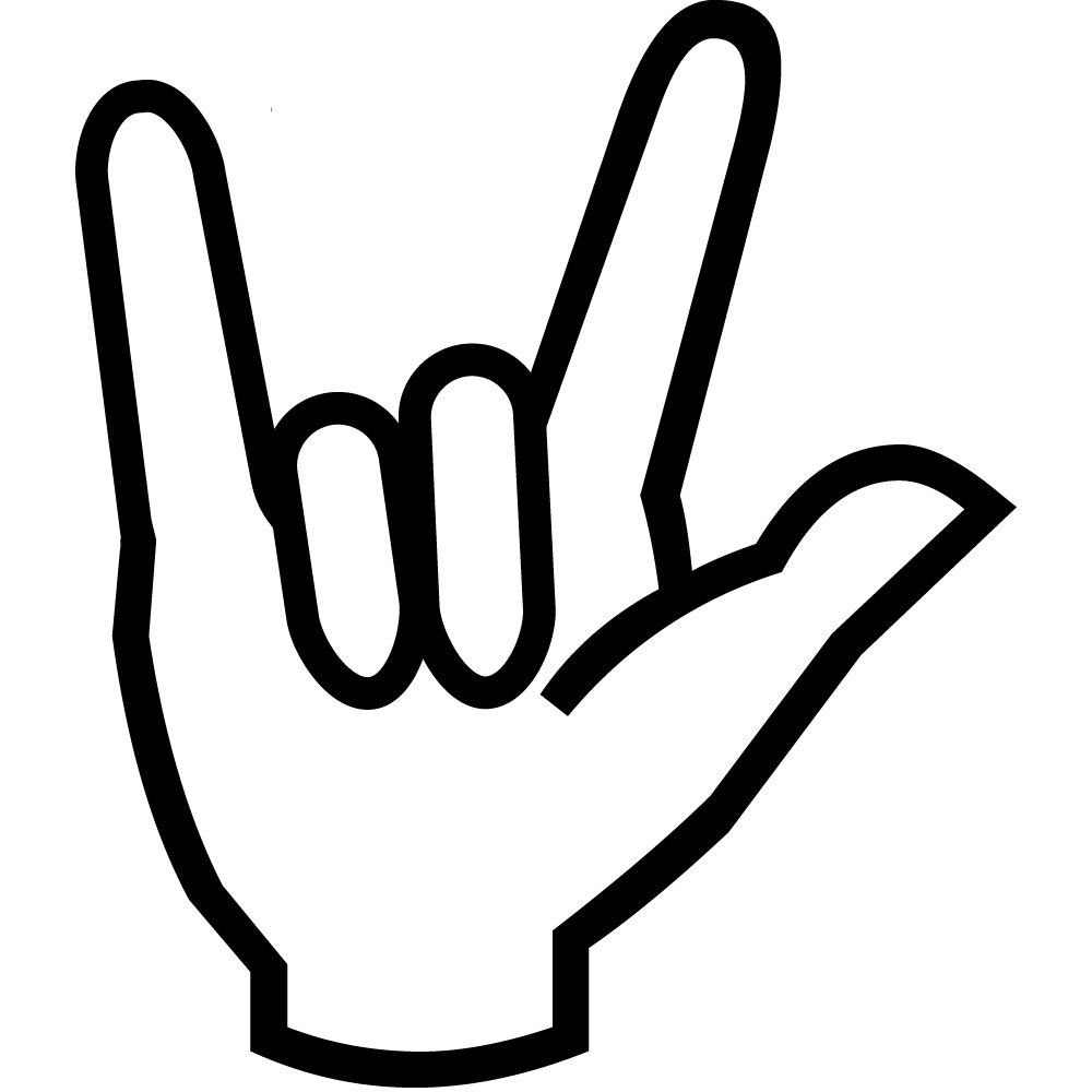
Winnie Zhan
I want to create a type of wingding that can be read and used by people who communicate with sign language. There are currently already wingdings of the Latin alphabet, but sign language is not only expressed through alphabets, there are also gestures that represent words, an expression and even phrases.

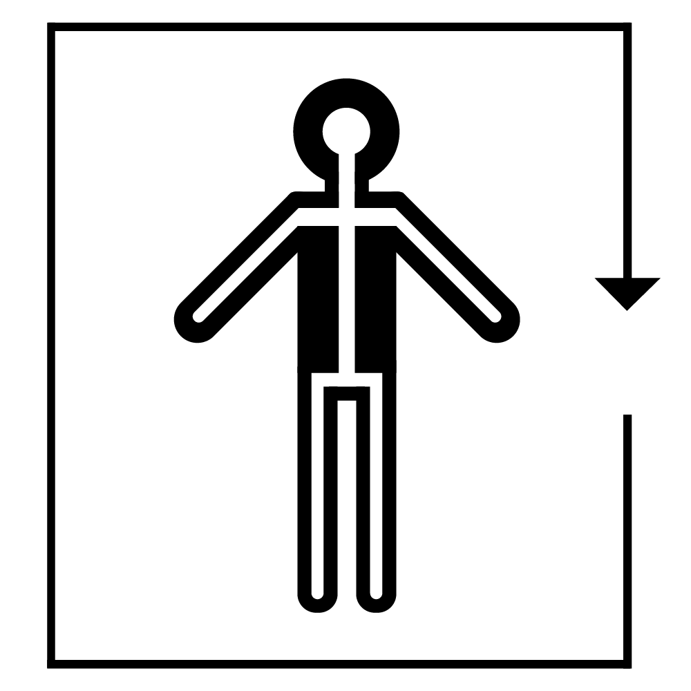
Shengnan Zeng
This icon that I created symbolizes the proof of vaccination. This icon could be effectively used to identify someone who has received the vaccination or in the event that vaccination is required in order to enter or attend.
Hung Truong
The purpose of this Wingding character is to promote Microsoft 3D sector and improve communication of the workflow. There are currently no Winding characters to help Art Director and Artist communicate their creative workflow.
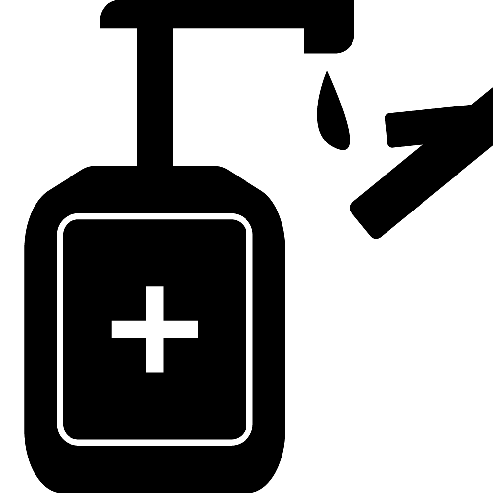
Don Tran
I wanted to keep a subtle reminder on how we keep eachother safe in society by keeping our hands clean. Even with our current technologies and our medical knowledge we have to make an effort to keep ourselves safe along with looking out for others.
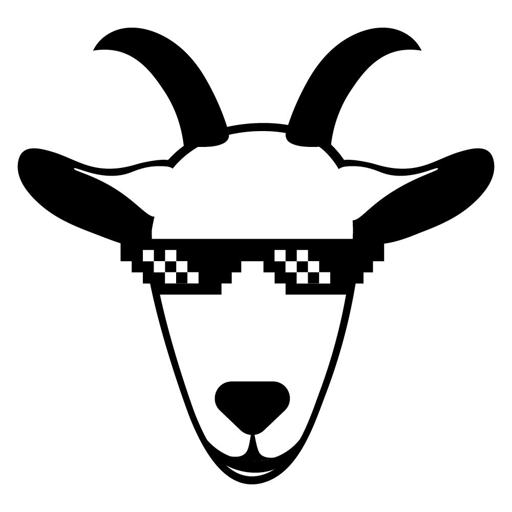
Marion Tolentino
Goat is used to describe someone who is simply the best, most impressive, or coolest. And with regards to that, I thought it would be fitting to create a wingding that encompasses just that, but also incorporate how other people viewed the term. Those who did not know the meaning of goat, like Meryl Streep, might assume that the term goat has a negative connotation. But what it actually is, is an acronym for Greatest Of All Time, therefore G.O.A.T.
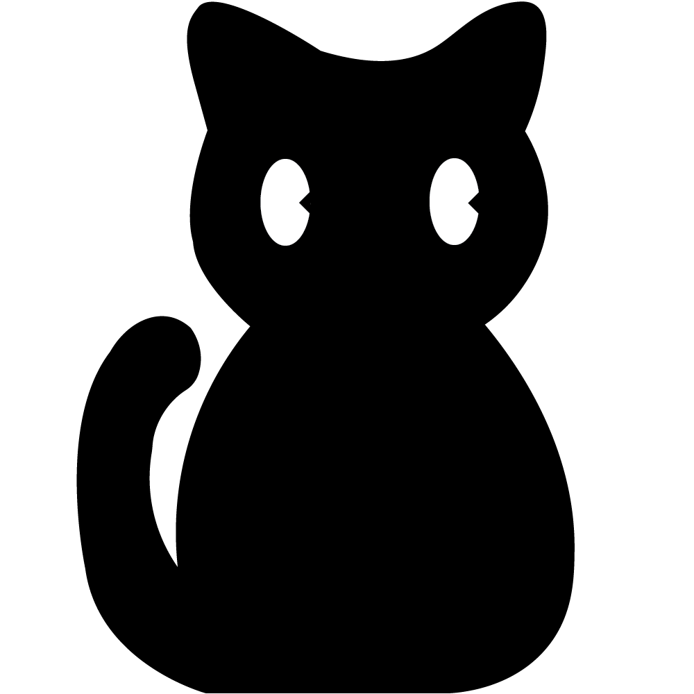
Narin Suleiman
It is proved there is a significant surge in “pandemic pets” by 93%. Including myself, I adopted a three-month Maine-coon kitten. A Cat that is known to be the largest domestic breed. Therefore, my inspiration of creating my dingbat character was my pet cat.

Zoe Soeiro
The Bitcoin symbol represents the rise in popularity of crypto currency and reflects modern day technology. With the rise of crypto currency being the main topic in many trends and conversations, I believe that a universal Bitcoin symbol added to ‘Wingdings 2022’ will be extremely popular and a great representation of modern technology.

Michelle Lin
Virtual reality is a 3D, computer-generated environment that allows the user to feel completely immersed in a virtual world. In recent years, VR technologies have advanced significantly, and each year, it becomes more accessible and affordable to experience for everyday people. Since virtual reality can be used for many different applications such as entertainment, education, and business, this icon will increase in use as VR gets more popular in the future.
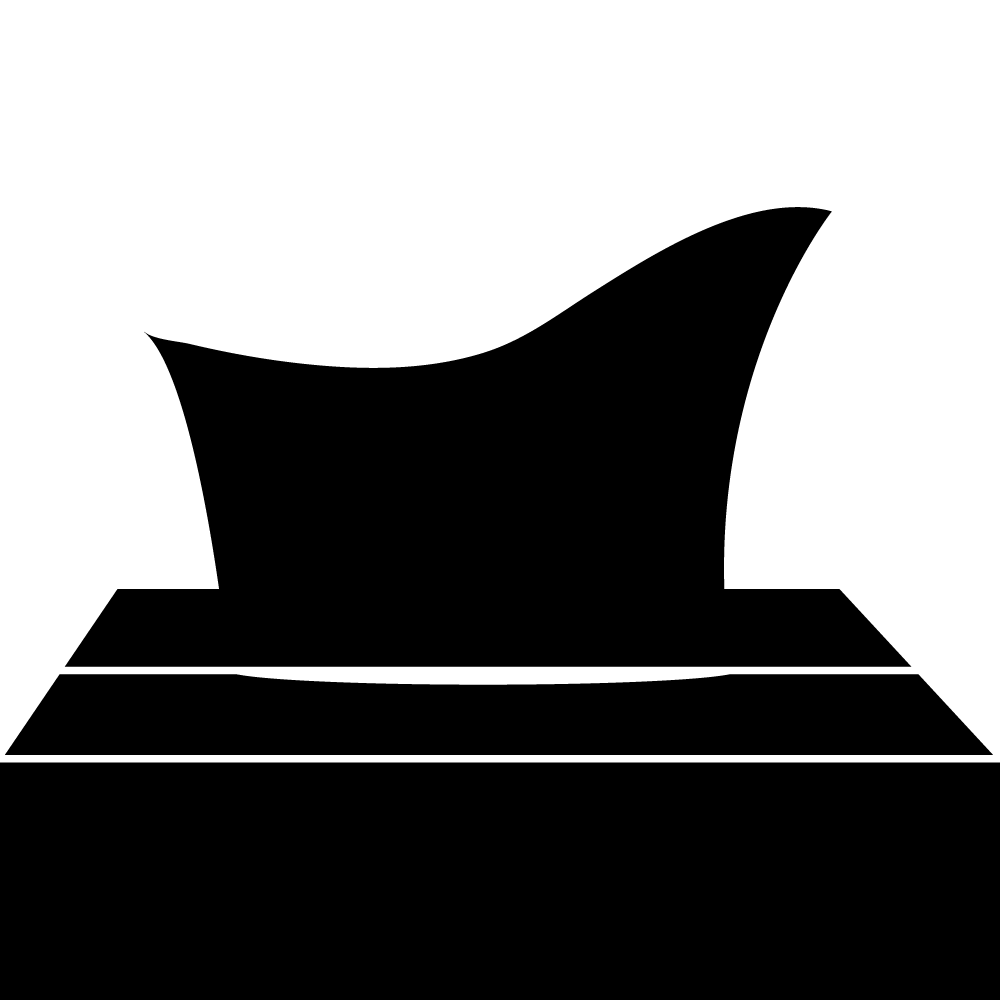
Fiona Lee
There is currently no emoji or wingding of a tissue box, however there is an emoji that is blowing its nose which is a close alternative, but it does not quite relate to the theme of self – care. In the past two years self – care has become something that many individuals are focusing on to become better versions of themselves.

Wafiq Kazi
This symbol encapsulates a large part of our social culture during the pandemic. The topic of vaccines has not only been one of the most discussed but also the most controversial subjects to date, which is why I feel this symbol is appropriate for all sorts of discussions surrounding vaccines.
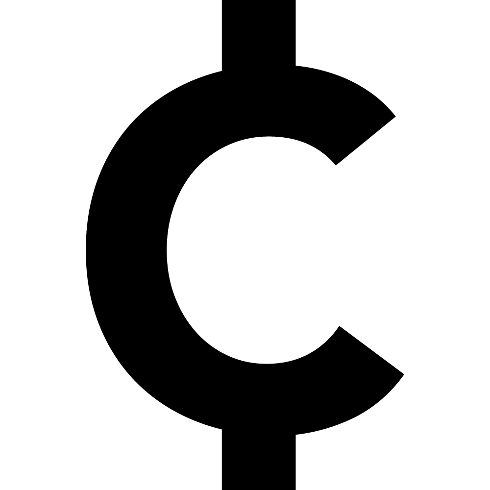
Pardis Haghighi
It is notable today that many keyboards have excluded the symbol of the cent as a whole, yet strategically decided to keep the dollar symbol. I created a cent symbol as it is still a very valuable and relevant currency used by many nations and should be distinguished from other currency symbols such as the euro, lira or pound. As cents are still displayed in prices and finances all over the world, it proves that the cent symbol is still a vital necessity and relevant sign in all financial decisions.
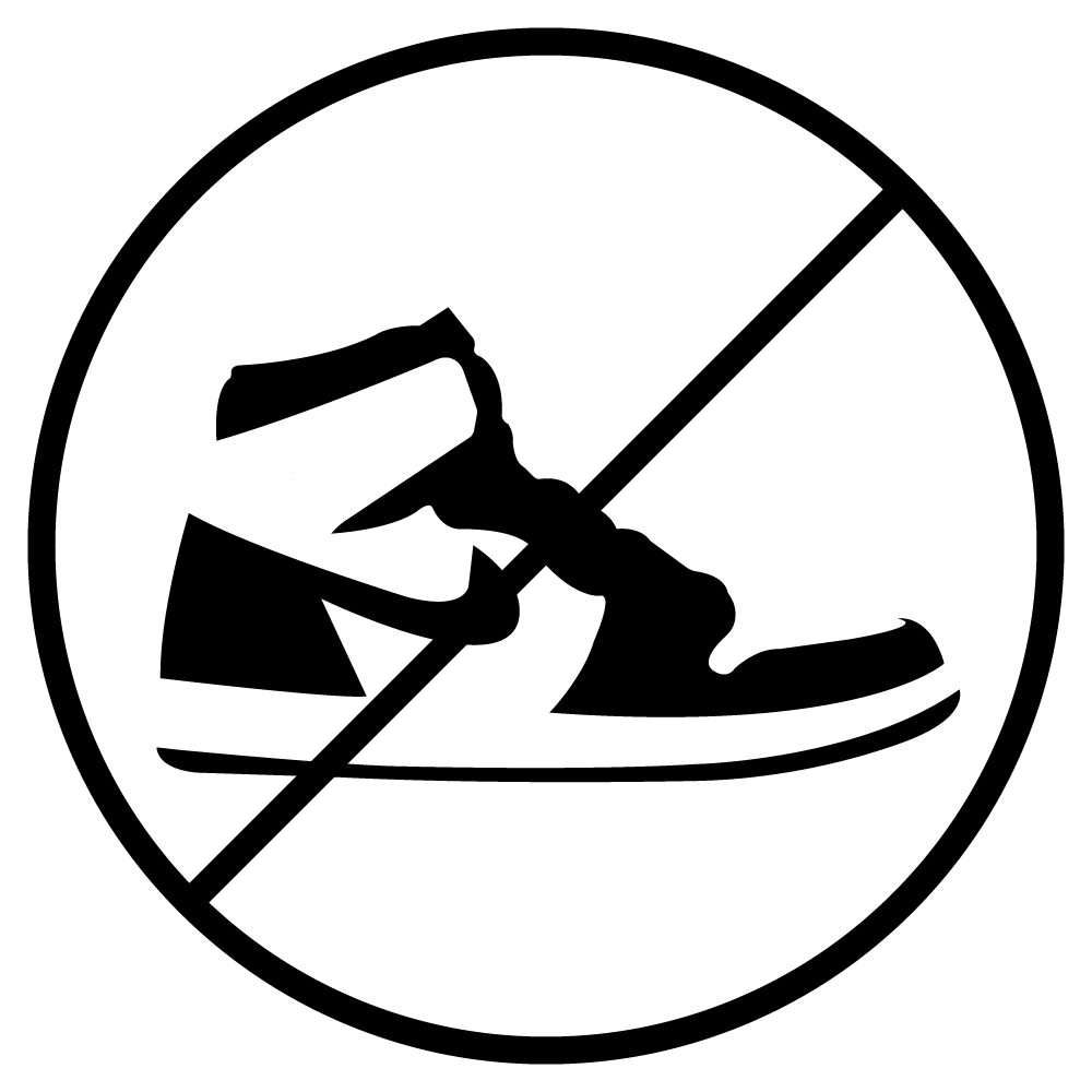
Courtney Gutang
As someone who grew up listening to R&B and is heavily influenced by the 90s to early 2000s culture, I decided to create my wingding on street fashion – but more specifically towards shoes. Shoes are an amazing way to express oneself. An outfit can be simple and plain, but with the right and unique pair of shoes, it can almost instantly elevate the entire look. The current shoe that stays forever on the market would be Jordan 1s.
Cailin Goolcharan
The wingding that I have created is reflective of the term “social battery”. During the recent pandemic, this concept of social batteries has become increasingly relevant as people have had limited interactions, connections and gatherings; therefore, when faced with a position of ongoing mingling and interacting with groups of strangers, one’s social battery can be drained quite quickly. The social battery winging is a subtle homage to mental health issues and real things that people deal with, but without being so blunt nor triggering.

Koby Elian DeGuzman
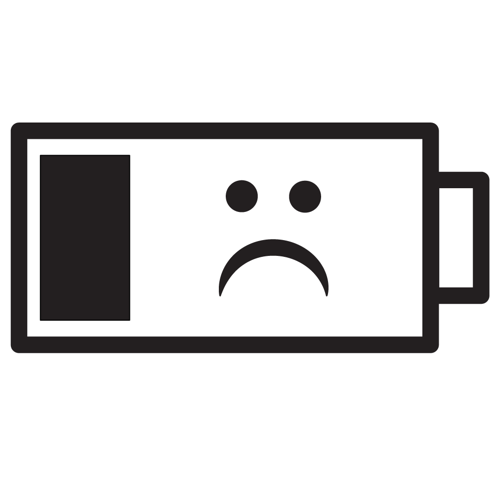
Our lives have been severely impacted by COVID-19 at some point in some way in the last two years, which makes this symbol very relevant to recent events.

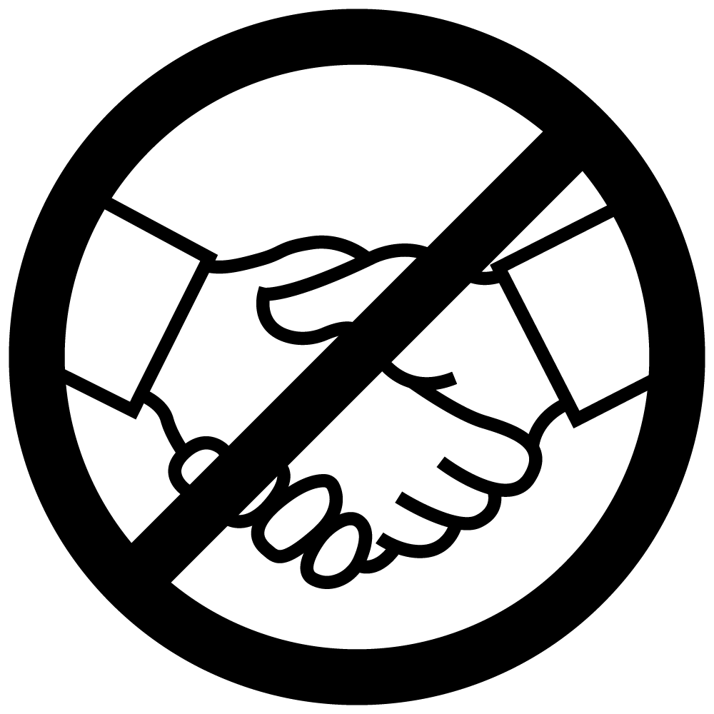
Kaela DallaPasqua
Due to the COVID-19 pandemic changing the way we interact with people; we don’t shake hands anymore. We opt for a verbal “hello”, an acknowledging head nod, or a quick touch of elbows to make it a little bit more personal. I chose to make the elbow greeting as my symbol as it was the simple to portray with basic shapes and I thought it would be the best symbol to make as it captures the new way of greeting people the past two years.
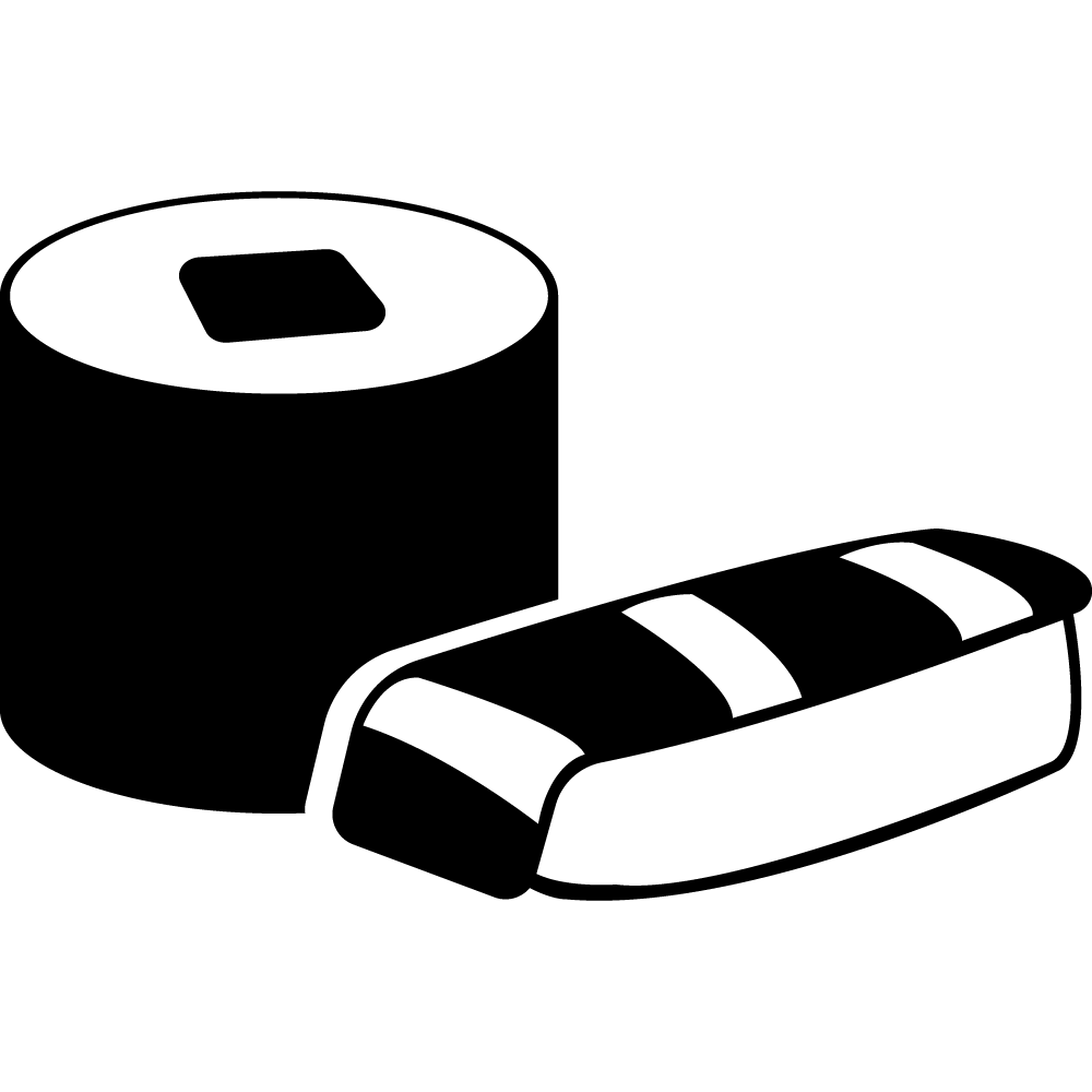
Joanna Dai
Over the years, the presence of Japanese sushi in popular culture has grown significantly to the point where it is rare to find someone that does not know what sushi is.
Stefania D’Ercole
Introducing a wingding for influencers and content creators! This wingding symbolizes the importance of many influential people in our culture today. Influencers and content creators have a big influence on decision-making and how people spend their money. This wingding was created to represent and reflect how influencers and content creators become creative while photographing items.
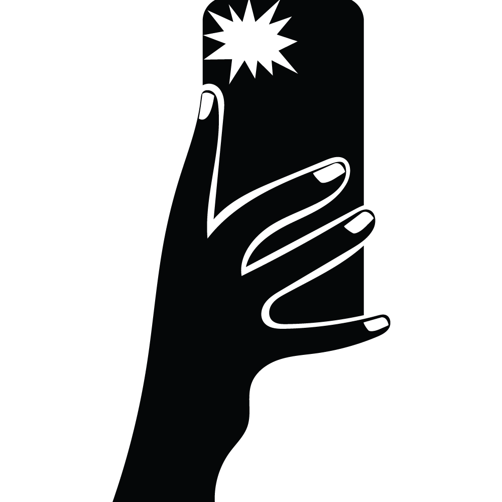
Zaib Bokhari
The wingding I designed is a way for people to notify others of their level of comfort without having to explain themselves, putting them in an uncomfortable position. It is a symbol of two hands being held with a prohibition sign over it, explaining that the individual is not at the level personally to be in contact with others after multiple years of being cautious of an extremely harmful worldwide virus.
Avani Mookerjea
Smartphones are important to everyday life and people use their smartphones for everything including for banking, ordering food, and a camera etc. Smartphones are a integral part of pop culture, they are how people communicate and connect with people.
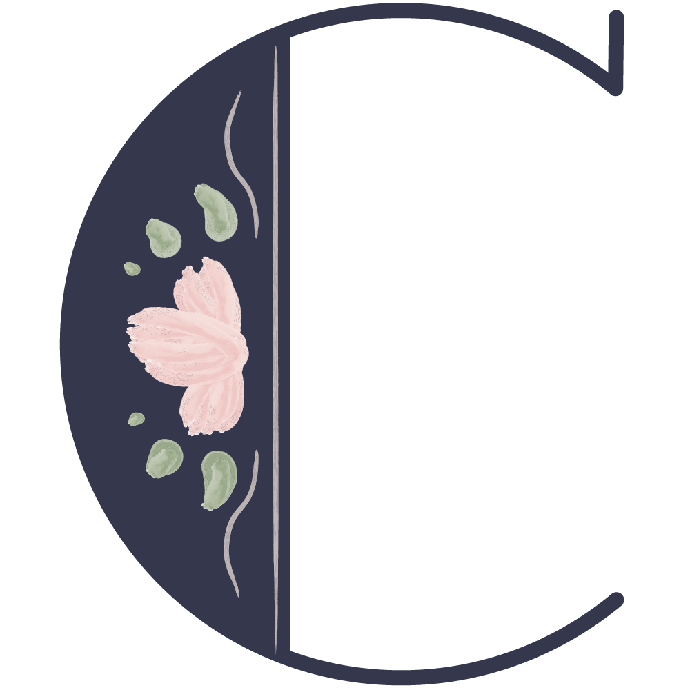
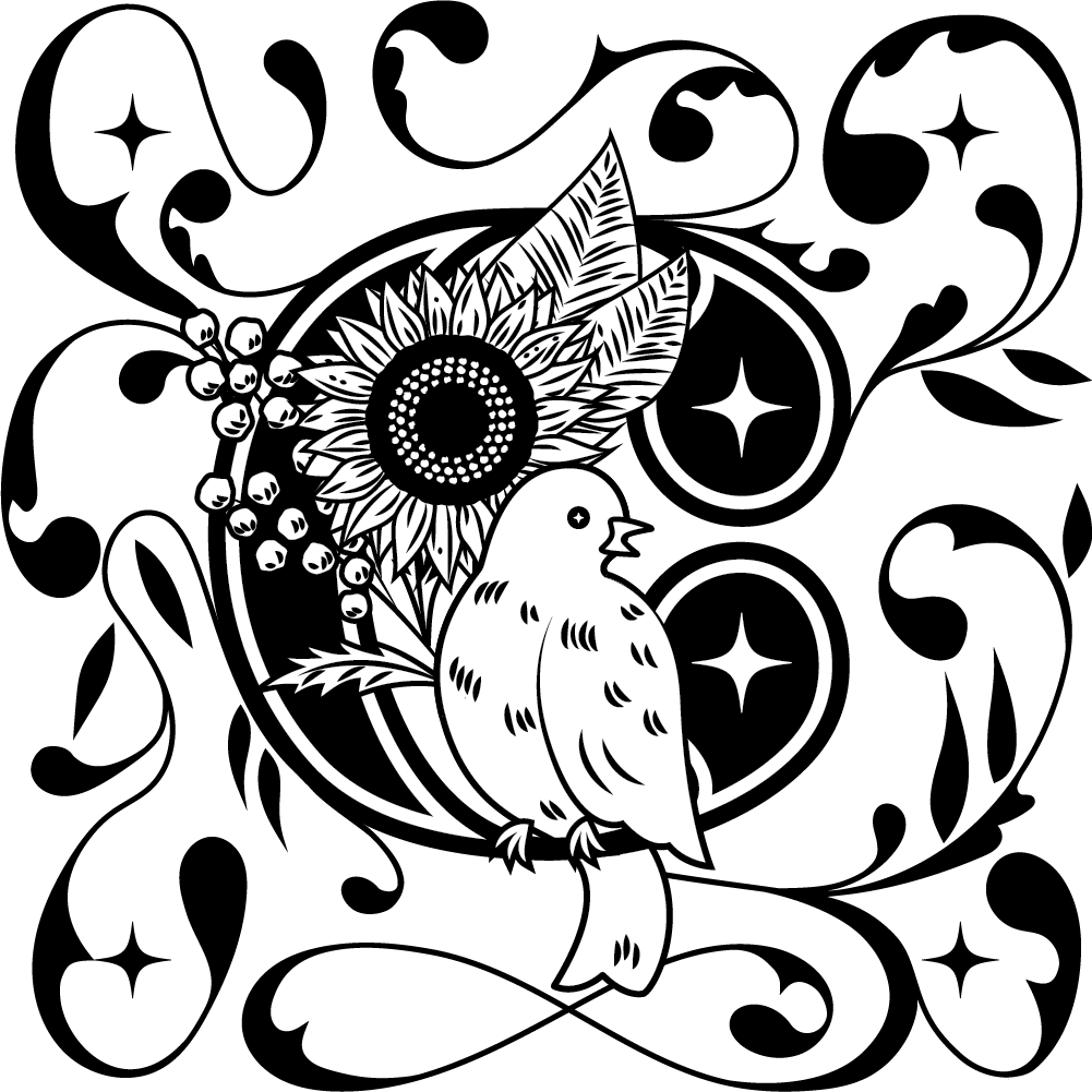
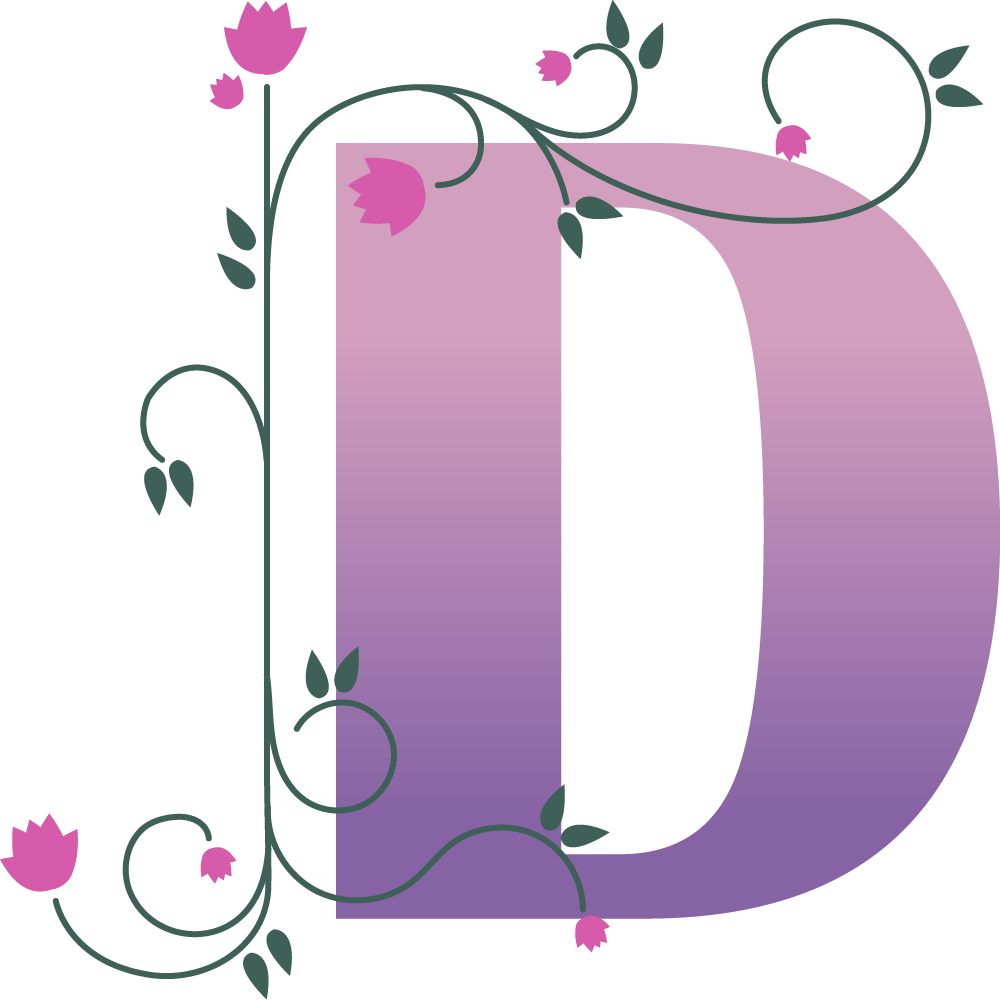
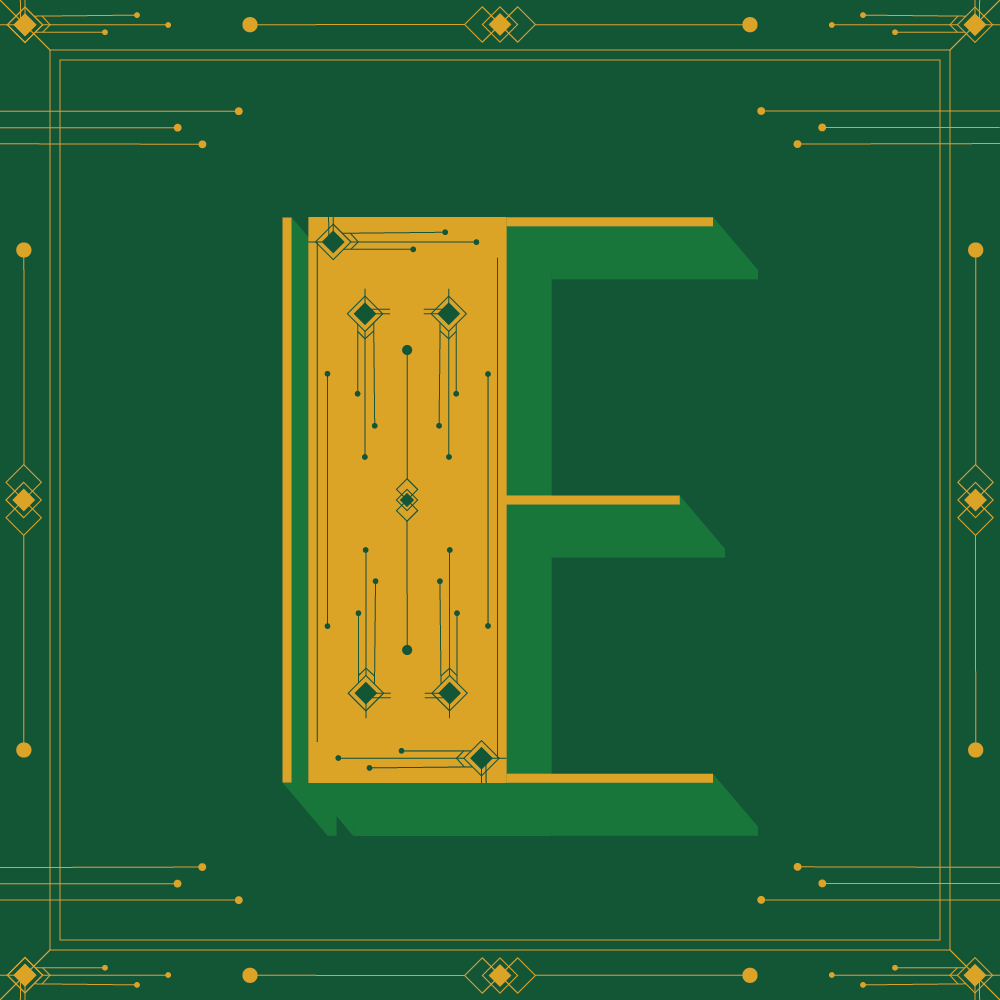
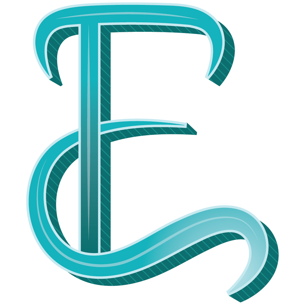
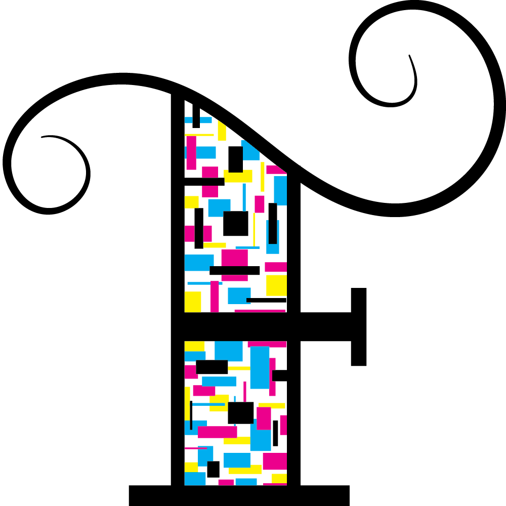
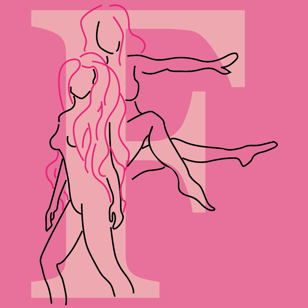
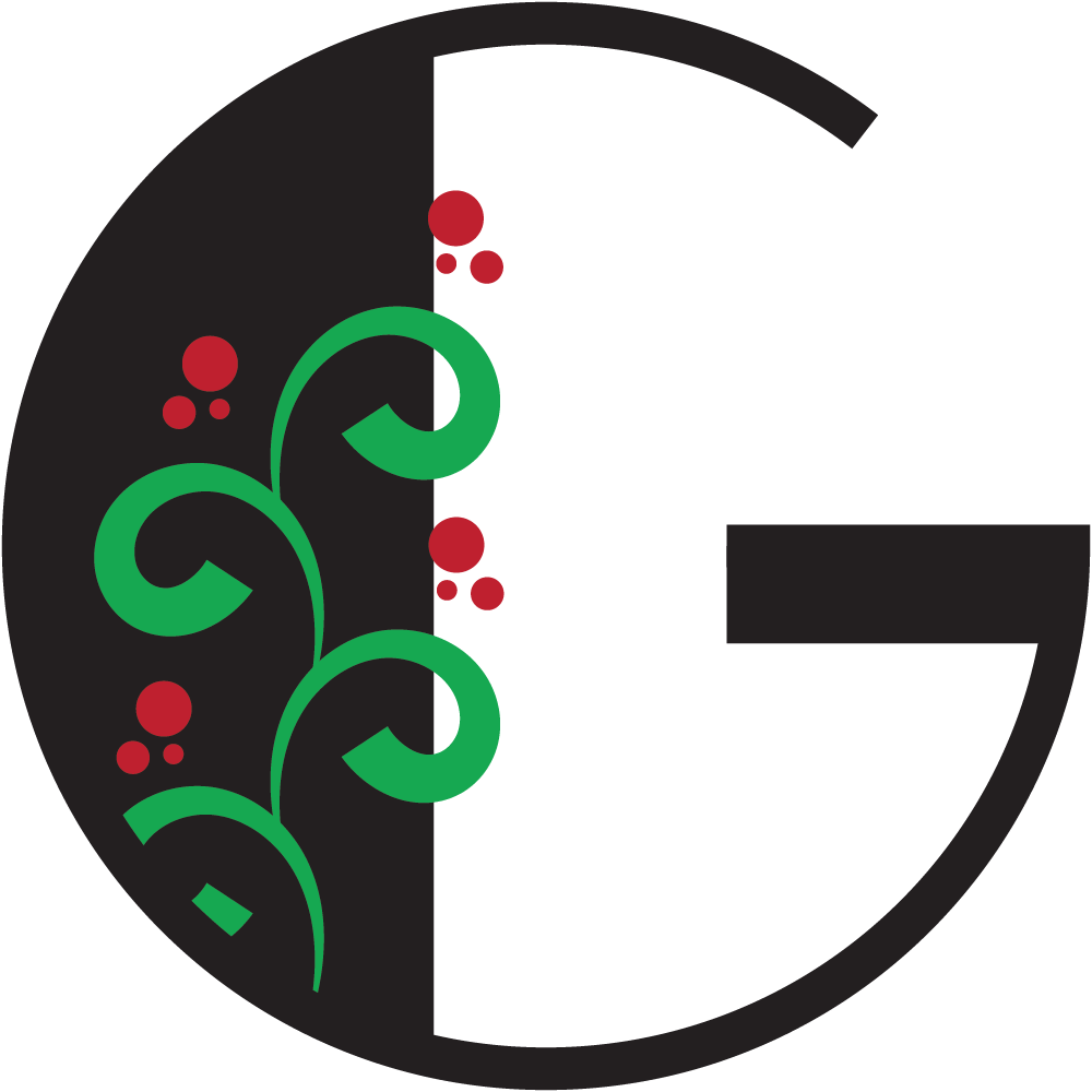
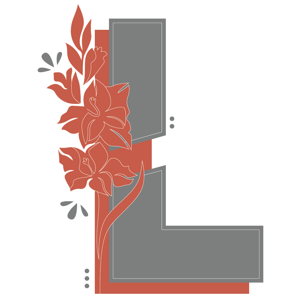
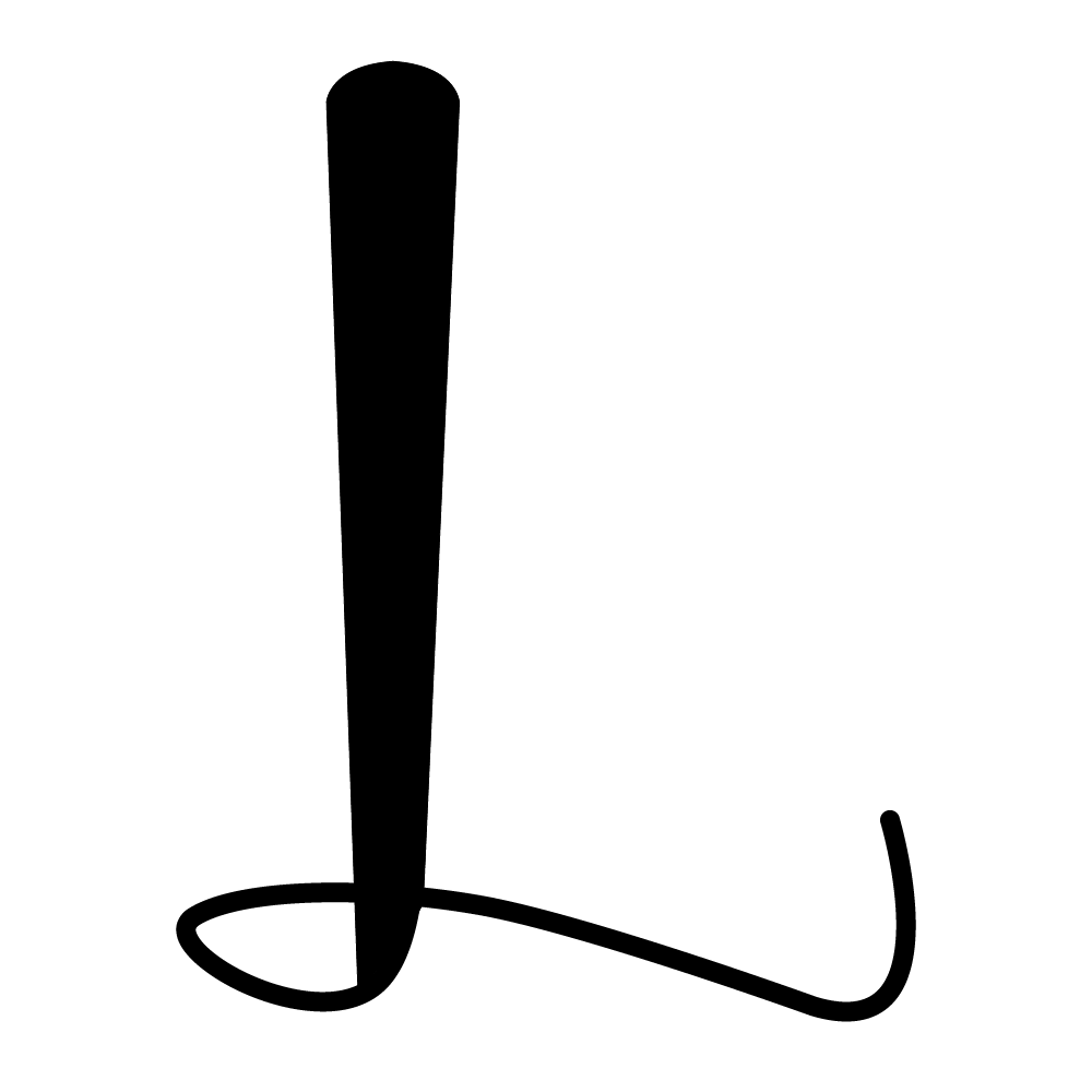
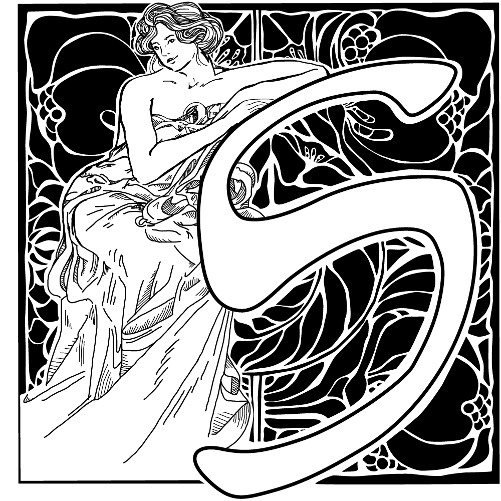
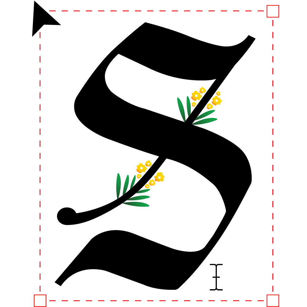
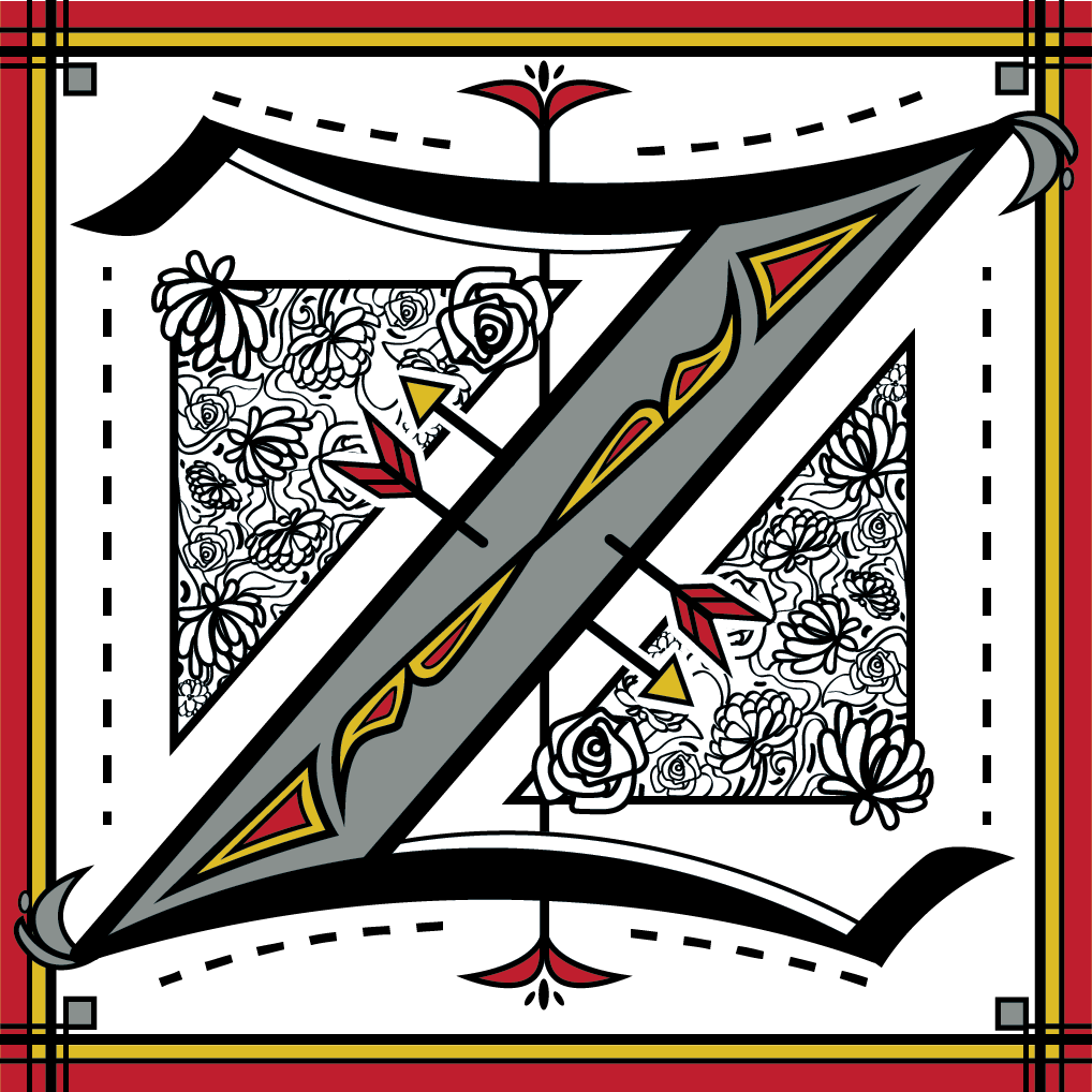
Drop Cap Like It's Hot
Students were asked to create a digitally-rendered illustration to act as a drop cap to be featured in a book about the history of graphic design told through female voices.

Ashley Larcombe
I designed my drop cap to have a 3-D look to it to incorporate the hedges in the Queen of Hearts garden as well as to give the letter some depth on the page leading the reader's eyes towards the drop cap. My drop cap came out looking like a modernized ornate drop cap used in old manuscripts that scribes would write and design.
Ravia Begum
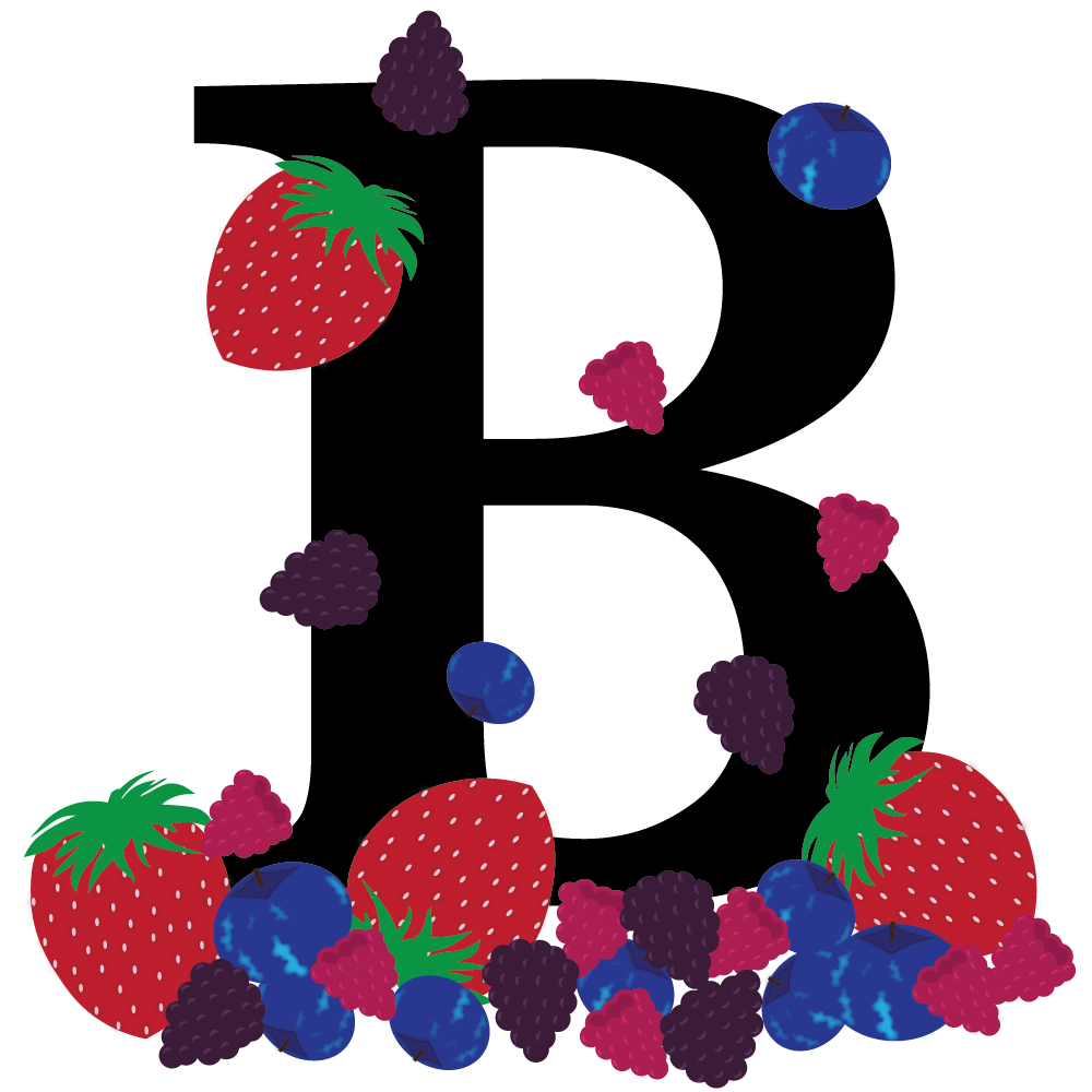
I went with a more modern approach as I added lots of color, designs and techniques. This drop cap design gave a feminine look and feel to it which I wanted to convey with the berries.
Sarmin Begum
I found inspiration in using colours like those used in the past such as gold or bronze colours and old looking pages to indicate historical European medieval books. Making my drop cap look super simple was the goal considering in the past, there were so many tiny details put into each drop cap letter that took a lot of time and effort to create. Therefore, simplicity would bring a hint of modernism into making my drop cap look more efficient and legible.
Claire Cambridge
This drop cap is inspired by the term “Deconstruction”. Deconstruction is one of the main goals of the feminist movement. In logo design, there is often a deconstruction of how the logo is built through perfect circles. Inspired by this, I decided to deconstruct the forms of the letter. Another term of inspiration is “transition”. The feminist movement calls for a transition away from the dominant patriarchy. To evoke this, I used the transitional typeface, Times New Roman, as a base. Transitional style typefaces are a middle ground between old style and modern typefaces. This choice of style is a literal transition. Deconstructing this specific typeface evokes the ideas of deconstructing what we already know.
Calissa Cathcart
I want the use of brushes to portray a creative side of graphic design, while still having clean lines and shapes to create the letter’s shape.
Anita Chen
My drop cap design consists of decorative flourishes, flowers, and a bluebird. Together it may look like a nature illustration, but these elements hold not only aesthetic purposes but also conceptual significance to the feminist movement which effectively appeals to the target market of graphic designers and coffee book lovers.
Daniella DeVeyra
I created a drop cap design that, above all else, is visually appealing with intricate patterns and bright colours. The foliage is also a nod to the ornate drop caps made by scribes in the past.
Elyse Kelly
This drop cap is inspired by the internationally celebrated author, creative director, type and graphic designer Lousie Fili. Taking inspiration from Fili’s trademark and expertise of Italian visual culture, this drop cap pays homage to her and her achievements. While Fili’s creations fall under the style of Art Nouveau, my drop cap takes more inspiration from Art Deco. The Art Deco style of my drop cap is an appropriate addition to the history of graphic design publication.
Elysse Watchon
I wanted to create something that incorporated traditional calligraphy to represent the history that is being told through the stories and modern calligraphy to represent the present day.
Melissa Figliola
I create abstract artwork using different rectangles of cyan, magenta, yellow, and black colours. I used various sizes of rectangles and arranged them in different directions to create the design I was looking for. To ensure the viewer’s eyes move around the letter, I included white space to break up the details. I decided to have this part because it helps create a modern design
Alisha Framroze
The woman’s body is drawn in such a way that it forms the drop cap letter in an artistic and unique form. I added a faint view of the letter in the background to help the viewer intemperate the letter in case the shape is too abstract for some.
Cameron Garside
My main goal was to aim for a modern approach with sans-serif type and flat illustrations and combine the modern day usage of typography, usually bold and sans-serif, with a call back to the drop caps of the past, usually ornate typography with serifs and complex illustrations such as flowers and vegetation attached.
Kielon Gerra
The flowers symbolize growth. Specifically, the growth of female empowerment over the centuries. Each individual flower represents the small steps that have been taken to overtime, become a worldwide movement.
Johanna Gibson
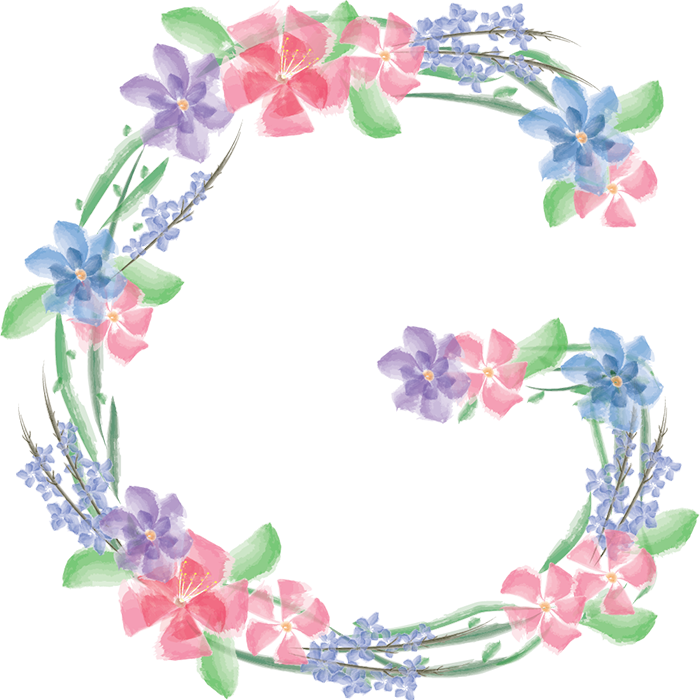
For my drop cap of the letter G, I decided to create a watercolour style character. There are beautiful pink, purple and blue flowers, in addition to vines, that take the shape of a G. The painted/ watercolour style is an ode to the illuminated drop caps and designs from the beginning of book printing, such as the Gutenberg Bible.
Makayla Howe
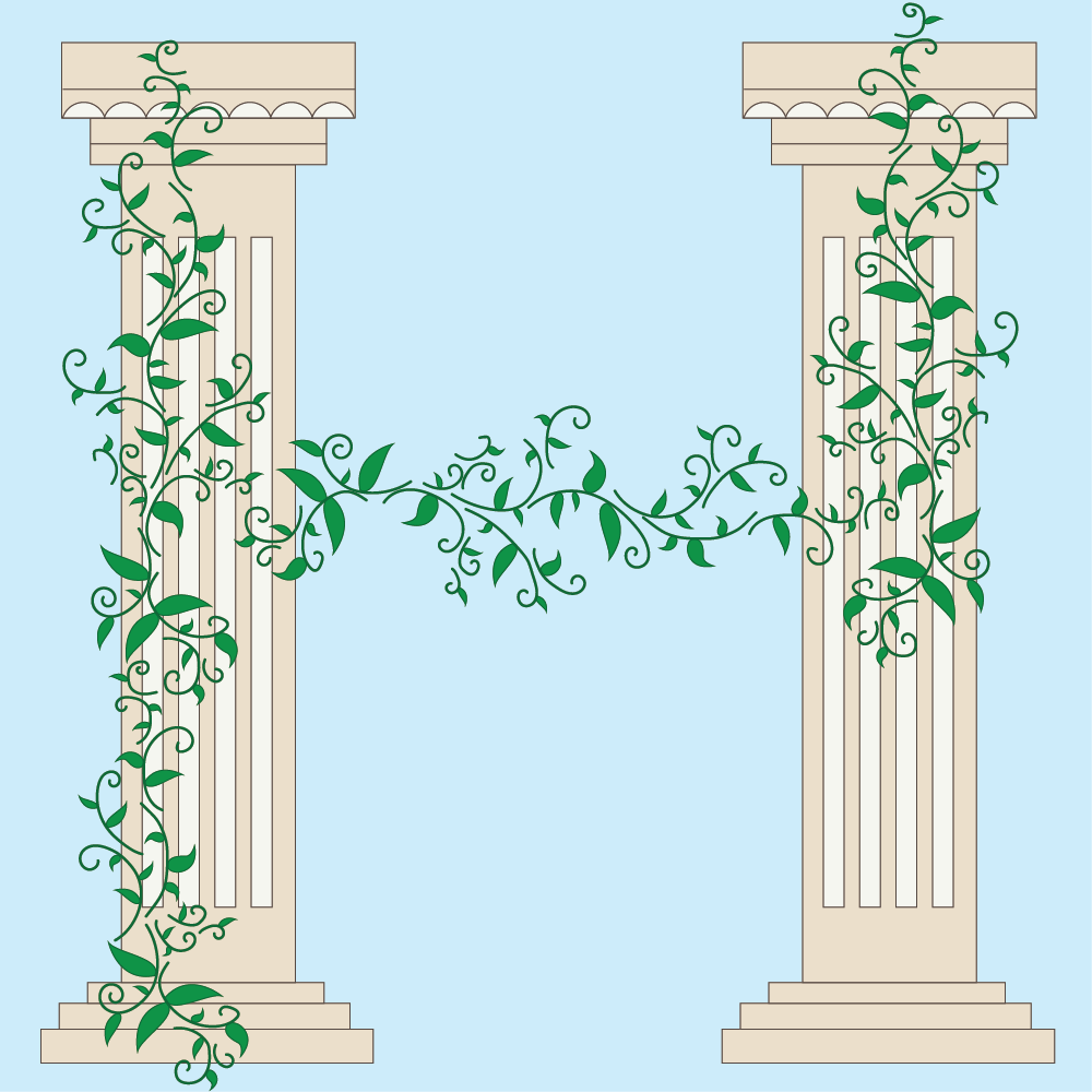
There are two columns standing vertical and tall with a vine wrapping around them. The vine then connects like a bridge in the middle creating the final form of the letter H. The vines represent life, connection, and growth. This is why I choose to connect the vines in the middle. Roman columns have been around in temples since the 8th to mid-7th centuries BCE. The architecture and history of the columns were fundamental to the success of Rome.
Mackenzie Johnson
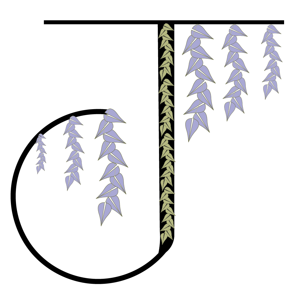
This new drop cap for the letter J was inspired by the beauty of nature.
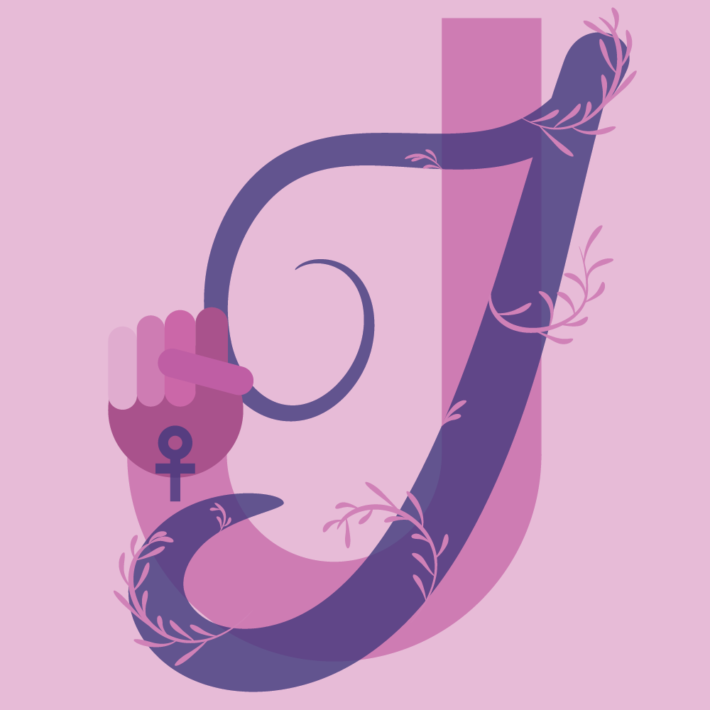
Brooke Jones
I decided to create a layered effect for the letters by designing a thick, sans serif J, as well as a transparent and dainty cursive J. This effect not only adds visual interest but relates to the theme described in the brief. The cursive J is meant to signify women of the past, as cursive has a very rich historical past. The sans serif J on the other hand, is meant to signify the women of today and the women of the future. look. This design choice was meant to signify women evolving in the field of graphic design, with the ability to be bold and unapologetic, something that was not always accepted in society.
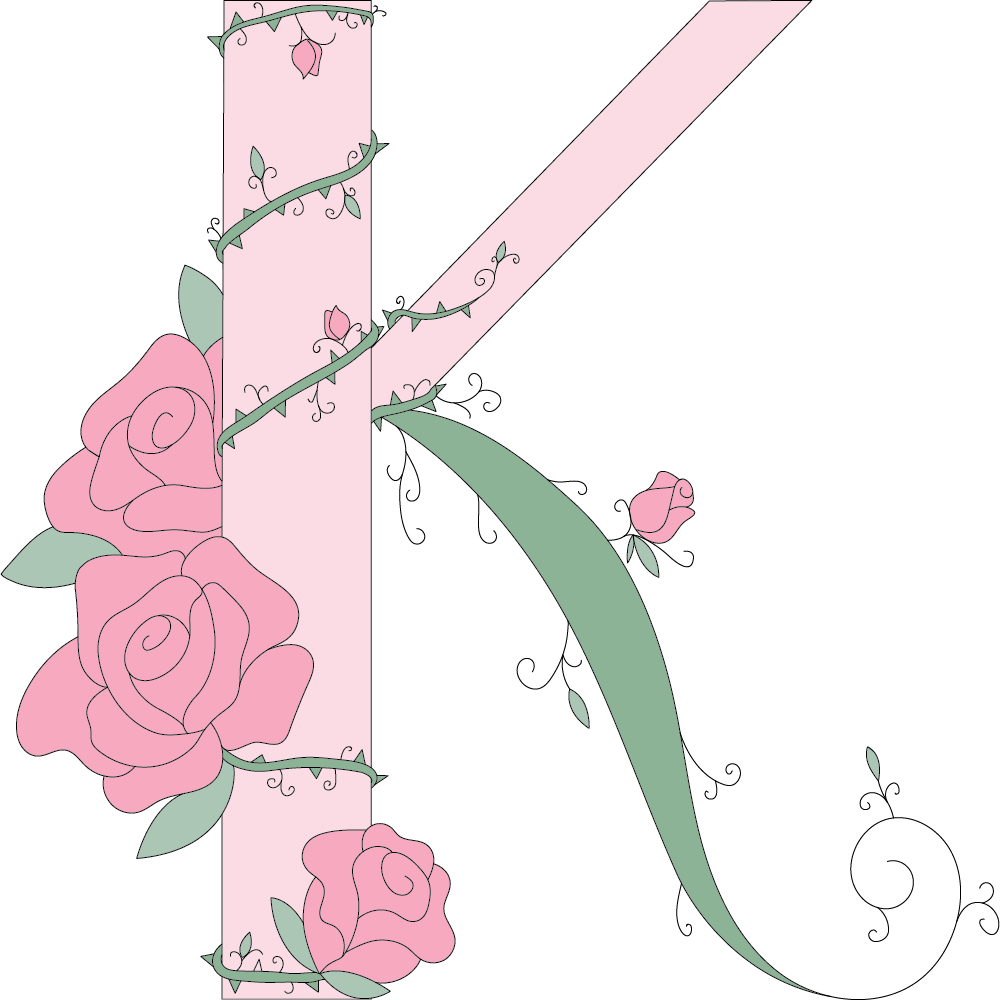
Vasiliki Kapetanios
I took inspiration from older drop cap designs, ones that are very intricate and ornate, yet still hold a lot of beauty to them. Since one of the target audiences for this book is lovers of coffee table books, I also took inspiration from the appearance of coffee table books. The books used have a very clean and simple cover design, and are used to add colour to a space, yet are not bright in colour.
Kelly Kienapple
Together, these high contrast elements recognize previous printed works, trends, barriers, and principles of design, while representing both the past and future by acknowledging various challenges within the history of graphic design.
Alexandra Kim
The book focuses on the telling of the history of graphic design through the perspective of women, but the part that states that “your design should thoughtfully capture the imaginations of designers everywhere” really struck a chord within me. Not only does this drop cap have to give an elegant and timeless look, but it also needs to be modern and stylish to suit the needs of both target audiences.
Haamiah Laylo
When designing my drop cap for HarperCollins new book about the history of graphicdesign told through female figures, I wanted the overall design to depict a woman’s elegance and resilience. Additionally, I wanted to create a beautiful, but simplistic drop cap that attracts their intended target audience and encapsulates modern typography themes but small hints of old classical drop caps as well.
Marisa Lopes
I wanted to demonstrate something more appealing to the eye and have some sort of artistic feel. The cursive style of a drop cap looked quite feminine to me and I believe it is quite appropriate for this book that will feature manuscripts and historical events of design.
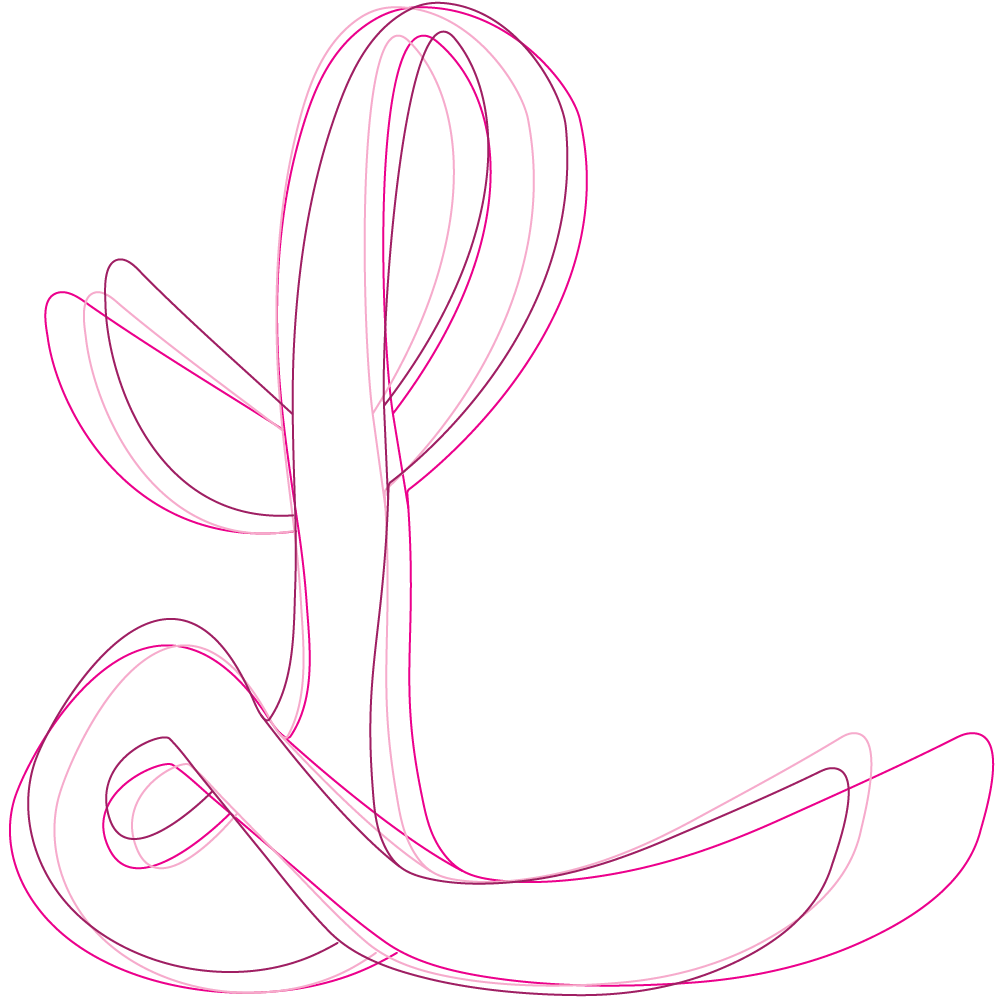
Kaleigh Lueske
I began to think of all the feminine words that start with the letter L: life, lifestyle, love, luck, luscious, and luxurious. These are all words I wanted to incorporate into my design during the brainstorming phase.
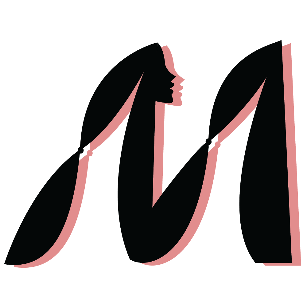
Wei Mao
I used the ideas of graphic design to design a simple drop cap. I only added some elements to the shape of “M” itself and used as few colors as possible. Because follow the long history of graphic design, the purpose of its emergence and development of it is always to achieve communication through simpler graphic symbols. Another design focus is on the female voice. I styled half of the M as a side silhouette of a woman with long braids and layered it with a “soft” shadow. Black is the dominant color of the shape, representing the long history; the shade is pink, representing the efforts of the women behind the development
Hayden McGreal
My final design aims to capture the rich history of drop cap design and margin illumination. I wanted to create a piece that visually bridges the gap between the centuries-old art of book design to the clean digitally rendered graphics of today.
James Metcalfe
The design brief for this project is for a book that outlines the history of graphic design thorough the voices of prominent women in the field. For a drop cap that relates back to this design brief, Harper Collins Publishers Canada uses words such as ‘beautiful’ and ‘ornate’, so I decided to go with a very flowy and hand drawn aesthetic for the design.
Kristian Murphy
I immediately knew I wanted my design to emulate some traditional aspects of drop caps while also incorporating more modern design trends and ultimately reflecting the theme of the book, The history of graphic design, told through a diverse range of female voices and stories. Through my design, I wanted to not only represent the graphic design industry, but also the ways women have contributed to it. While creating the drop cap I was heavily inspired by illuminated manuscripts from the middle ages. As I researched references for this project I was intrigued by the bright and colourful illustrations in medieval books that often included small images of people and animals into the letters.
Linda Lin
For my drop cap design, I’ve decided to do the Letter “O” instead of the first letter of my initial. The reason for this is because I wanted to have a woman's face incorporated into my drop cap design as this design brief is told through a diverse range of female voices and stories.
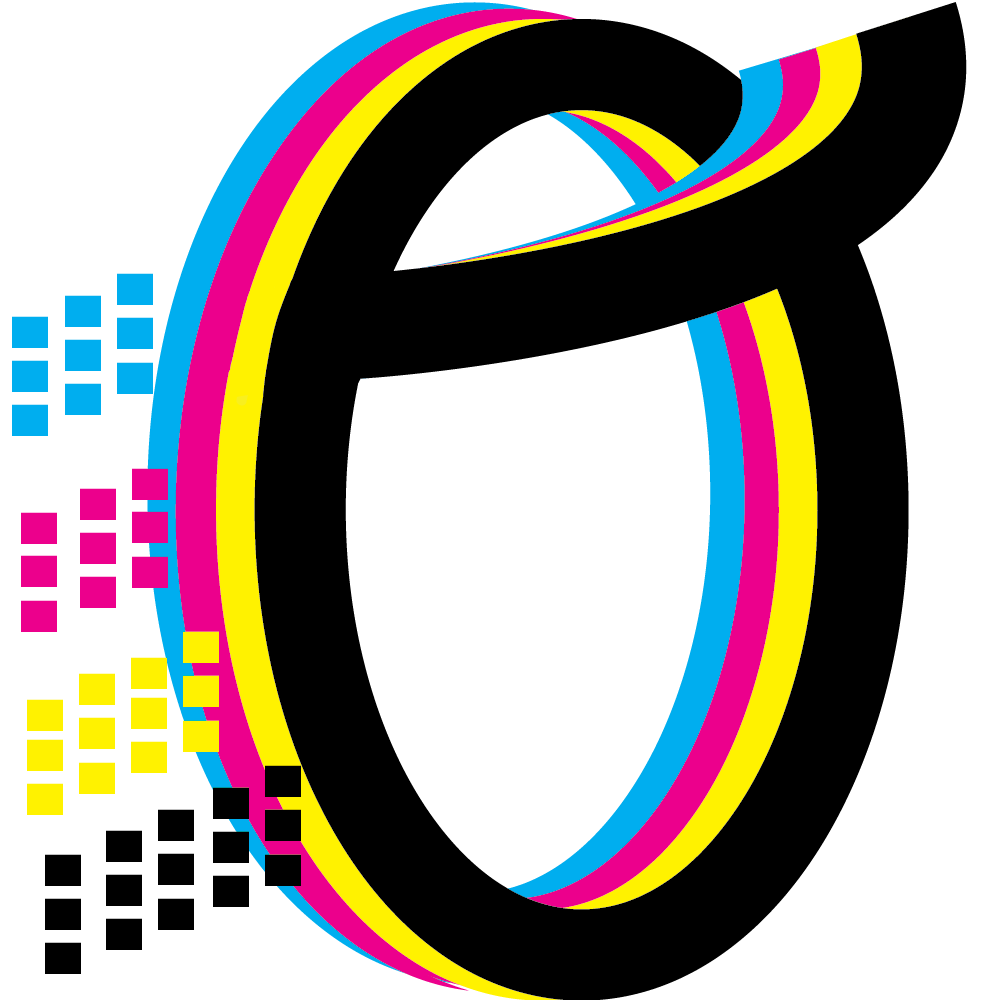
Andres O’Brien
One of the first things that we learned when studying graphic design in GCM is CMYK. Cyan, magenta, yellow, and black are the ink plates used in printing, from posters to business cards, basically everything.
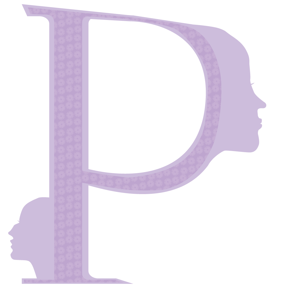
Michelle Pena Martinez
To include them, I first chose to utilize women’s profiles on the drop cap, and especially in the lobe as it would compliment the shape. I made sure to change the features between the faces to highlight the diversity of female voices that would be included in the book. It is very important to ensure that it is not just a “standard” silhouette as they are usually based on White women. I created variety since the history book will hopefully feature women of colour and the drop cap should be representative of that.
Kim Pham
For my piece, I wanted to create a design that looked modern and bold yet very feminine at the same time.
Zohal Rashid
When I think of the history of graphic design, my mind immediately goes to patterns, an art element that is widely used and can be even seen in nature. Patterns are symbolic in many cultures and often tell many stories from specific regions. For this project, I decided to use the blue Mosaic tile patterns based in Morocco to design my drop cap. I was inspired by the blues and free hand design. I wanted to focus on a pattern style that I’ve come to love very much because of its beauty, history, and symbolism.
Emma Scott
I chose to create an illustrative drop cap that would emulate art nouveau stylings. The art nouveau style developed in the 1880s as a rebellion against popular art education practices at the time, mass production, and the perceived loss of quality that came with it (Gontar, 2006). I felt that it would be an ideal style for bringing unique typography to the spotlight. Art nouveau posters merged fine art with graphic design.
Kayla Shui
The drop cap I have created brings together classic and modern elements of graphic design recognizable to designers in Canada. its style is influenced by Blackletter type. Though less decorative, the letter is cleaner and more modern, ultimately increasing legibility – an important part of bookmaking. This Blackletter S also harkens back to the 11th century and the birth of moveable type, a milestone in graphic design history.
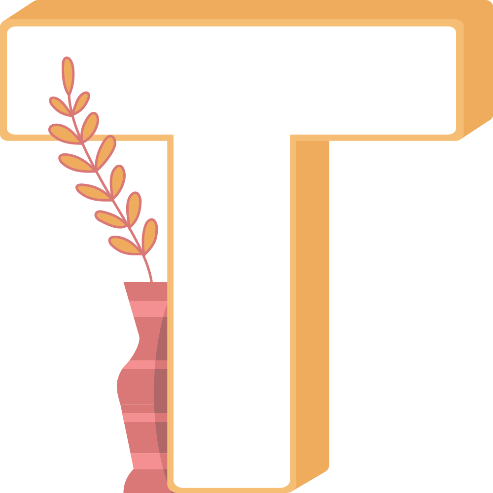
Katie Tucker
I chose to create a typeface for the letter ‘T’ that is simple and decided to incorporate a small design element to represent emotions, positivity, and ideation. In regard to the drop cap being created for lovers of coffee table books, I thought that this design would entice the target audience and encourage them to want to display a book with this drop cap.
Ian Ugale
I didn’t want to make a design that was inherently feminine, to play into the gender normal attributes that is usually pushed in mainstream media felt too easy. I also wanted to create some sort of visual commentary on how the design space and its relationship with gender.

Erik Vanegas
The industrial revolution took place from 1760 to 1840 and it was during this time that there were many advancements in manufacturing processes. The result of this was that factory work became prevalent in society which improved productivity on all fronts. It was these advancements in machinery that in turn affected the way typography was made. In order to fit the manufacturing process better, be suited for mass production, and accommodate for new mediums of communication, typefaces had to change and one of the outcomes was slab-serifs.
Malwina Zerek
Throughout my life I have been incredibly inspired and motivated by art and nature. The goal was to demonstrate how art is greatly influenced by the world around us, and that personal experience can greatly affect our design choices.
Mark'd
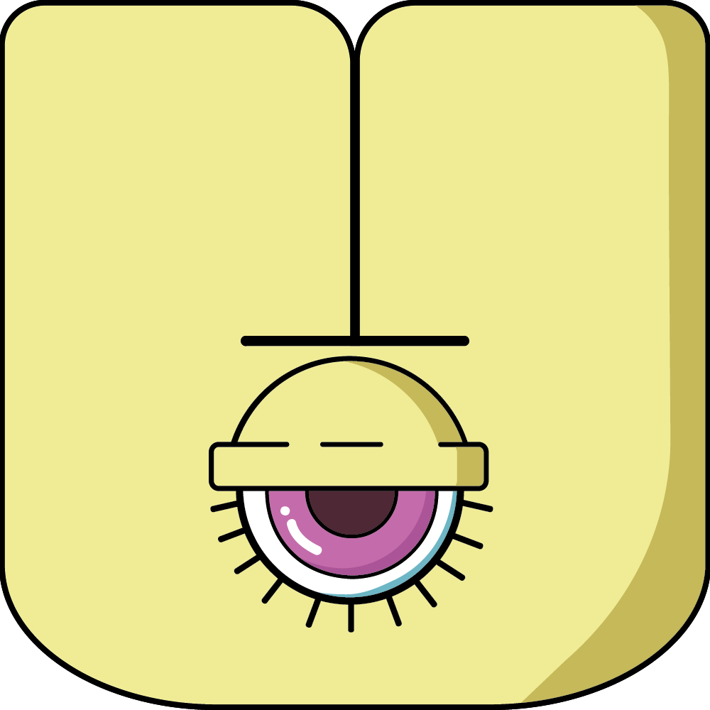
Students were asked to design and name a new punctuation symbol that the world has never seen before, thinking about its meaning and when and where it would be used in text.
Jiawen Bai
Ear mark can be used after the end of a sentence, indicating that the sentence is heard from others, rather than said by oneself, the authenticity of the sentence is not sure, and the meaning of the sentence is not conveyed by oneself.
Lauren Balatbat
This new punctuation is called the “joy mark” because it is meant to express joy, kindness, and happiness. For example, when a client is happy or satisfied, they can use the joy mark to end a good review or compliment. This mark can also be used internally when colleagues are communicating with each other to show their appreciation and gratitude both casually and professionally.
Shelby Cooper
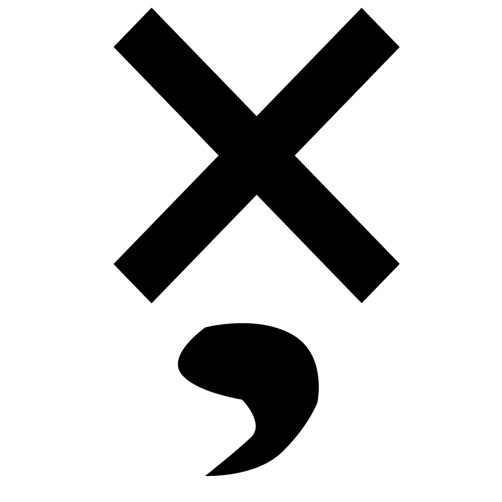
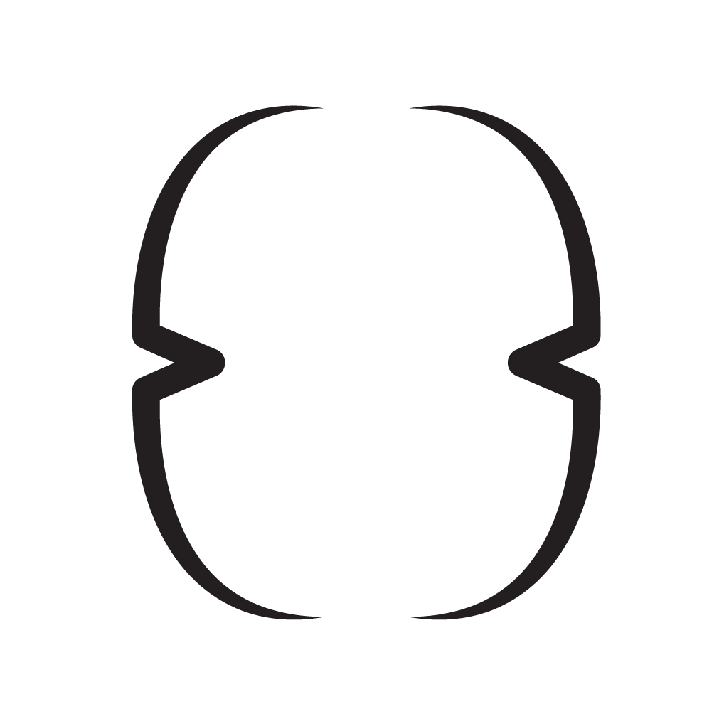
The Kudla Mark is a simple symbol that separates two separate/opposite ideas in a single sentence.

Christopher Leinwand
The similophe marks are a innovative new form of punctuation that bridge the gap between things to convey a more clear and accurate track of what the writer is wanting you to learn from/ relate to certain material.
Louisa Leung
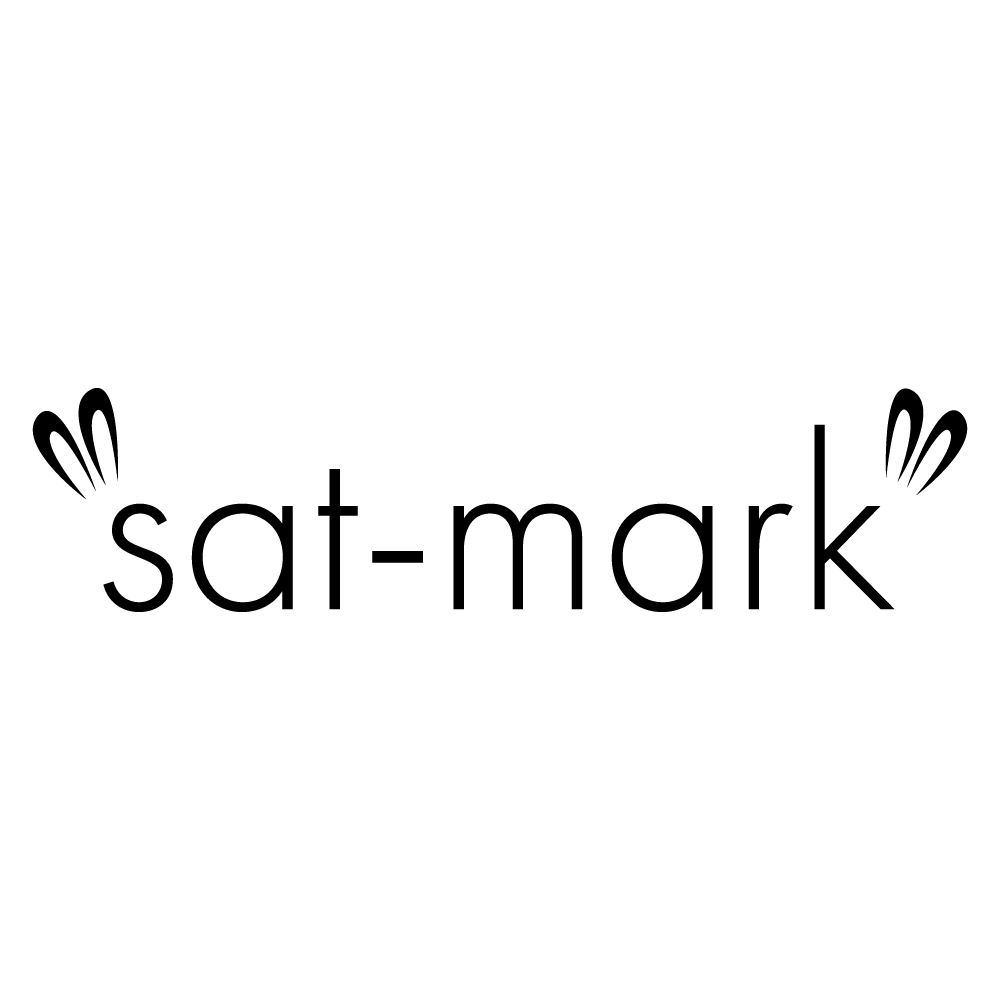
This punctuation mark would be used whenever air quotes are used, such as for sarcasm, irony, or satire. When these phrases are spoken, they are usually said in a different tone. This sat-mark is meant to help identify that so the message could be conveyed properly.
Ethan Lisi
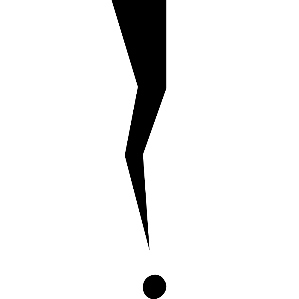
I wanted to make a punctuation mark that would represent a long pause between phrases, kind of similar to an em dash, but specifically used between phrases. It would work very well in scripts, which often have these long pauses.
Raianne Mallari
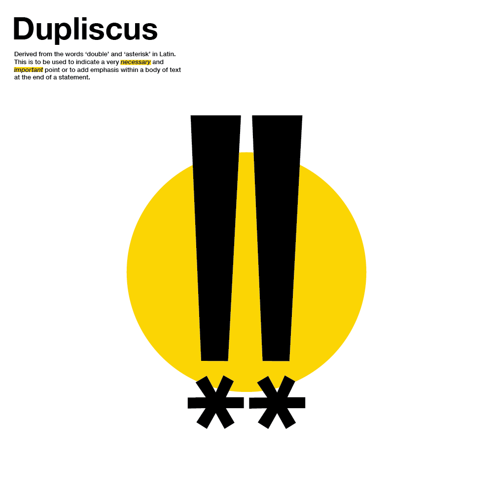
A new punctuation named “Dupliscus” came to be and it is, essentially, to be used to indicate a very necessary or important point or to add emphasis within a body of text at the end of a statement. The name is derived from the Latin words ‘duplici’ and ‘asteriscus’ which translate to ‘double’ and ‘asterisk’ in the English language.
Abigail Meana
“Valeo” is the Latin word meaning “be strong”. The valeo mark is a punctuation mark that is used at the end of a sentence when an individual is saying something with emphasis and shows courage, bravery, and hope.
Maya Navarro
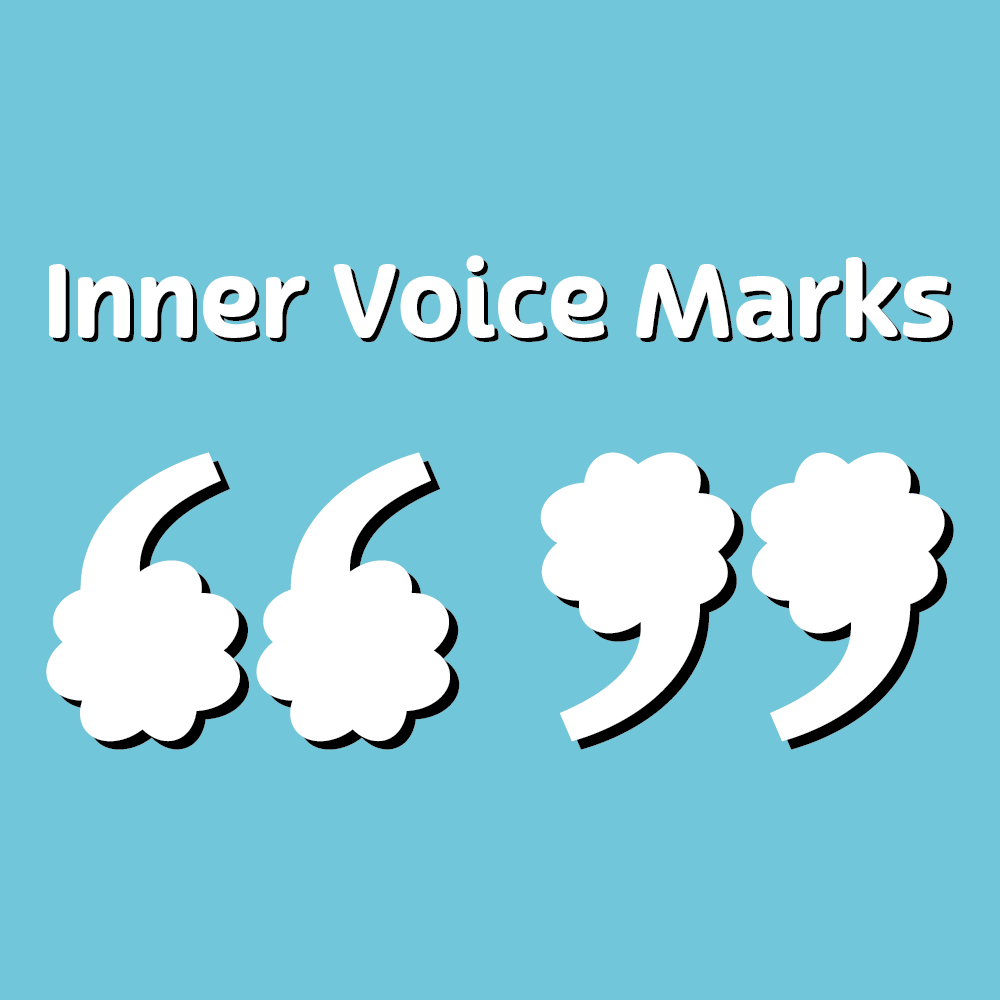
There is no punctuation mark that specifically represents a quoted passage that a person says to themselves - not out loud, but in their mind. My idea for the new punctuation mark is, “Inner Voice Marks.” These marks would work similarly to quotation marks, in which they would be placed before and after a quoted passage within a body of text; however, they would instead be used when a writer indicates the inner thoughts of someone rather than something an individual says out loud.
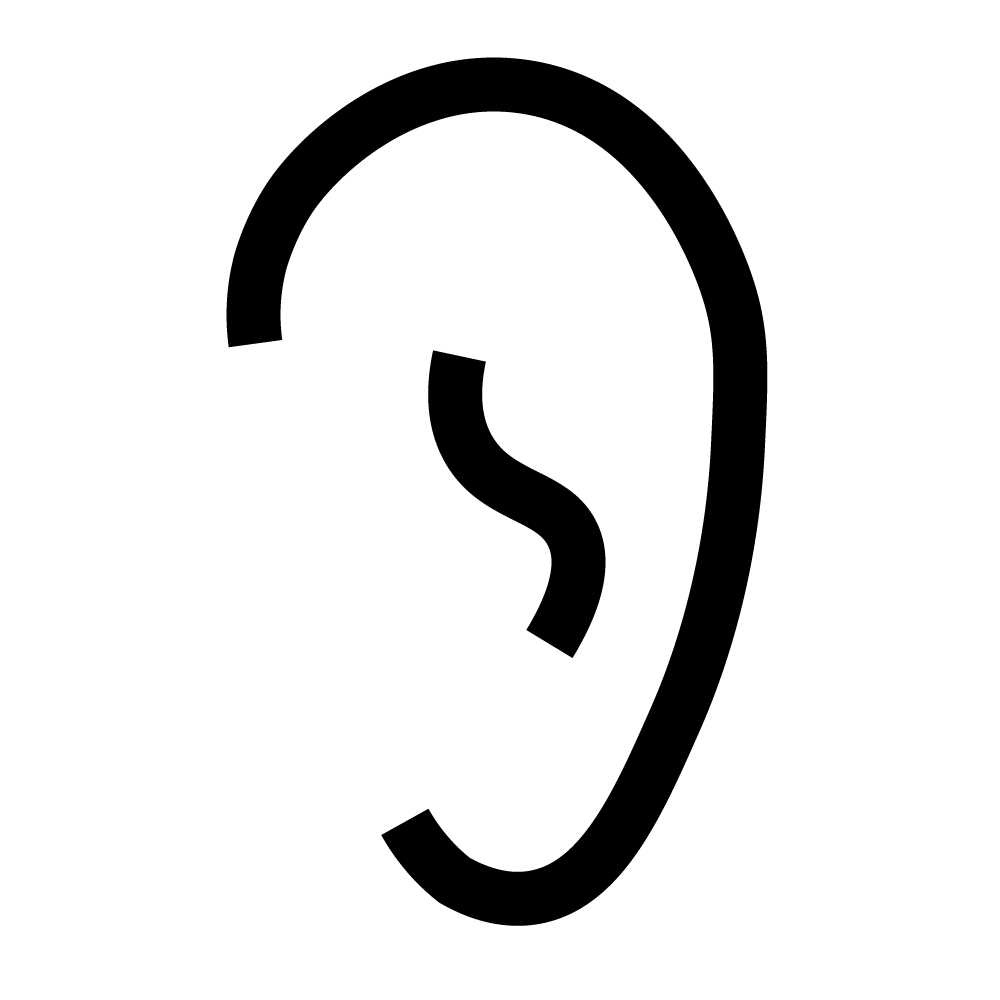
Dong Pan
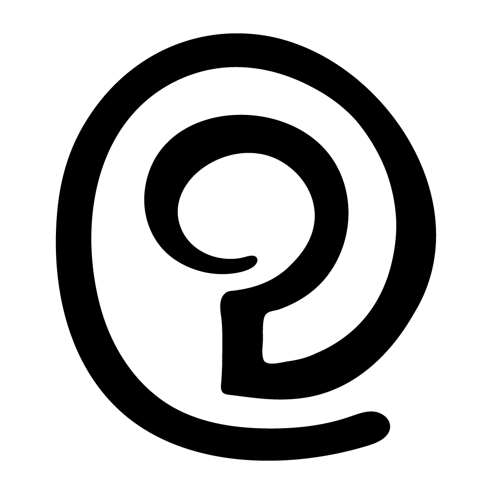
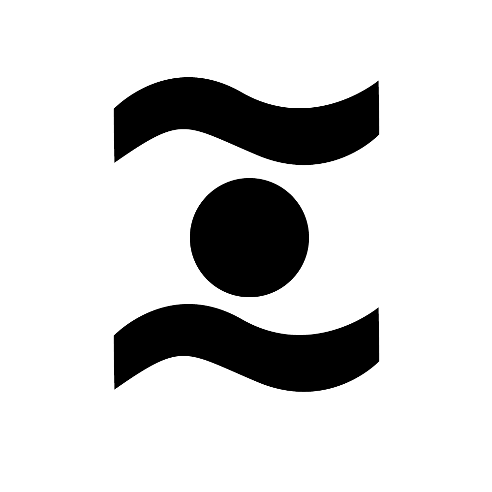
The new symbol, a question mark inside a circle shaped like an ear, represents the new branch's commitment to listening carefully to customers' needs and stories and doing our best to find the best solution to tell their stories through communication design. The circle around the question mark denotes that we value everyone's voice and welcome everyone's opinions and suggestions within the agency and in the community.
Katarina Pokrajac
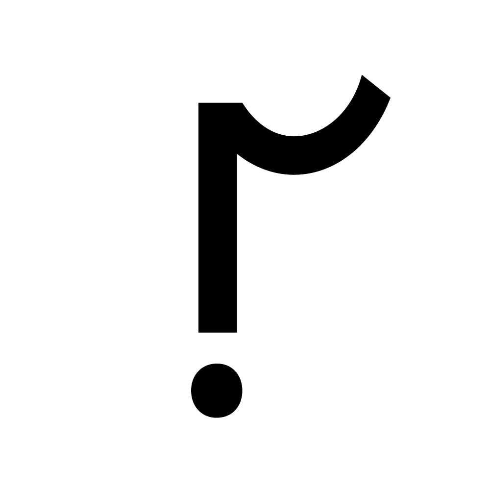
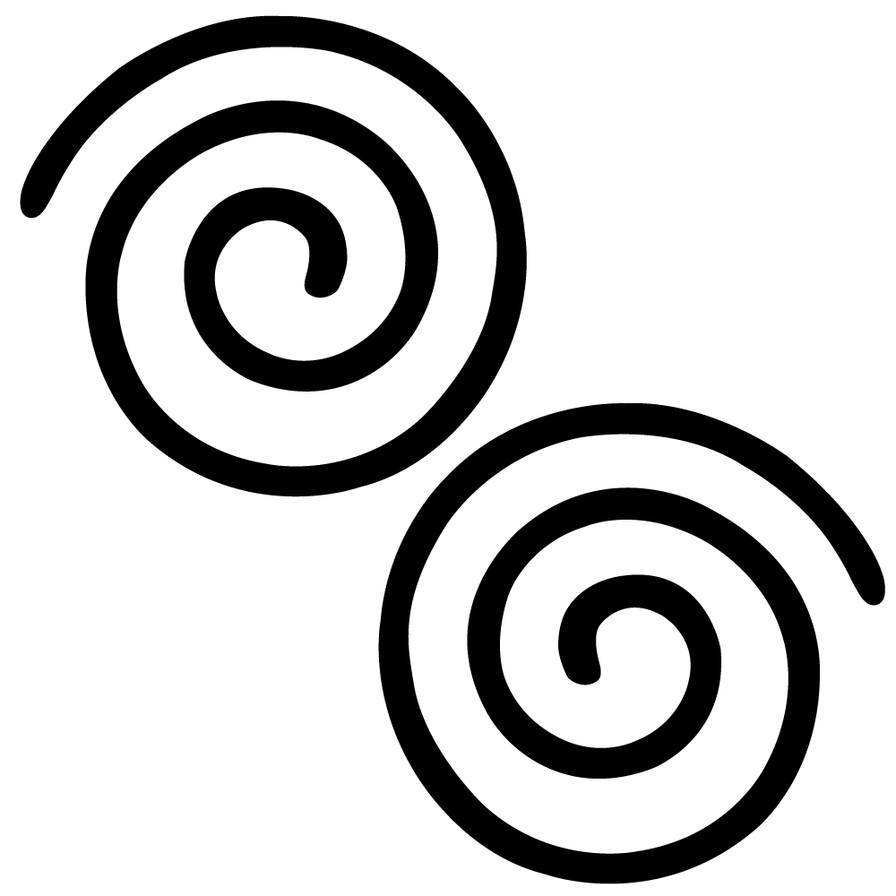
The symbol that you see is called a “helix”. The helix will be used in the context of reviewing and requesting clarification from others.
Lily Ramsey
The stario is used to end statements in a tone between that of a period and an exclamation mark. This is most helpful in a professional context where one wishes to make light-hearted statements or sentences without discrediting their authority with the overuse of exclamation marks. Where the period may be received curtly and the exclamation mark excessively, the stario reads positively without sacrificing the sincerity of its writer.

Zoe Statiris
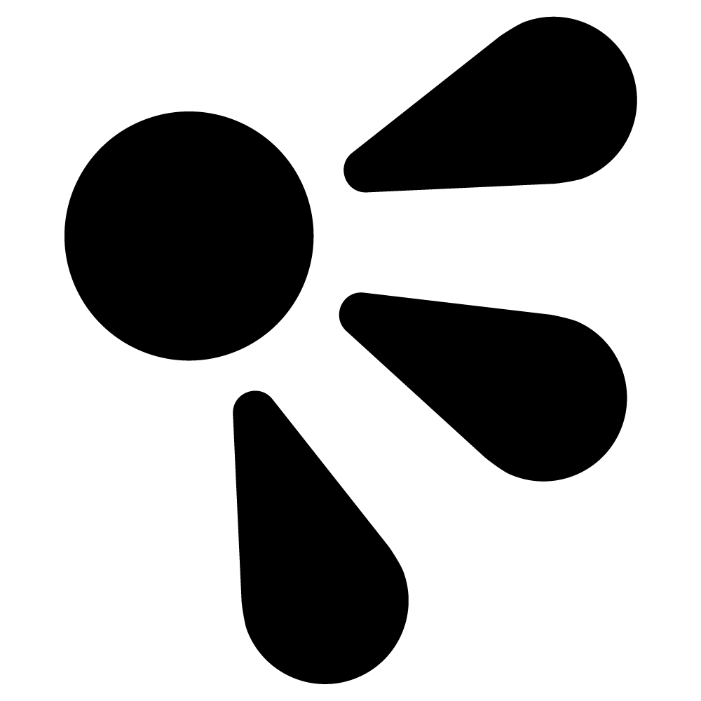
The new punctuation mark I created was a double exclamation mark (Dex mark). Meant to highlight a point by expressing overt, uncontrollable excitement and joy, the Dex mark makes it possible to emphasize a sentence even more than a single exclamation point.

Hasan Uzun
My punctuation mark creation idea is to create a ‘Speaker’s Mark’ that indicates different people talking in written content, specifically novels or articles. My inspiration for this glyph's creation comes from my difficulty figuring out who is speaking in novels when there are no other additional details to support the speaker’s quotations.
Kelly White
An “importext” punctuation symbol is to be used to help emphasize the importance of a sentence. It should be located at the end of the sentence that is meant to be recognized as important.

Evin Wong
My punctuation mark creation idea is to create a ‘Speaker’s Mark’ that indicates different people talking in written content, specifically novels or articles. My inspiration for this glyph's creation comes from my difficulty figuring out who is speaking in novels when there are no other additional details to support the speaker’s quotations.
Jarif Yasar
This symbol is called a maximus, Latin for important. This will be the opposite of the parenthesis. While the parenthesis indicates a line that is unrequired for the sentence, this will indicate a line that is especially important for a sentence.
Benjamin Yee
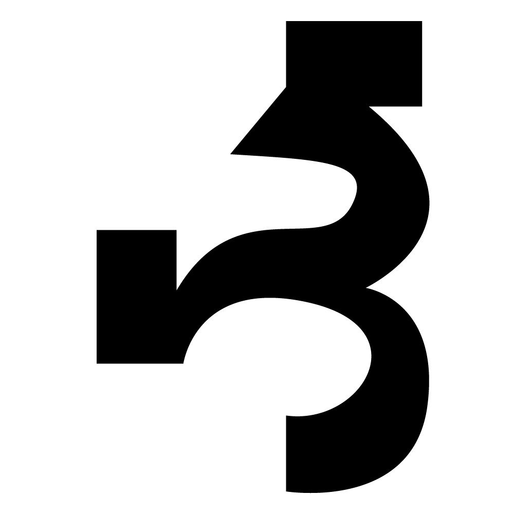
The symbol that I designed shall be named the “D’entendre Mark”. It is a symbol used similarly to quotation marks or brackets in which the symbol is used at the beginning and end of the idea. The main use for the D’entendre Mark is to indicate ideas with double or multiple meanings (double entendres).
Sarah Zahavi
Communication has never been easier—and deciphering someone’s tone has never been more difficult. Plain writing can be read as angry, or standoffish, or aggressive; friendships can be ruined, families torn apart, all over the potential misreading of a sarcastic text. So, here’s the problem: how can we indicate the tone of our messages efficiently and effectively, without detracting from the message itself? Introducing the Oktzani: this punctuation mark is designed to be combined with existing punctuation and will indicate the use of a sarcastic tone.

Noshig Zakarian
When thinking of a punctuation mark that is new and innovative I thought of my personal favorites and most used ones which are the question mark and exclamation point. So I thought why not combine the two.
Isabella Zinga
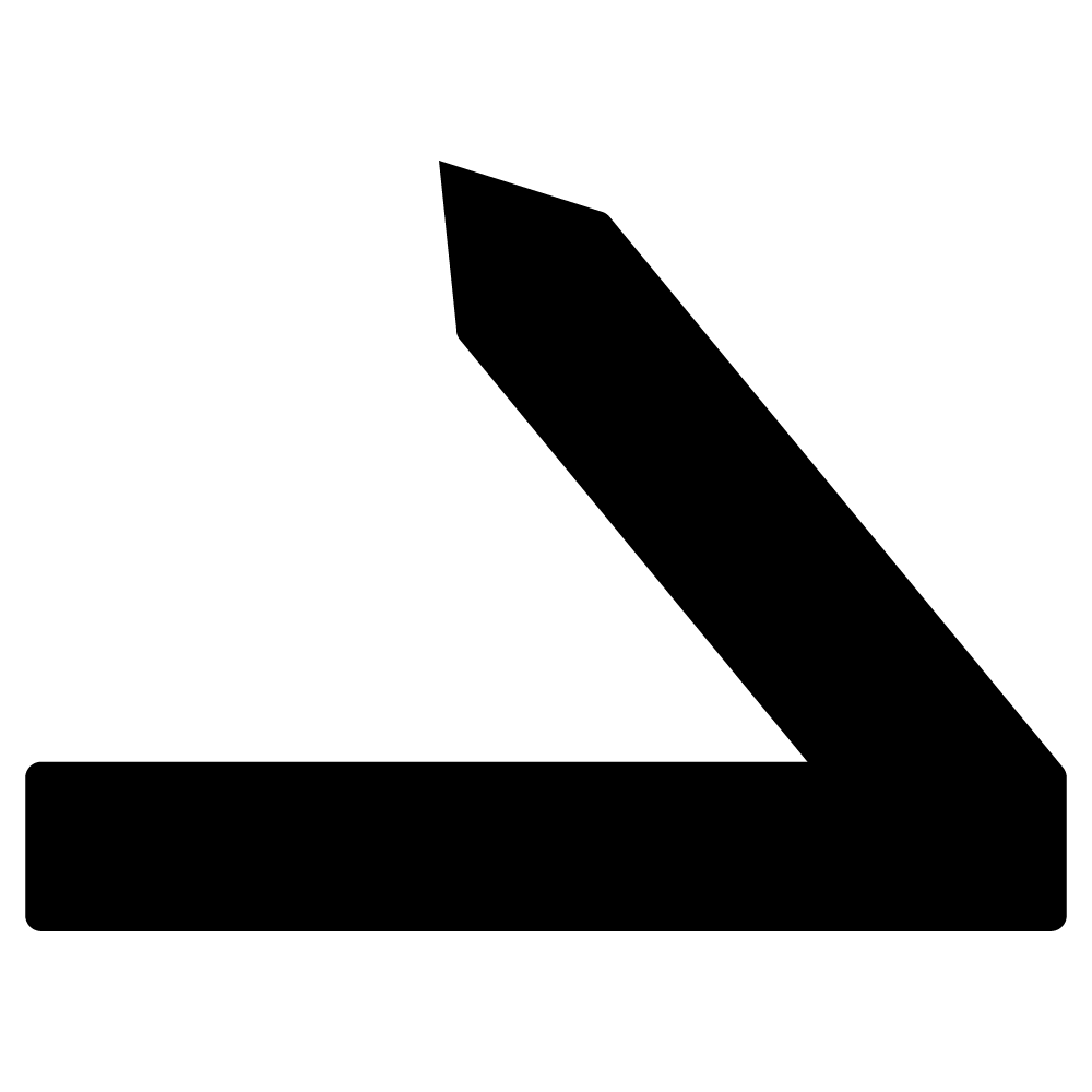
This new punctuation symbol is called a Symcon. This new punctuation is used for page breaks. The Symcon is placed at the end of a sentence, whether it's the middle or the end just before the writing goes onto a new page.

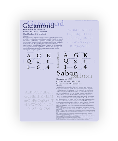
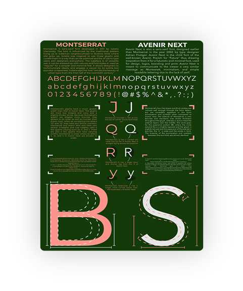
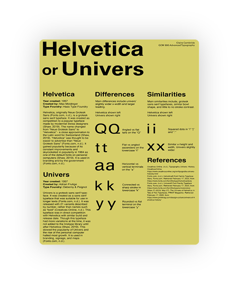
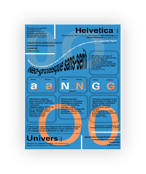
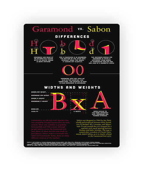
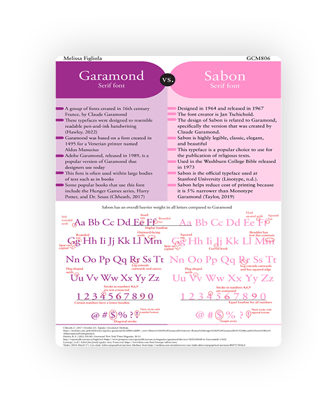
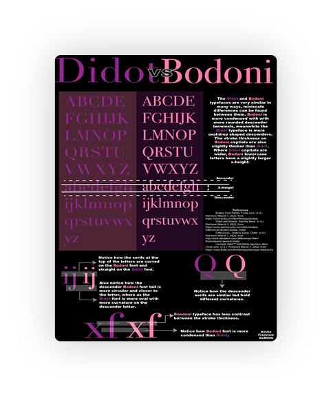
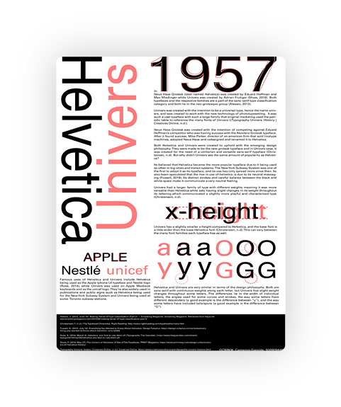
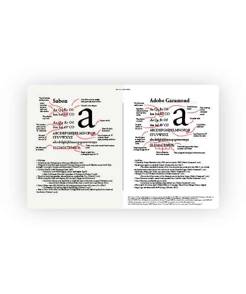
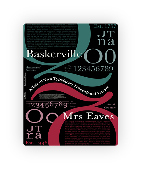
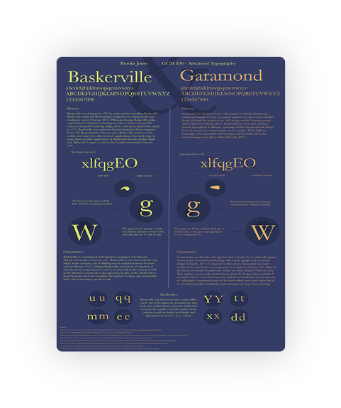
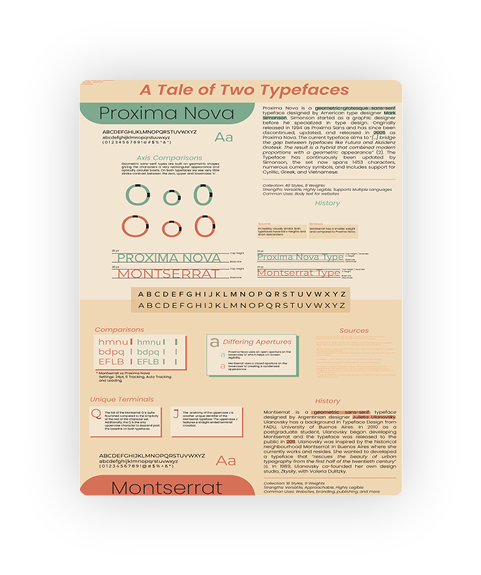
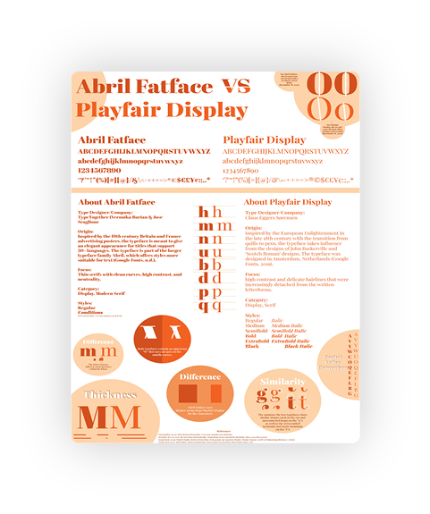
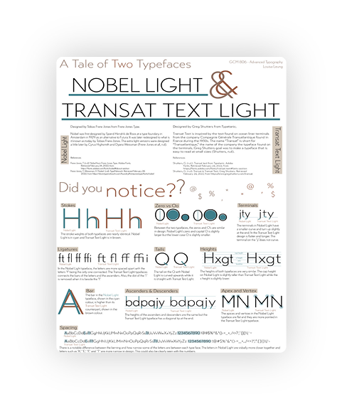
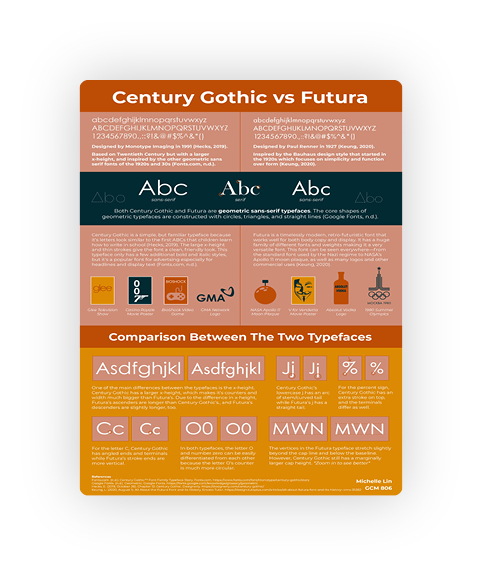
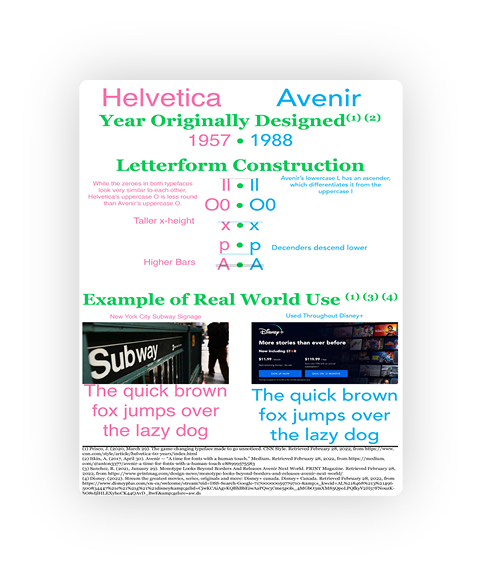
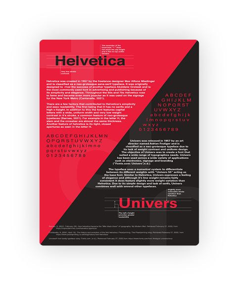
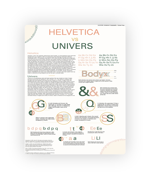
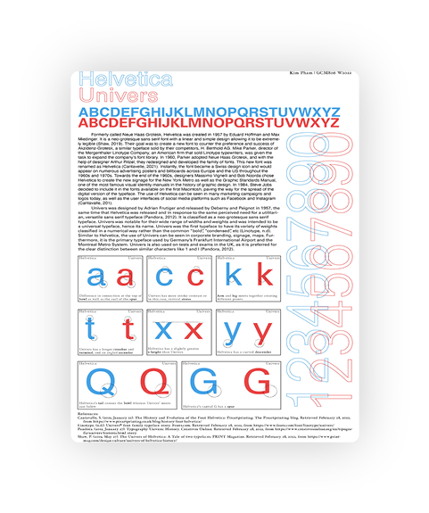
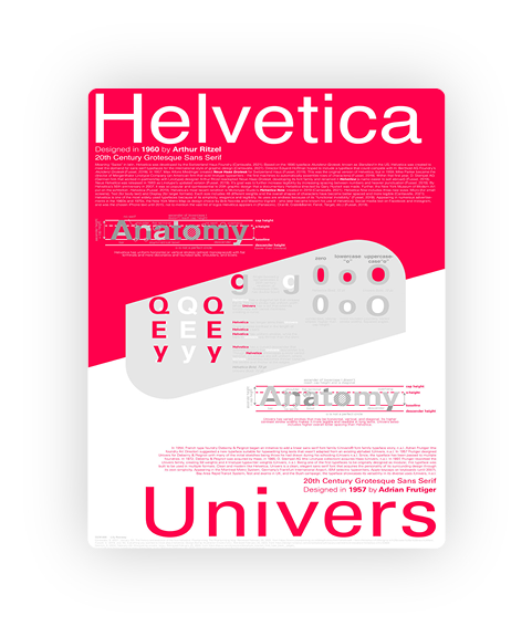
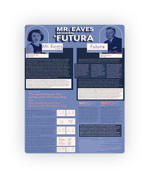
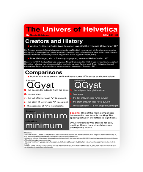
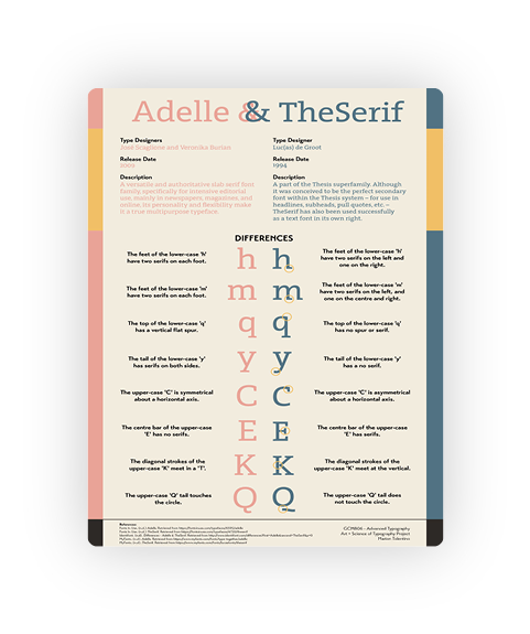
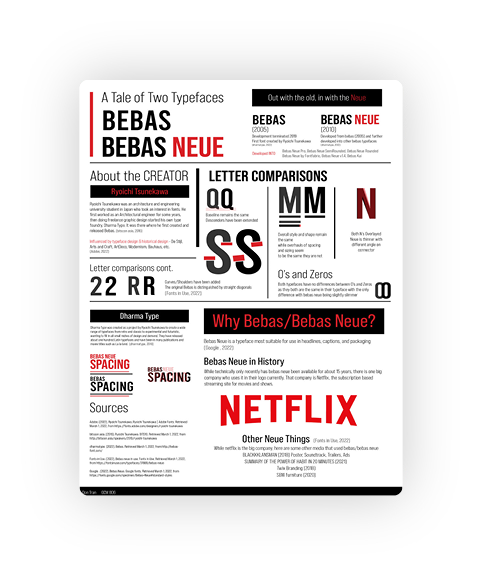
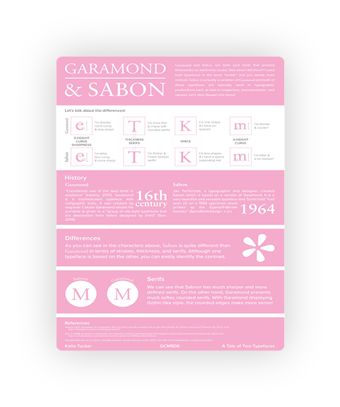
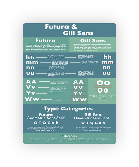
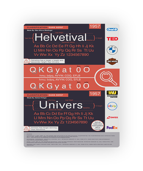
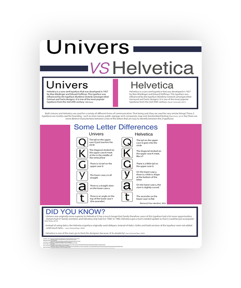
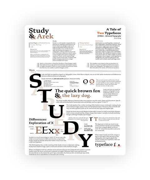
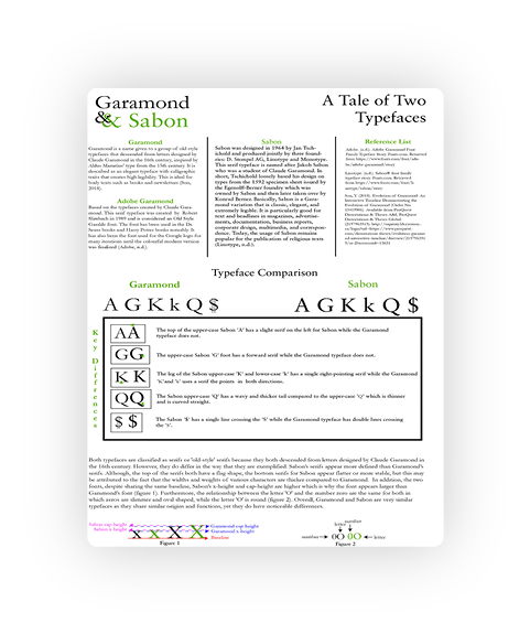
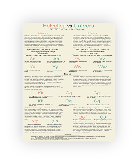
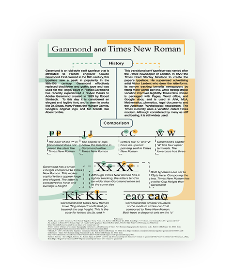
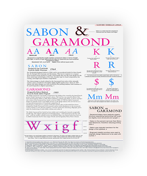
A Tale of Two Typefaces
Students were asked to create a poster visually displaying a structural analysis of two typefaces, with a goal of opening a reader’s eyes to the subtle nuances in similar looking typefaces.
By Ravia Begum

By Sarmin Begum
By Zaib Bokhari
By Claire Cambridge
By Calissa Cathcart

By Anita Chen

By Stefania D'Ercole
By Koby De Guzman
By Melissa Figliola
By Alisha Framroze
By Cameron Garside
By Kielon Gerra
By Cailin Goolcharan
By Brooke Jones
By Elyse Kelly
By Kelly Kienapple
By Haamiah Laylo
By Fiona Lee
By Christopher Leinwand
By Louisa Leung
By Linda Lin

By Michelle Lin
By Ethan Lisi
By Marisa Lopes
By Michelle Martinez Pena
By Hayden McGreal
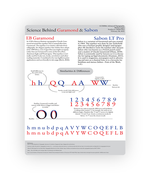
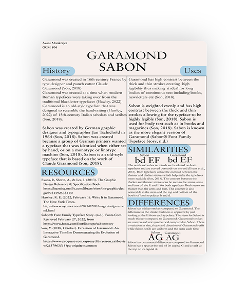
By Avani Mookerjea
By Kristian Murphy
By Adam Nevins
By Alyssa Papa
By Kim Pham
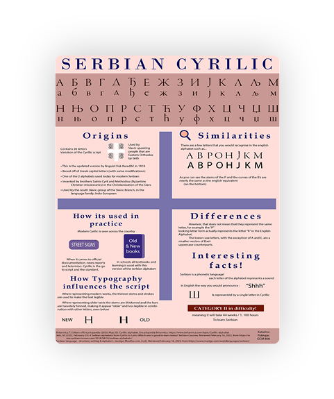
By Katarina Pokrajac
By Lily Ramsey
By Emma Scott
By Zoe Statiris

By Nasrin Suleiman
By Marion Tolentino
By Don Tran
By Katie Tucker
By Hasan Uzun
By Erick Vanegas
By Elysse Watchon

By Kelly White
By Evin Wong
By Jarif Yasar

By Benjamin Yee
By Shengnan Zeng
By Malwina Zerek
By Winnie Zhan

By Isabella Zinga
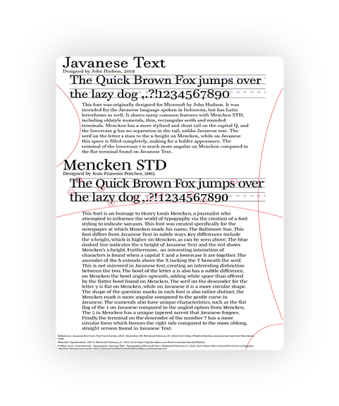
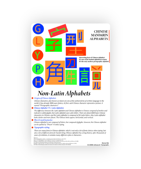
Non-Latin Alphabets
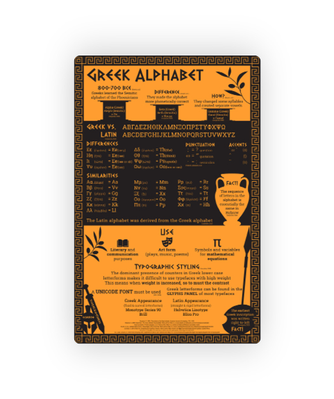
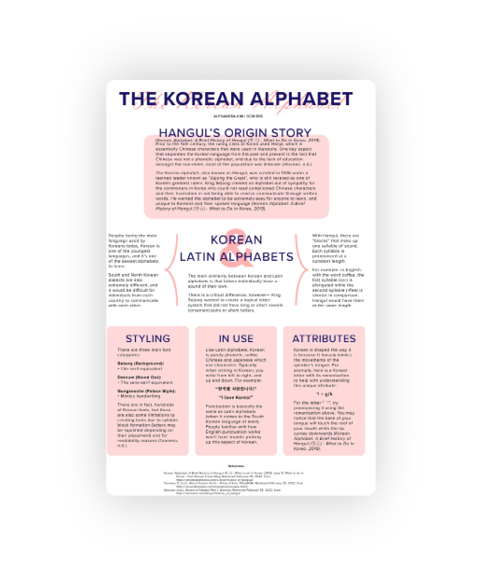
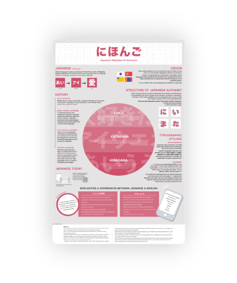
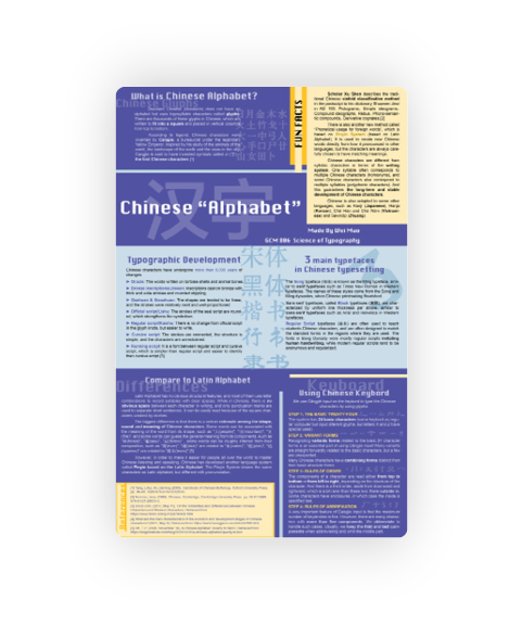
Students were asked to create a poster visually displaying a structural analysis of a non-Latin alphabet, including its origins, as well as similarities and differences to the Latin alphabet.
By Jiawen Bai
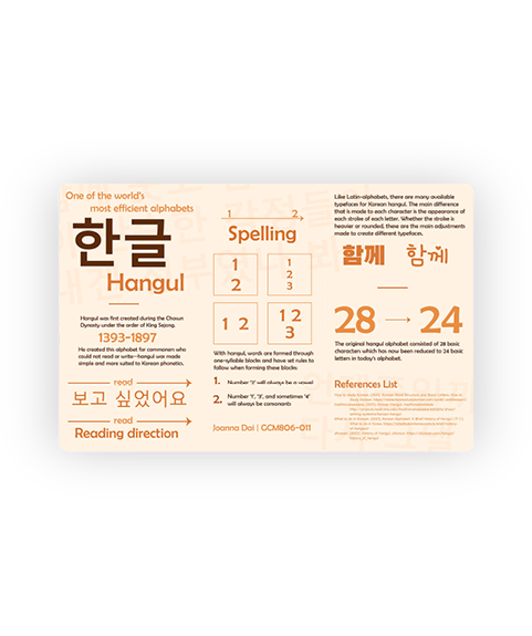
By Joanna Dai
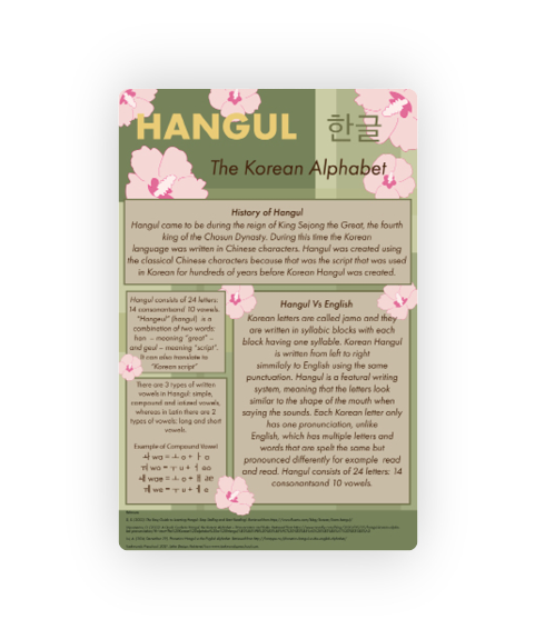
By Kaela Dalla Pasqual
By Danielle De Veyra
By Mackenzie Johnson
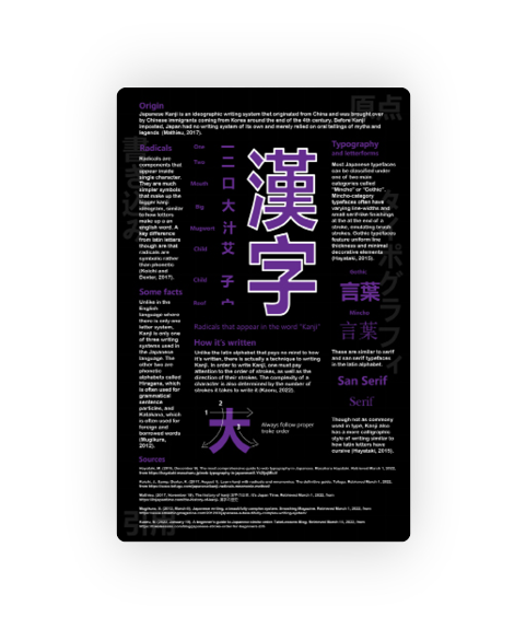
By Vasiliki Kapetanios
By Alexandra Kim
By Raianne Mallari
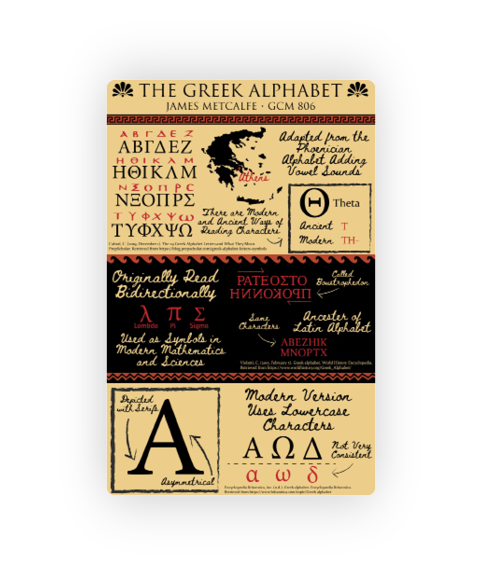
By James Metcalfe
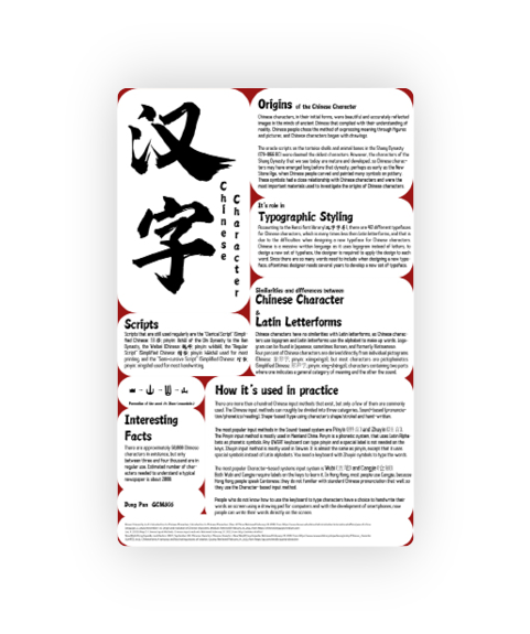
By Pan Dong
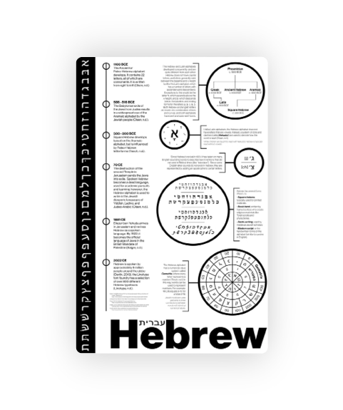
By Katarina Pokrajac
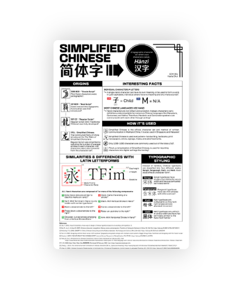
By Kayla Shui
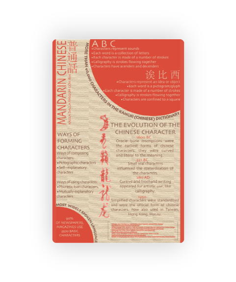
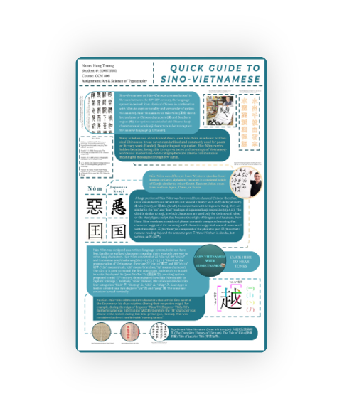
By Hung Truong
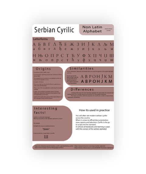
By Sarah Zahavi
By Noshig Zakarian
An Incomplete History of Type
Students were asked to research, write and record a podcast episode that explores the history of typography through the lens of a single typeface told in an audio storytelling format.