We are in the process of updating Ted Rogers School of Management and Ted Rogers MBA brand resources. Please stay tuned!
Typography
The Ted Rogers School of Management's typography, photography, colours and layout grids bring our brand to life. The words you choose. The type you use. The colours, graphics and imagery you communicate with. It involves the thoughtful stewardship of each of our students, staff, faculty and partners. This section covers the specific guidelines for the use of the visual language to protect the integrity and quality inherent to our brand.
Type tells a story. The right typeface, used consistently, builds character.
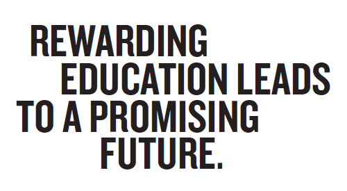
Headline Type: Knockout
The functional flexibility of Knockout helps us to create a clear and consistent visual hierarchy at the display level. It’s many widths and weights offers a range of voices to command attention while communicating a progressive and unique brand personality.
Alternative Font: News Gothic
When Knockout is not available and a more universally available system typeface is required, please use News Gothic.
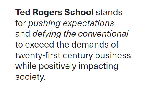
Body Type: Neue Haas Unica
Neue Haas Unica is a modern day sans serif that was designed to be different — sharper than Helvetica, warmer than Univers and cleaner than Akzidenz. It is a clean, understated and elegant face that complements our display face of Knockout.
Neue Haas Unica Pro Regular is used for body copy with Italics and Bold weights used sparingly to highlight information.
Neue Haas Unica Pro is by Monotype, and can be purchased at Monotype.com (external link)
Alternative Font: Arial
When Neue Haas Unica is not available and a more universally available system typeface is required, please use Arial.
Headline Styles & Copy Examples
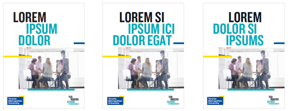
Headline examples
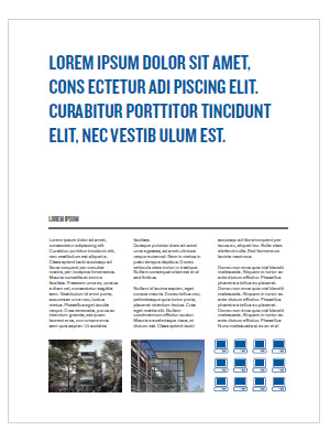
Interior page copy example
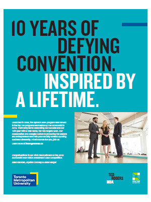
Magazine ad example

Digital ad example
![]()
Brand guidelines
Want a printable version of the information on the Marketing Resources website?
TRSM intranet
TedNet (external link, opens in new window) (TMU credentials required)
Staff and Faculty Intranet. Find our administrative policies, resources, procedures and practices.