We are in the process of updating Ted Rogers School of Management and Ted Rogers MBA brand resources. Please stay tuned!
Ted Rogers MBA
Wordmarks
This section provides information, guidance and tools on how and when to use the Ted Rogers MBA wordmark – with and without the university's logo.
Consistent use of our Ted Rogers MBA wordmark will create a unified brand presence and build our identity.
The university's logo and Ted Rogers MBA wordmark should be presented with a perception of harmony and hierarchy, rather than competing for attention.
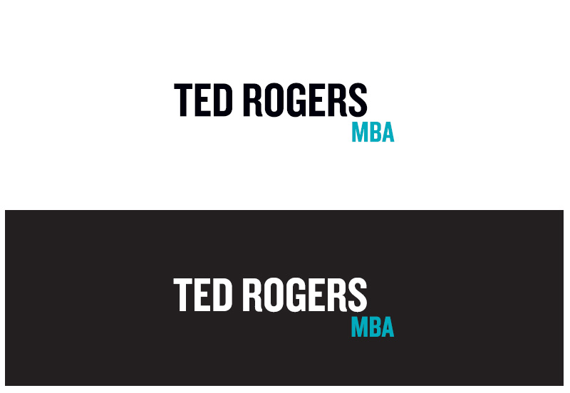
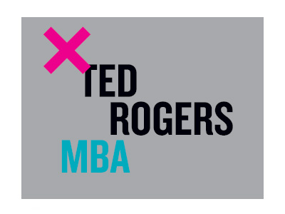
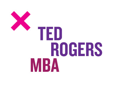
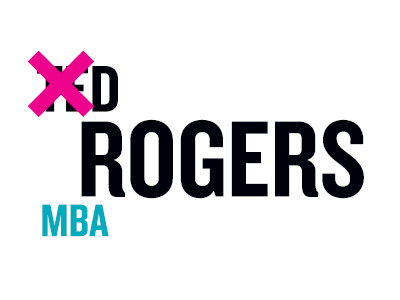
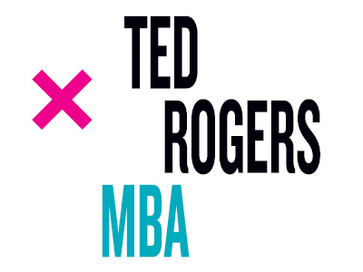
Our Ted Rogers MBA wordmark uses an unconventional type arrangement to communicate our uniqueness, progression and movement. Simple in nature, the wordmark commands attention while communicating a progressive and unique brand personality for our faculty.

Wordmark variation

1-Colour (Black)

Full-Colour, Negative Teal Background

Full-Colour, Negative Black Background

1-Colour, Knockout Teal Background
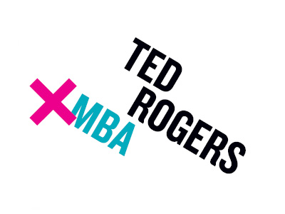
Horizontal alternative
There are times in our applications when a horizontal wordmark makes better sense for legibility. The horizontal version should be reserved for applications with specific space considerations such as web, signage and small swag applications.
The horizontal wordmark should only be used in exceptional cases, i.e., when space is limited.
Minimum size & clear space for wordmarks
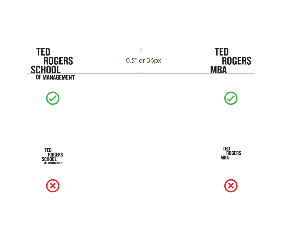
There is no standard measurement of minimum size for all media (print and web) because of different viewing distances, printing processes and resolutions, etc.
When applying the wordmark, please ensure that all elements are clearly visible and legible.
As a guiding principle, “Ted Rogers School” and/or “Ted Rogers MBA” should NOT appear smaller than 0.5 inches (print) or 36 pixels (web) in height.
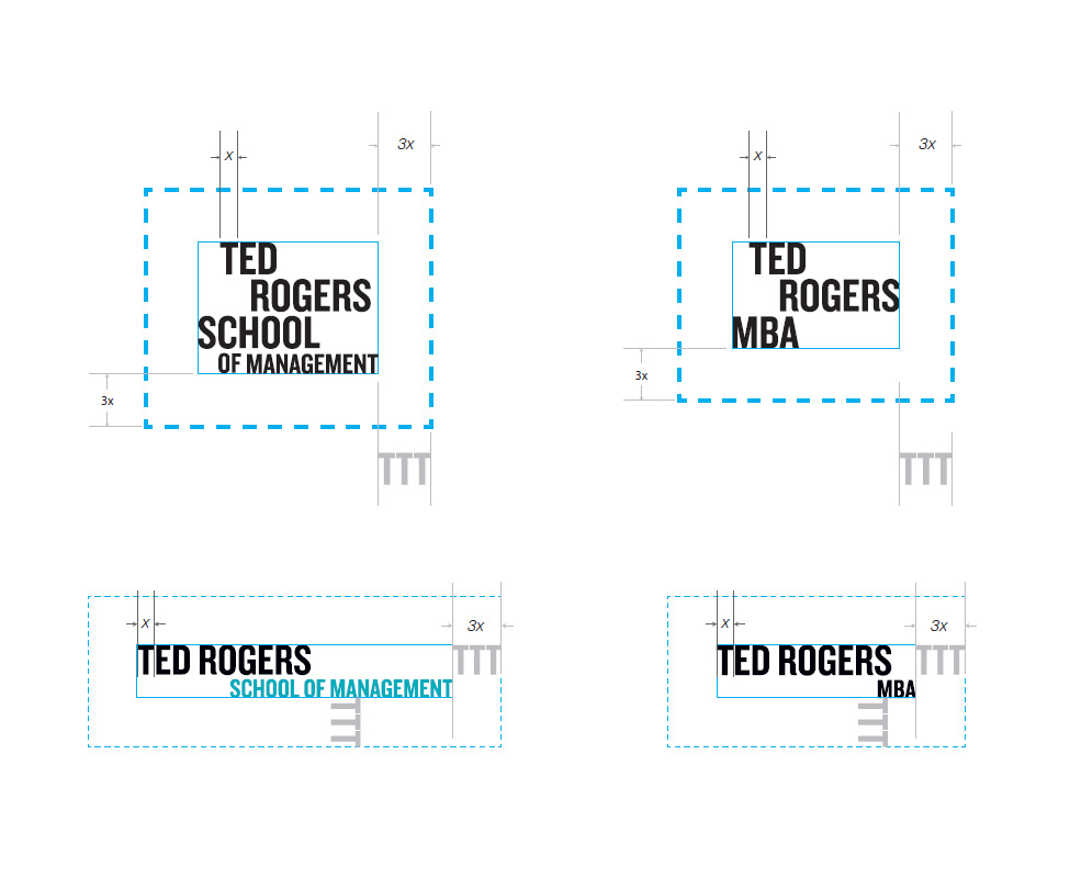
A clear space must always be maintained around the logo to ensure that the wordmarks remain distinct from other graphic elements. No other graphic elements should appear within this space. Please pay careful attention to the placement and visibility of the wordmark, as it allows our presence to resonate.
The clear space should be at least 3 times the width of the first "T" in the wordmark all around. This space will change depending on the size of the wordmark.
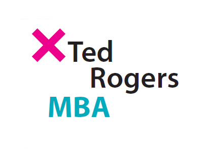
Wordmark usage
The Ted Rogers MBA wordmark is used for independent brand building with the university's logo in proximity. This placement reminds the audience the Ted Rogers MBA is part of university – but can stand alone.
The Ted Rogers MBA wordmark is used with the university logo next to it, spaced as demonstrated on the right.

The TMU + TR MBA official logo lock-up is build on the university logo to create a signature specific to the MBA entity within the institution. This lockup help us build brand association and visual clarity by reducing the number of stand-alone logos.
Please don't alter this logo lockup. The Ted Rogers MBA text is always black, unless the lock-up appears on a dark background, in which case text is set in white. Spacing and alignment is set by the university's lockup guidelines.

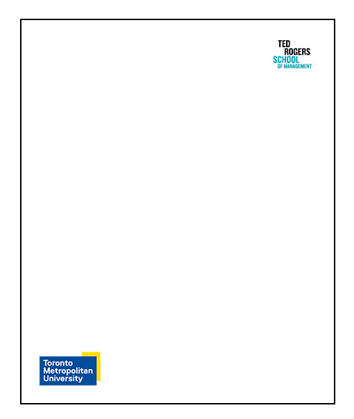
The recommended placement of the Ted Rogers School / Ted Rogers MBA wordmarks is in the bottom right corner of a layout. An alternate placement of the wordmark is in the upper right corner.
In all instances, make sure that there is enough contrast between the logo and its background.
Please note the preferred placement of the wordmark would be to the far right with the university Logo placed to the far left. Where possible always use the full colour university logo.

Wordmark Placement (Recommended)
Wordmark Placement (Alternate)
Suggested Scale
The suggested scale examples shown here are starting points. Depending on layout, the use of wordmark and application, these sizes may require additional consideration.

E-Header / Evite
900px wide
Logo width should be between 1/5–1/6 the width of the digital document.

Letter
8.5" x 11"

Tabloid
11" x 17"
Banner
31" x 78"
The following examples illustrate a few improper applications of the Ted Rogers MBA wordmark.
DON'T place the wordmark on backgrounds that provide little contrast or legibility.
DON'T change the colours of the wordmark.
DON'T add gradients or add special effects to the wordmark (i.e., drop shadows, outlines).
DON'T change the scale of relationships between the wordmark.
DON'T skew, stretch or distort the wordmark.
DON'T rotate or tilt the wordmark.
DON'T retype the text or recreate the typeface of the wordmark.
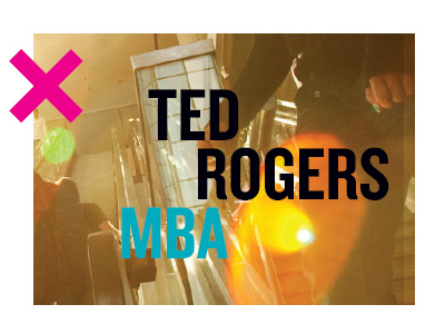
DON'T place the wordmark on an image without sufficient contrast.

DON'T combine or make the wordmark appear to form part of any other text or graphic.
![]()
Brand guidelines
Want a printable version of the information on the Marketing Resources website?
TRSM intranet
TedNet (external link, opens in new window) (TMU credentials required)
Staff and Faculty Intranet. Find our administrative policies, resources, procedures and practices.