Graphic Device
The university’s primary graphic device is a combination of overlapping boxes containing photography, text and brand colours. This unites our toolkit elements and creates a modular visual language that makes up our distinct style.
These boxes are used to create clear space for headlines and call-out text, define the edges of photography and contain fields of colour. In layout, they are used together to create visual interest, balance and movement. When used thoughtfully, they are the most effective tool for conveying the TMU university brand.
Unique Graphic Devices
To create more brand alignment, the university is moving away from the use and creation of unique graphic devices for faculties, departments and units, that are distinct from the university’s primary graphic system. Instead, we recommend building a creative look that draws on the university’s core brand elements — in particular, the use of overlapping boxes to frame content (photography and copy) along with colour.
Longer standing unique graphic devices may continue to be used until they are eventually phased out. However, no new graphic devices should be created and no new materials should be created using existing graphic devices. For questions email tmubrand@torontomu.ca.
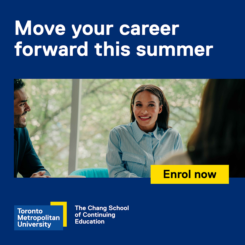
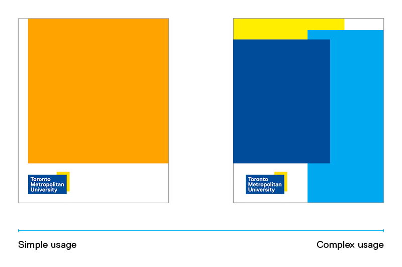
Depending on application, audience and message, our graphic device can be used simply, with a single box, or up to a maximum of three boxes of imagery and colour.
Overlapping frames are integral to our visual language. When designing for the TMU brand, start simple – all boxes should have a purpose.
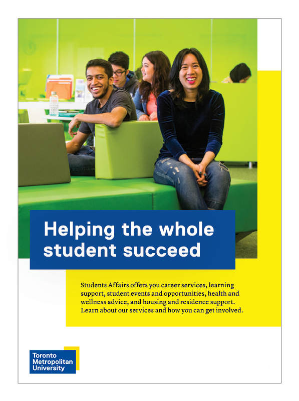
The university’s graphic device uses a combination of overlapping boxes containing photography, text and brand colours. The following guide below shows the steps to combine all of the elements effectively.
Consider your text first.
- Always start with headlines on your top layer, and consider a colour frame to draw attention.
- When combining text with boxes, create comfortable margins around the headline text by using a lower case letter as a spacing unit.
- Boxes are always rectangular; do not jog rectangles to conform with text rag.
- Website addresses are placed in the lower right corner.
Add photography and colour to complement your message.
Colour
- Use colour to complement photography or increase visual interest.
- Fields of colour are used to balance the page layout.
- Select colours that create contrast without overwhelming or competing for attention.
- Maximize background colour boxes as much as possible while maintaining some white space to retain the visual language of overlapping frames.
Photography
- We recommend using one strong image.
- Enlarge the photo as much as possible for hierarchy in the layout.
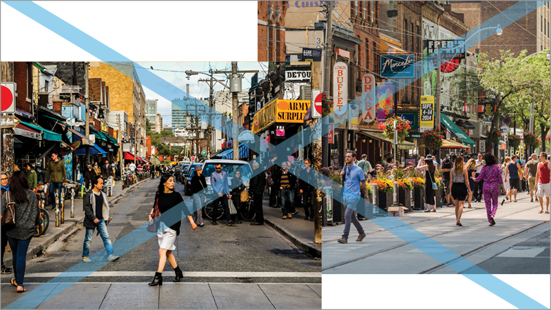
- Boxes can be used to create thoughtful cropping of imagery.
- Photography can be used to complement primary messages, or in the background for texture.
- Place the box over the photograph in such a way that it does not crop out any important information.
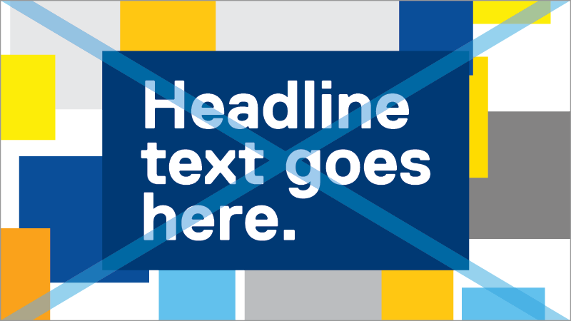
This is an example of a complex graphic usage where three boxes of imagery or coloured boxes are used.
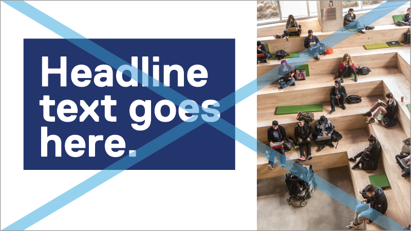
Avoid multiple photographs of the same scale or content.
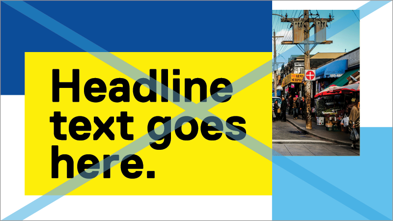
Avoid overlapping boxes or text with colours that blend together.
Avoid boxes that do not overlap.
Avoid lining up box edges.
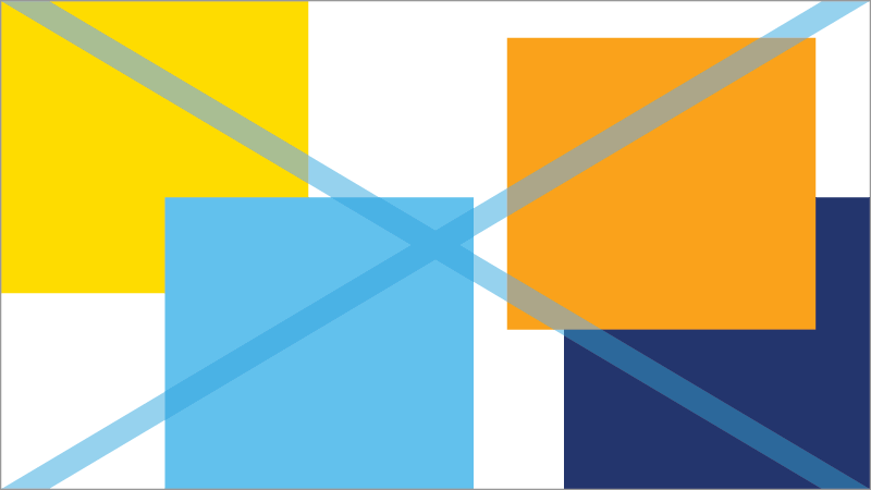
Avoid boxes of similar sizes.
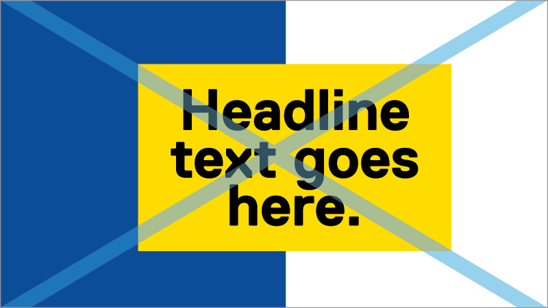
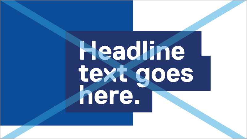
Avoid centring or right-aligning text.
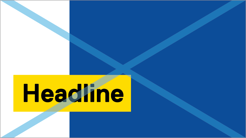
Unless limited by the layout size, avoiding placing a box that bleeds on three edges. Always show at least two edges of every box.
Avoid complicated layouts with excessive use of the graphic device. Layouts should feel comfortable and purposeful.
Avoid creating boxes that are geometrically complex. All boxes should be rectangular.